Blog

White-Label Print Fulfillment: What the Production Workflow Needs to Support

TLDR

A reliable white label print fulfillment workflow must control the complete path from accepted order to carrier handoff and remake resolution. It needs an executable job record, normalized SKU instructions, capacity-aware release rules, traceable work in progress, brand-specific packing controls, meaningful shipping events, and structured defect records. Blind shipping is only one requirement. The larger objective is to produce the correct item, version, quantity, finish, packaging, and label without relying on someone to interpret the order manually.

The operational test is straightforward: can a valid order move through production while retaining its identity at every handoff? If the answer depends on tribal knowledge, inbox searches, handwritten exceptions, or one experienced employee recognizing a SKU, the workflow is not yet repeatable.

White-label fulfillment is a closed-loop production system

A white-label program may hide the producer’s identity from the end customer, but the production floor needs unusually clear internal visibility. The system must know which brand owns the order, which product was purchased, which approved artwork applies, how the item should be produced, what belongs in the package, and what shipping identity the customer should see.

That makes the work broader than blind shipping. Blind shipping governs what is absent from the package or label. White-label fulfillment also governs order intake, production routing, quality criteria, brand presentation, status reporting, and exception handling.

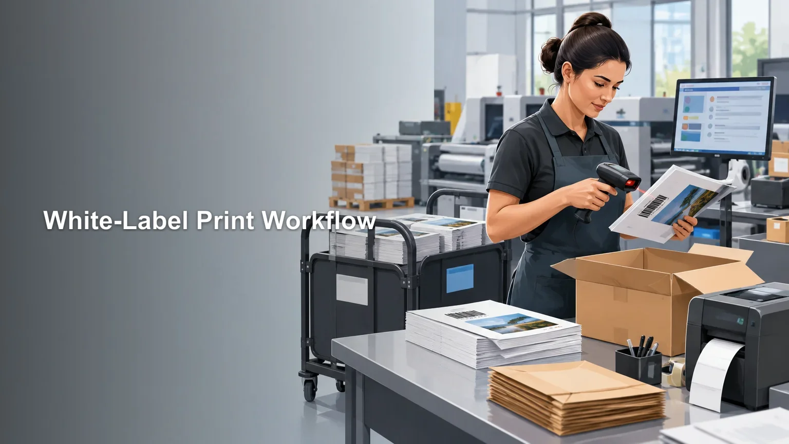
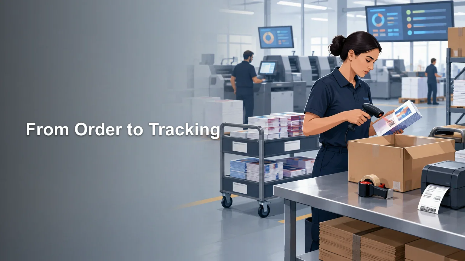
The workflow should form a closed loop: receive data, validate it, convert it into production instructions, execute those instructions, verify the result, pack the order, confirm carrier handoff, and feed defects or exceptions back into the system. For a fuller order-stage model, see the ecommerce print production workflow from paid order to tracking.

Create one executable job record

Every accepted order should create or update one authoritative job record. This does not mean every shop needs one particular MIS, ERP, workflow format, or automation platform. It means the same controlled record—or connected records with clear ownership—must carry the information needed at each handoff.

CIP4 describes JDF as a format for exchanging job, product, process, device-capability, and status information across graphic-arts workflows. That makes it a useful model for thinking about structured production data, even when a shop does not implement JDF. CIP4 identifies JDF/JMF as originating in 2000 and XJDF/XJMF as published in 2018. Readers evaluating standards-based integration can consult CIP4’s overview of JDF and XJDF.

At minimum, the executable record should contain:

  • A unique order and line-item identifier that remains attached to the work through production and packing.
  • Client, storefront, or brand identity, including the applicable packing and return-address profile.
  • The external SKU and its normalized internal product definition.
  • Approved artwork identity, revision, personalization data, and any proof or approval state required by the program.
  • Quantity, dimensions, substrate, print method or route, finishing operations, and expected component count.
  • Quality criteria, including checks specific to version, personalization, finish, orientation, and quantity.
  • Pack-out instructions covering mailers, cartons, inserts, labels, packing slips, and prohibited producer branding.
  • Requested service level, calculated ship-by commitment, shipping service, destination data, and address-validation result.
  • Current status, timestamps, hold reasons, exception history, and any remake relationship.

The record should answer production questions without forcing operators to reopen the storefront order. If artwork control is a recurring weakness, establish the version and naming rules described in organizing print-on-demand artwork files before scaling fulfillment.

Translate storefront SKUs into shop-floor instructions

A storefront SKU is a commercial label. The floor needs an operational definition. The translation layer should map each sellable configuration to a bill of materials, route, artwork requirements, quality checks, and pack-out profile.

For example, two orders for custom stickers may share a product family while requiring different substrates, cut paths, dimensions, quantities, laminates, backing configurations, or packaging. Those attributes can change equipment routing, setup, inspection, and material staging. Treating both orders as simply “stickers” removes the distinctions production needs.

SKU layer What it should define Failure prevented
Product definition Finished dimensions, quantity basis and component structure Producing the wrong configuration
Artwork rule Template, approved revision, variable-data fields and cut information Wrong version or mismatched personalization
Production route Required print, cure, cut, laminate, bind or other finishing stages Skipped or incorrectly sequenced work
Material rule Substrate, coating, laminate, ink-related constraints and packaging components Substitution or stock mismatch
QC rule Inspection points and acceptance criteria for that configuration Generic inspection that misses SKU-specific defects
Pack-out rule Insert, packing slip, label, mailer or carton, and branding profile Cross-brand contamination or incomplete packages

Normalization also limits SKU sprawl. Customer-facing names can vary by storefront while multiple SKUs map to the same controlled production recipe. Conversely, visually similar products should remain separate when an attribute changes the route, material, finishing time, inspection method, or package.

Plan capacity around constrained routes

Headline machine speed is not the same as shippable throughput. An order is complete only after all required printing, finishing, collation, inspection, packing, and carrier-handoff steps are complete. The practical constraint is whichever required resource limits that flow during the planning period.

Capacity planning should therefore group demand by route and resource requirement. A press may have room while cutting is overloaded. Printing may finish early while manual kit assembly becomes the queue. Packing may appear unconstrained until several brands require different inserts and shipping-label profiles at the same time.

Before committing a service level, identify:

  • Expected order arrival patterns rather than monthly averages alone.
  • Demand by production route, material family, finish and pack-out profile.
  • Available time at the likely constraint after maintenance, setup and known commitments.
  • Changeovers that consume capacity without creating finished units.
  • Labor-dependent stages such as sorting, kitting, inspection and packing.
  • Material availability and replenishment lead times.
  • Carrier cutoff or collection times that determine whether completed packages can leave that day.

Release decisions should use this constraint-level view. Releasing every valid order immediately can flood the floor with work that cannot reach its next stage, increasing work in progress and making urgent jobs harder to find.

Batch compatible work without losing order identity

Batching can reduce material changes, setup work, or repeated device configuration. It can also create queues and sorting errors. A useful batch groups work that is operationally compatible while preserving the identity of every order and line item.

Possible compatibility attributes include substrate, thickness, print mode, finishing route, laminate, size range, cut method, color or curing requirements, and pack-out profile. Brand identity alone is not necessarily a production-compatible grouping, and different brands may share an upstream batch if downstream separation remains controlled.

A batch should be broken when waiting would jeopardize a ship-by commitment, when one job requires a different process condition, or when the combined batch creates more sorting risk than setup savings. The decision is not “batch or do not batch.” It is whether the saved setup time exceeds the delay and handling risk introduced by the batch.

Control materials and work in progress at each handoff

Material control extends beyond printable stock. White-label orders may depend on client-specific inserts, packing slips, labels, mailers, cartons, or other components. Each controlled component needs an identity, storage location, availability state, and replenishment trigger appropriate to the operation.

Do not release an order merely because its printable material is available if a required packing component is missing. That converts a known shortage into stranded work in progress. A material-ready check should cover everything required to produce and ship the order, unless the workflow intentionally allows a documented later allocation point.

At each stage, the system should show where the work is, what operation was completed, what comes next, and why it is waiting. Broad statuses such as “in production” are useful for customer communication but too vague for floor control. Internally, distinguish meaningful queues such as awaiting print, printed awaiting finishing, finishing complete awaiting QC, and QC passed awaiting pack-out.

Verify the order, not only the print quality

A technically clean print can still be the wrong product. White-label QC must verify conformance to the order as well as visual or physical quality.

Checkpoints should be proportional to risk and placed where a defect can still be contained economically. Typical checks include preflight before release, first-piece or setup approval where appropriate, verification after a critical finishing stage, and order-level checks before sealing the package. The Ghent Workgroup publishes digital-print resources covering PDF/X-oriented workflows and preflight consistency, which can inform file-exchange controls without making one PDF/X configuration mandatory for every operation.

Order-level verification may need to confirm:

  • Correct order, SKU, artwork version and personalization.
  • Correct quantity and number of components.
  • Required dimensions, material, finish and orientation.
  • Successful completion of each required production operation.
  • Correct brand profile, insert, packing slip and external label.
  • Absence of producer branding where the program requires neutral presentation.

Barcode scanning can help connect physical work to digital records, but it is an implementation option rather than a substitute for process design. Whatever identification method is used, it should prevent the operator from applying the right procedure to the wrong order. Additional checkpoint design is covered in the guide to reducing reprints with quality control checkpoints.

Treat packing and carrier acceptance as production stages

Pack-out is not administrative cleanup after production. It is the final assembly operation. The station needs controlled instructions for package selection, component count, insert selection, document suppression or inclusion, label identity, and any brand-specific presentation rules. If inserts are part of the program, maintain them as controlled components rather than informal marketing extras; the branded package insert guide explains the common content choices.

Shipping also needs distinct events. “Label created” means the operation generated a label. It does not prove the carrier has the parcel. USPS distinguishes acceptance from later tracking events, so a workflow should not treat label creation and carrier acceptance as identical.

Define “shipped” explicitly. A defensible internal definition is carrier acceptance or another selected handoff event supported by the applicable carrier data. If customer systems receive a shipped notification at label creation, track that separately so operations can still see parcels awaiting physical handoff.

Packaging and labels also need rule ownership. USPS Domestic Mail Manual standards address package integrity and applicable mailing-label or barcode requirements. Current service-specific rules should be checked when configuring a shipping workflow; USPS Postal Explorer’s basic mailing standards provide an official starting point for domestic USPS mail.

Close the loop on remakes

An informal “print another one” process hides failure demand and can repeat the original error. Every remake should be linked to the original order while receiving its own controlled production identity.

The remake record should retain the original SKU, artwork revision, production route, material lot or relevant traceability data, timestamps, inspection history, packing record, shipping event, reported defect, evidence supplied, disposition, and authorized corrective action. It should also identify whether the cause was artwork, data, material, print, finishing, handling, packing, shipping damage, or not yet determined.

Defect categories need enough specificity to guide action. “Quality issue” is not actionable. “Wrong artwork revision,” “laminate omitted,” “short quantity,” and “incorrect insert” point to different controls. Trend the reason codes, then change the workflow where failures originate rather than adding inspection everywhere.

Use metrics that reveal flow and repeatability

Measure the system by its ability to turn accepted orders into correct, carrier-handed packages. Useful operational measures include order aging by stage, first-pass yield, on-time ship rate, remake rate, shortage frequency, queue time at the constraint, and defect reasons.

Definitions matter more than a large dashboard. Decide when the clock starts, what qualifies as a valid order, how holds affect service-level reporting, what event counts as shipped, and whether first-pass yield is measured by item, order, batch, or another unit. Without shared definitions, two teams can report different results from the same work.

Start with an exception review. Select recent late orders, remakes, material holds, and mispacked shipments. Trace each one backward through the job record and ask where identity, instructions, capacity, materials, or status became unclear. Those breakpoints reveal which workflow control to build first.

The practical next step

Map one representative order from receipt through carrier acceptance, including every decision, queue, scan, document, material movement, and manual interpretation. Then map one remake of that order. The resulting gaps usually fall into four groups: missing data, uncontrolled SKU rules, invisible capacity or WIP, and weak exception records.

Fix the point where operators must guess before buying more automation. Once order identity, routing rules, quality criteria, pack-out profiles, statuses, and remake data are explicit, software and equipment integrations can accelerate a stable process instead of automating ambiguity.

References

  1. What is (X)JDF – CIP4 Organization
  2. www.cip4.org
  3. Digital Print – Ghent Workgroup
  4. faq.usps.com
  5. 600 Basic Standards for All Mailing Services | Postal Explorer

Ecommerce Print Production Workflow: From Paid Order to Tracking Number

TLDR

A dependable ecommerce print production workflow gives every order a release gate, a current owner, a next action, and an exception route. Do not release a job merely because payment succeeded. Validate the order data, bind the correct artwork to the correct product, run product-specific preflight, preserve order identity through batching, record production and QC results, verify packout, and mark the order shipped only after the carrier handoff event your operation recognizes.

The hard part is not listing production steps. It is controlling the handoffs between software, people, files, equipment, finishing, packing, and carrier systems. An order that looks complete in the storefront can still be missing an approved file, usable cut path, production method, shipping service, or customer decision. The workflow must expose those gaps before materials and machine time are committed.

The model below is a practical operating framework rather than a universal print standard. Exact routes vary by product, substrate, print method, finishing requirements, equipment, service level, and carrier. The control principle remains consistent: a job advances only when the information required by the next stage is complete and traceable.

The ecommerce print production workflow at a glance

Print production is an interconnected process. PRINTING United Alliance discusses order acceptance, scheduling, preflight, proofing, printing, finishing, kitting, and shipping as connected workflow steps rather than isolated departments. For ecommerce work, those production stages also need reliable order data and customer-facing status logic.

Stage Release gate Typical owner Exception route
Order capture Payment and required order fields validated Storefront or order system Payment, address, SKU, or configuration hold
Artwork assignment Approved artwork version linked to the order item Order automation or prepress Missing-artwork or approval hold
Preflight File passes rules for the ordered product and process Prepress Correction, proof, or customer-contact queue
Production release Route, quantity, materials, instructions, and due date confirmed Scheduler or production control Capacity, material, or specification hold
Batching Every unit remains traceable to its source order Production control Split batch or isolate incompatible work
Printing Output matches released job data and approved setup Press or device operator Stop, adjust, or reprint
Finishing and assembly Required cut, laminate, bind, sew, kit, or assembly steps completed Finishing team Rework or component-shortage hold
Quality control Defined checks pass and results are recorded QC owner or authorized operator QC hold, rework, or replacement
Packing Product, quantity, inserts, address, and service verified Fulfillment team Packout or address exception
Carrier handoff Shipment reaches the defined acceptance milestone Shipping system and fulfillment team Manifest, pickup, tracking, or carrier exception

1. Capture an order that production can actually use

A paid order is a commercial event, not necessarily a production-ready job. The capture stage should convert storefront selections into structured production instructions. If a storefront such as Printiverse feeds jobs into production, the integration still needs to translate customer selections into unambiguous SKUs, files, quantities, routes, and deadlines.

Before release, the order record should normally contain a unique order and line-item identifier, product SKU, ordered quantity, size or variant, artwork reference, production method, material or blank, finish, shipping destination, selected service, promised date, and any approved customization data. Product-specific fields might include a cut contour, binding style, garment placement, white-ink rule, sequential numbering range, or kit components.

Validation should separate three outcomes: ready for artwork processing, held for correction, or canceled. A missing apartment number may need an address exception; an unknown SKU may indicate a catalog mapping failure; a paid order with no associated artwork belongs in an artwork hold. Sending all three into one general queue makes ownership unclear.

2. Bind the correct artwork version to each order item

Artwork control should answer four questions without relying on memory: Which file is approved? Which SKU and variant does it belong to? When was it approved? Which production file was generated from it? The order should reference an immutable approved version or controlled asset ID, not whichever file currently occupies a shared folder.

Variable-data jobs need another level of traceability. Preserve the source record, rendered output, order line, and production position as related identifiers. Validate record counts before release, and do not allow a corrected spreadsheet or generated PDF to silently replace the released version.

A consistent asset structure, approval state, and archival policy are covered in more detail in the guide to organizing print-on-demand artwork files. The practical goal is to prevent names such as “final-revised-2.pdf” from functioning as version control.

3. Run product-specific preflight before release

Preflight should test the file against the ordered product and intended production path. A generic “PDF opens successfully” check is not enough. Depending on the work, rules may cover page size, bleed, safe area, color space, spot colors, embedded fonts, transparency, effective image resolution, total ink coverage, overprint behavior, cut paths, white-ink layers, and PDF compatibility.

Adobe Acrobat Preflight can inspect issues involving color, fonts, transparency, image resolution, ink coverage, and PDF compatibility, and its profiles can be customized for a workflow. That makes it a useful example of rule-based inspection, but the shop must still define what constitutes a pass for each product family.

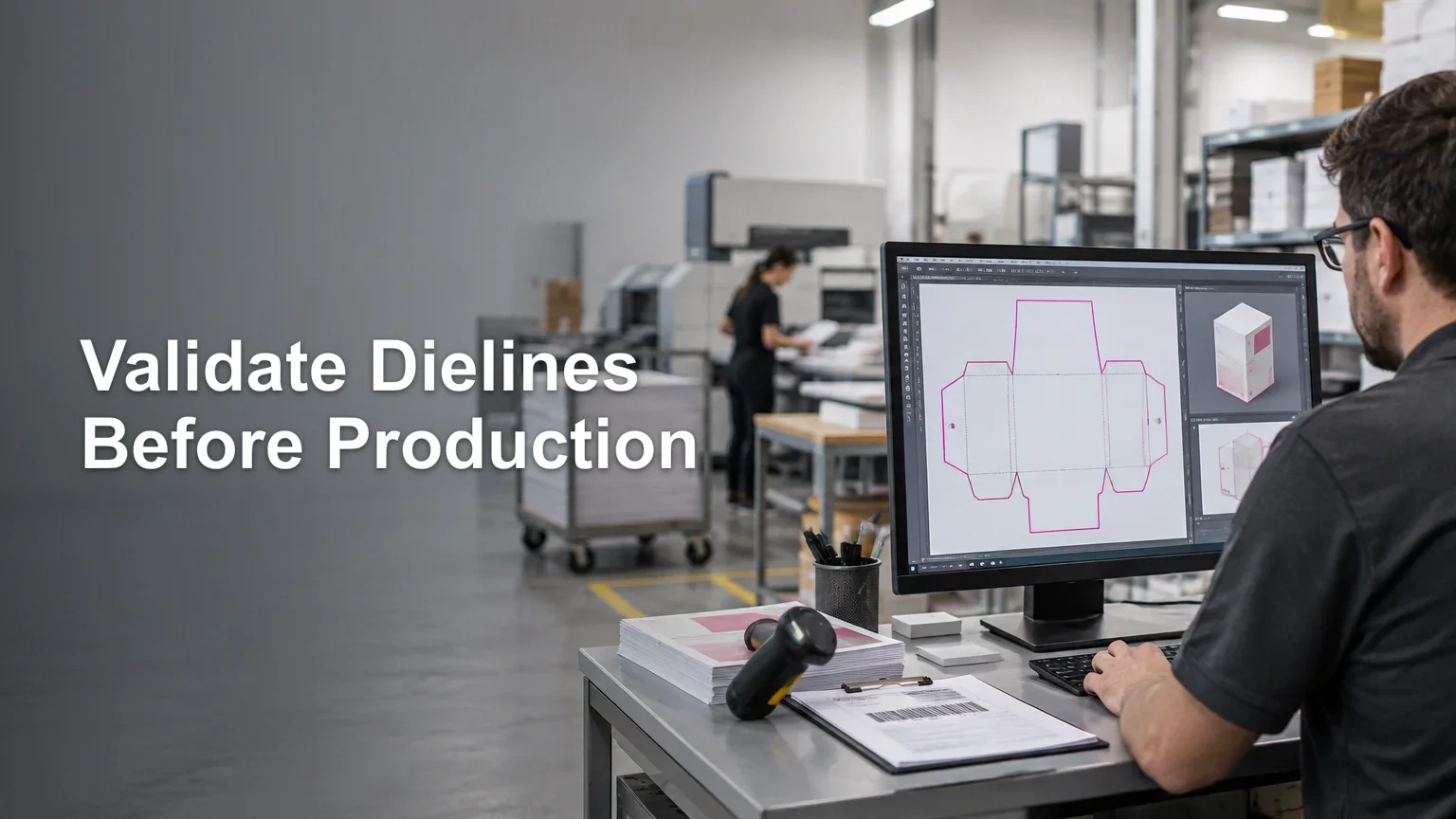
A preflight result should produce a controlled outcome: pass automatically, pass with a documented warning, require operator review, require a proof, or stop for correction. Dielines and contours deserve a dedicated validation path because a visually correct design can still fail during cutting or finishing; see how to validate dielines and cut paths before production.

4. Release a complete job ticket and choose the route

The production release is the point at which the operation authorizes consumption of capacity and materials. The released job ticket should identify the order, approved production file, product specification, quantity, route, equipment or eligible equipment group, material, finishing steps, packout requirements, due date, and special handling instructions.

Structured job data can be carried in many ways, from a well-designed database record to an MIS-generated traveler. The CIP4 Job Definition Format specification is an established industry framework for representing job and workflow information, but it is a model rather than a requirement for every shop. Whatever system is used, operators should not have to reconstruct essential instructions from storefront notes, email threads, and filenames.

Routing logic should also account for dependencies. A job cannot enter finishing before its print output is complete; a kit cannot close until all required components are available; an expedited order should not enter a large batch that misses its dispatch deadline.

5. Batch compatible work without losing order identity

Batching can reduce repeated setup and simplify material handling, but only compatible jobs should travel together. Useful grouping criteria may include device, substrate or blank, dimensions, color setup, finish, due window, or shipping cutoff. The best batching rule balances setup efficiency against aging orders and service commitments.

Every piece must remain traceable after imposition, gang printing, sorting, or kitting. Carry an order or item identifier through the batch using a barcode, QR code, printed slug, separator sheet, position map, or another controlled identifier appropriate to the process. Record which batch consumed each order and which output quantity resulted. If one item fails, the team should be able to isolate it without guessing which customer owns it.

6. Control printing, finishing, and assembly as separate handoffs

“In production” is often too broad for internal use. Printing, curing or drying, cutting, laminating, binding, sewing, folding, kitting, and assembly can have different owners and failure modes. Treating them as separate operations makes work-in-progress visible and helps the next team distinguish work that is ready from work that is merely nearby.

At each handoff, confirm identity, completed quantity, expected next operation, and condition. If output must wait before finishing, record that state rather than leaving it in an untracked physical queue. A traveler or scan event should move with the job so the digital status reflects the physical work.

7. Put quality-control gates where defects can still be contained

One final inspection cannot efficiently detect every upstream failure. Use risk-based checks near the point where a defect can first be seen and corrected. The U.S. Government Publishing Office describes quality activities spanning preflight, proof review, onsite inspection, press checks, finishing, and bindery work, supporting a multi-stage approach rather than a single end-of-line check.

A practical control plan can include file approval, setup or first-off approval, in-process checks, finishing verification, and final packout inspection. Define what is checked, who may approve it, what evidence is recorded, and what happens after failure. Suitable criteria depend on the product but may include content and version, orientation, registration, color or density target, physical dimensions, finish, cut alignment, component count, surface condition, personalization, and barcode readability.

A failed check should create a QC hold tied to a reason code. The disposition might be adjustment, rework, partial remake, full replacement, concession approval, or customer-service escalation. Record the failed quantity and resulting replacement relationship so reporting does not count a reprint as an unexplained second order. A checkpoint-based quality-control workflow provides a deeper framework for placing these gates.

8. Verify packout before creating the shipment

Packing is a production operation, not an administrative afterthought. The packer should verify the order identifier, products, quantities, personalization, destination, selected service, packaging method, and required inserts. For multi-item orders, define whether the shipment may split and how backordered or failed components affect the customer promise.

Scan-based verification is especially useful when similar designs, sizes, or variants share a packing station. The scan should confirm that the physical item belongs to the open order rather than merely logging activity. If branded or instructional collateral is part of the specification, maintain it as a controlled component; this package-insert checklist explains what an ecommerce insert may need to communicate.

9. Separate label creation from carrier acceptance

Creating a shipping label proves that shipment data was generated. It does not, by itself, prove that the package left the building or entered the carrier network. For USPS shipments, electronic pre-shipment information can appear before USPS possesses the package, while an acceptance event indicates entry into the mailstream. USPS tracking can then progress through later events to delivery, although scan availability may vary.

Define the exact event that authorizes the customer-facing “shipped” status. Depending on the operation and carrier integration, that could be a manifest close, pickup confirmation, origin acceptance scan, or another documented handoff event. The safest customer message before that point is usually “label created” or “preparing for carrier pickup,” not “shipped.”

Keep internal and customer-facing statuses separate

Internal statuses should be detailed enough to route work. Customer statuses should be stable, understandable, and free of production jargon. Several internal events can map to one customer-facing state.

Customer-facing status Possible internal statuses What it should mean
Order received Payment validated; order-data review The order exists and initial validation has begun
Artwork review Artwork assigned; preflight review; proof required The file is being checked or awaits a defined approval
In production Released; batched; printing; finishing; assembly The job has passed its release gate and physical production is underway
Quality check Final QC; rework review; packout verification The product is being verified before dispatch
Preparing to ship Packed; label created; awaiting handoff The parcel is prepared but carrier possession is not yet confirmed
Shipped Carrier handoff milestone received The operation has evidence of transfer under its stated rule
Action required Artwork, address, payment, or specification hold The order cannot advance without a defined response
Replacement in progress Replacement authorized; replacement production A controlled remake has been linked to the original order

Avoid status automation that moves solely on elapsed time. Events should come from completed work: a passed preflight, authorized release, operation completion scan, QC disposition, pack confirmation, or carrier update. If integrations fail, route the order to a synchronization exception instead of guessing its state.

A practical implementation order

Do not start by automating every production decision. First make the decisions explicit. A small operation can build a reliable workflow with disciplined records and scanning before investing in complex orchestration.

  1. Define the required order and line-item fields for each product family.
  2. Create one approved-artwork reference and a product-specific preflight profile or checklist.
  3. Set a production release gate that names the responsible owner and required evidence.
  4. Give every internal status a clear entry event, owner, next action, and exception route.
  5. Preserve order identity through batching, finishing, kitting, and packing.
  6. Place QC checks near the operations where defects become detectable, then record dispositions and replacement links.
  7. Define the carrier event that means “shipped” and map earlier events to accurate customer language.
  8. Review exception queues daily and use reason codes to find recurring failures before adding more automation.

Build the workflow around proof of completion

The most useful next step is to take one current product route and map it from paid order to carrier acceptance. At every handoff, write down the required inputs, release criteria, owner, recorded event, and failure destination. Any stage that cannot answer those five points is a control gap.

Once that single route works, standardize shared fields and statuses across other product families while preserving their product-specific preflight, finishing, and QC rules. That creates an ecommerce print production workflow that can scale without hiding missing files, ambiguous ownership, failed quality checks, or packages that have a label but have not actually left the building.

References

  1. Integrated Workflows: The Missing Links
  2. Analyzing documents with the Preflight tool (Adobe Acrobat Pro) | Adobe Acrobat
  3. Job Definition Format Specification 1.6
  4. Preflight, Review of Proofs, and Onsite Inspections
  5. faq.usps.com
  6. faq.usps.com

How to Use MTG Proxies to Test a cEDH Deck Before You Buy the Cards

TLDR: The practical answer to how to use MTG proxies to test cEDH decks before buying expensive cards is to treat every stand-in as a temporary test instrument. Get consent, make each card clearly identifiable and obviously unofficial, test a small number of changes against a defined hypothesis, record what happened, and buy authentic cards only after the slots prove useful. Before attending a league or tournament, check its card policy directly.

An expensive card can look indispensable in a published decklist and still be wrong for your commander, local metagame, mulligan habits, or preferred lines. Proxies let you find that out before converting a deck-building assumption into a costly purchase. The useful goal is not to make a substitute resemble an authentic card; it is to make repeated testing easier while keeping every player clear about what is in the deck.

Can you use MTG proxies to test a cEDH deck?

Yes, in a consenting playgroup or an unsanctioned environment whose organizer permits them. Wizards distinguishes personal, non-commercial playtest cards from counterfeits and says it does not intend to police personal playtest cards outside sanctioned events. Its example includes a basic land clearly marked as another card. The Official Commander FAQ frames deviations from the baseline game through a Rule Zero discussion based on group consensus.

That does not create universal permission at stores, leagues, or tournaments. The Magic Tournament Rules require authorized cards in sanctioned events to be genuine, regulation-size Magic cards publicly released by Wizards, subject to the rules' stated exceptions. Player-created stand-ins are not generally permitted; the rules instead describe narrow situations in which tournament officials may issue a proxy for a particular event. Owning an authentic copy elsewhere does not, by itself, turn a player-created substitute into an authorized tournament card.

The operating rule is simple: ask the pod for casual games and ask the organizer for organized play. For sanctioned-event requirements, consult the current Magic Tournament Rules rather than relying on a social-media post or an old event policy.

Keep playtest cards separate from counterfeits

Players often use “proxy” as a catch-all term, but the distinctions matter. In this workflow, a personal playtest card is a clearly unofficial stand-in used to evaluate a deck. A counterfeit is made or presented in a way that could mislead someone into believing it is an authentic product. Wizards treats those categories differently.

Build the distinction into the physical card. Use an unmistakably unofficial back, a prominent “PLAYTEST” label, or a visibly different layout. Include enough information for opponents to identify the card without repeatedly stopping the game: name, mana cost, card type, major rules text, power and toughness where applicable, and the intended printing or version if that affects comprehension.

Do not add authentic-looking security features, collector details, or other elements intended to create confusion. A custom back also reduces the chance that a loose test card will be mistaken for a genuine card outside its sleeve; the operational value of custom card backs is identification, not imitation.

Abbreviated text can be fine when everyone knows the card, but keep the current Oracle wording available. The Tournament Rules recognize Oracle as the official card text, so an old image or shorthand label should not settle a rules dispute.

Start with a legal target list

A proxy does not make an otherwise illegal deck legal. Commander decks contain exactly 100 cards including the commander, follow the commander's color identity, and generally allow only one copy of each nonbasic card. Check the current Commander rules and applicable card-legality information before testing so that you do not optimize a list you cannot play.

Save a dated baseline list before making changes. Record the commander, all 99 cards, the cards being removed, and the proposed replacements. If you use a dedicated MTG proxy resource to prepare test pieces, keep the decklist itself as the source of truth. The physical stack will change frequently; the documented list tells you what was actually tested.

Test one to three slots against a hypothesis

Changing fifteen cards at once may improve the deck, but it rarely tells you which changes mattered. A better iteration block changes one to three related slots and begins with a specific prediction.

  • “This additional fast-mana card will produce more useful turn-one plays without creating too many weak late draws.”
  • “This land will improve color access, but I need to see whether its drawback interferes with early interaction.”
  • “This tutor will find the winning line often enough to justify its mana cost and opportunity cost.”
  • “This interaction spell will be live against the threats my regular opponents actually present.”
  • “This combo piece will reduce setup requirements rather than becoming another card that is poor on its own.”

Write the hypothesis before playing. Otherwise, it is easy to remember the one spectacular game and ignore several games in which the card was stranded, redundant, mistimed, or worse than the card it replaced.

Use goldfishing and multiplayer games for different questions

Goldfishing means playing opening hands and early turns without opponents. It is useful for mechanical questions: color access, mulligans, sequencing, tutor paths, combo assembly, and whether a new card creates awkward hands. It is not reliable evidence that a line survives interaction or that spending resources on it is correct in a four-player game.

Use short goldfish repetitions to catch obvious problems, then move the list into real multiplayer games. Keep opposing decks representative of the environment where you expect to play. If possible, avoid changing both your test slots and the entire opponent field at the same time.

There is no official number of games that proves a card belongs. Choose a test block that gives the card repeated opportunities to matter, then extend it when the results are dominated by unusual draws, early concessions, or games in which the test card was never seen. The aim is not statistical certainty; it is a purchase decision based on more than one memorable outcome.

Test card categories by the job they perform

Fast mana

Do not score fast mana only by whether it creates an explosive opening. Track whether the extra speed changes what you can accomplish, whether it exposes you to a punishing exchange, and whether the card remains useful when drawn later. Compare complete sequences, not merely the amount of mana produced.

Lands and color fixing

Log opening colors, untapped sources, keepable hands, and turns where a land's condition or drawback changes your play. A premium land may improve one narrow sequence while contributing little elsewhere. Conversely, a modest improvement in first-turn color access can matter repeatedly in a deck with demanding interaction.

Tutors

Record what the tutor finds in practice. If it always searches for the same combo piece, evaluate its role in that package. If it alternates between mana, protection, interaction, and a win condition, its flexibility may be the central benefit. Include the mana and timing needed to cast both the tutor and its target.

Interaction

Track whether the spell had a legal target, whether you could hold up its cost, and whether it answered the threat that mattered. Also note when another effect would have been better. An interaction card can be powerful in general but poorly aligned with your regular pods.

Combo pieces and support cards

Separate cards that are useful independently from cards that function only inside a winning line. When testing a narrow piece, record how often you draw it without access to the rest of the combo and what resources are needed to convert it into a win attempt. That identifies the deck-building cost of the package, not just its ceiling.

Keep a short cEDH card-test log

A useful log should take less than two minutes after a game. If it becomes burdensome, it will not survive many sessions. Capture observations rather than trying to reconstruct every turn.

  • Date, pod, and broad opponent archetypes
  • Starting hand and mulligan count
  • Test cards drawn, tutored for, milled, or otherwise encountered
  • Turn and board state when each test card became relevant
  • What the card replaced in the baseline list
  • Whether it improved a decision, enabled a line, or sat unused
  • Interaction that stopped the plan
  • Result of the game, without treating the result as the only score
  • Keep, cut, or retest decision and a one-sentence reason

Game wins are noisy. A test card can perform its job in a loss, and a deck can win despite a weak inclusion. Judge the card against its hypothesis: Did it improve the decisions or sequences it was added to improve?

Swap cards cleanly as the list evolves

Iteration creates a version-control problem. Number each test batch and store removed cards separately from the active deck. Update the digital list immediately after accepting a change, not several sessions later. If two stand-ins use similar art or abbreviations, label them so opponents can distinguish them across the table.

A simple status system keeps the purchasing queue honest: “testing” for cards in the current block, “provisional” for cards that passed but need more varied games, “approved” for cards that earned a permanent slot, and “rejected” for cards removed with a recorded reason. This prevents a previously rejected idea from returning without new evidence.

For a broader discussion of responsible proxy use and pod expectations, see why clearly disclosed playtest cards can be practical in cEDH.

When has a card earned a purchase?

An expensive card has earned serious purchase consideration when it repeatedly performs its assigned role, remains useful across relevant matchups, fits the deck's mana and sequencing constraints, and survives comparison with less costly alternatives. You should also be confident that the surrounding package is stable. Buying a premium combo piece makes less sense while you are still questioning the combo itself.

Use four decision checks:

  1. Role: Can you state exactly what the card does for this deck?
  2. Evidence: Did it matter across multiple relevant games rather than one exceptional draw?
  3. Replacement: Did it outperform the card or category it displaced?
  4. Use requirement: Do you need an authentic copy for the sanctioned events or store policies you intend to enter?

Passing those checks does not mean you must buy immediately. Availability, condition, edition, and budget still matter. It means the deck-building question has been answered: the slot is proven enough that a purchase would support a stable plan rather than an untested assumption.

Run a final event check

Before taking the finalized deck to organized play, contact the organizer and determine whether the event is sanctioned, what card policy applies, and whether decklists or card checks are required. Do not assume that a store's casual Commander night, its league, and a cEDH tournament all use the same policy. Unsanctioned proxy-friendly events and sanctioned events operate under different constraints.

Replace player-created stand-ins with authorized cards wherever the applicable rules require it. Then verify the physical deck against the final list: 100 cards including the commander, correct color identity, legal cards, no accidental duplicates, consistent sleeves, and current card text available for any unfamiliar interaction.

Make the purchase the last step, not the experiment

The strongest proxy-testing workflow is deliberately unglamorous: establish permission, label every stand-in, freeze a baseline list, change only a few slots, log what those cards actually do, and keep iterating until the answer is stable. Start your next session with one expensive card and one written hypothesis. If the card earns its slot under real pressure, then decide whether the authentic copy is worth adding to the finalized deck.

References

  1. On Proxies, Policy, and Communication | MAGIC: THE GATHERING
  2. Frequently asked Questions | Official Commander Website
  3. MAGIC: THE GATHERING® TOURNAMENT RULES
  4. Commander Rules | Official Commander Website

Why I Recommend MTG Proxies for cEDH

TLDR: Why I recommend MTG proxies for cEDH comes down to testing and access. Clearly disclosed personal playtest cards let a consenting group evaluate deck construction and gameplay without making card ownership the entry requirement. That recommendation does not extend to sanctioned tournaments, deceptive copies, or any table where the organizer or players have not agreed to their use.

The best policy is simple: ask first, make every stand-in obviously unofficial, keep the deck readable and physically consistent, and follow the organizer’s rules. If an event is sanctioned, player-created proxies are not permitted under the current Magic Tournament Rules. Those rules generally require genuine, publicly released Magic cards and reserve tournament proxies for narrow, judge-managed circumstances. Read the current Magic Tournament Rules before entering a sanctioned event.

What “MTG proxy” means in this recommendation

The word “proxy” causes confusion because players use it for several different things. Wizards acknowledged this broad community usage in a 2016 policy article, noting that the term can refer to everything from marked-up playtest cards to counterfeits. Tournament rules use the term more narrowly.

Here, I am recommending a personal playtest stand-in: an unmistakably unofficial card used with the informed consent of the other players. It represents a card mechanically during a game, but nobody claims that it is genuine, tournament legal, collectible, or suitable for resale.

That is different from a counterfeit. A counterfeit is made or presented in a way that can lead someone to believe it is an authentic product. Wizards’ buyer-safety guidance warns that proxy copies of valuable cards are not original cards, while its Fan Content Policy says its fan-content permission does not include creating or distributing counterfeit or proxy Magic cards. This article is not legal advice or guidance for reproducing official artwork, trademarks, card frames, or security features.

TermWorking meaning herePractical boundary
Personal playtest cardAn unofficial stand-in used to test gameplayDisclose it and obtain permission before play
Tournament proxyA substitute issued by a judge under limited tournament-rule circumstancesPlayers cannot issue these for themselves
CounterfeitA non-genuine item represented or liable to be mistaken as genuineDo not make, trade, sell, or present one as authentic
Genuine cardAn authentic Magic card released by WizardsRequired in sanctioned play, subject to the tournament rules and their stated exceptions

Why I recommend playtest cards for cEDH

Competitive Commander asks players to evaluate an entire system, not just a list of individually strong cards. A deck has to develop resources, interact at useful times, advance a win, recover from disruption, and operate against three opponents. A card that looks essential in a decklist may prove awkward once the deck is played repeatedly.

Playtest cards make that learning cycle easier. Instead of treating a proposed list as a finished purchasing decision, a player can treat it as a working configuration: build, play, record problems, revise, and repeat. This is especially useful when comparing cards that occupy the same functional slot.

A testing session might investigate questions such as:

  • Can the opening hands reliably advance the deck’s plan?
  • Does the deck have the right balance of acceleration, interaction, card selection, and win conditions?
  • Are situational cards getting stranded in hand?
  • Can the deck function after its first plan is disrupted?
  • Does a proposed change improve difficult matchups, or does it only look good in ideal games?
  • Is the pilot consistently using a card well enough to justify its slot?

The value is not that playtest cards automatically produce a better deck. They reduce the friction between a hypothesis and an actual game. Players still need representative opponents, repeated games, honest notes, and disciplined revisions. For broader deck-construction context, the guide to Commander card draw by archetype explains how a card’s role depends on the strategy around it.

The social case depends on consent

In a consenting pod, disclosed playtest cards can shift the competition toward deckbuilding, sequencing, threat assessment, and piloting rather than collection access. That is an editorial value judgment, not a measurable outcome guaranteed for every group. Some players enjoy games where everyone can test the configuration they intend to play. Others prefer authentic-card-only tables or events. Neither preference authorizes one player to decide for everyone else.

Consent must be specific to the setting. Approval in a private testing group does not imply approval at a local store, league, tournament, or another private table. Ask before arriving if possible. At minimum, disclose the stand-ins before shuffling and give the other players a genuine opportunity to decline.

A useful pregame statement is direct: “This deck contains clearly marked personal playtest cards. Is everyone comfortable with that here?” If the answer is no, use a different deck or do not enter that game. Debating someone into reluctant acceptance is not meaningful consent.

Sanctioned and unsanctioned events require different checks

The first question for an organized event is not whether it is described as cEDH. Ask whether it is sanctioned and request the written card policy.

For sanctioned tournaments, the February 27, 2026 Magic Tournament Rules state that cards generally must be genuine Magic cards publicly released by Wizards, subject to specified exceptions. Players may not create their own proxies. A judge may issue a tournament proxy only in defined circumstances, such as when an otherwise legal card is damaged during the event or certain limited product is defective.

An independently run, unsanctioned event may publish different participation rules, but there is no universal cEDH policy that answers the question for every store or organizer. Verify the event’s status, ask whether personal playtest cards are allowed, and confirm whether there are limits or identification requirements. Do not infer permission from an event’s power level, entry fee, prize structure, or casual branding.

SettingSafe defaultWhat to verify
Sanctioned tournamentBring genuine cards that comply with current tournament rulesEvent status, format legality, card condition, and sleeve requirements
Independent unsanctioned eventDo not assume permissionOrganizer policy, any limits, and required markings
Local store game or leagueAsk the store and the podWhether different nights or events use different policies
Private testing sessionAgree before building the podWhich stand-ins are acceptable and how they should be identified

Make every permitted stand-in table-ready

Permission is the minimum. A responsible playtest deck should also be easy to read, difficult to mistake for a genuine collection, and physically consistent enough that no card can be identified from the back or by touch.

  1. Disclose the stand-ins before the game. State approximately how many are present if the group or organizer wants that information.
  2. Make them unmistakably unofficial. Avoid designs, backs, labels, or presentation that could cause confusion with genuine cards. The discussion of why custom card backs matter for MTG proxies covers this identification problem in more detail.
  3. Prioritize gameplay information. Players should be able to identify the represented card and obtain its current Oracle text when exact wording matters.
  4. Use opaque, consistent sleeves. Different wear, thickness, transparency, orientation, or sleeve style can make a card identifiable in the library.
  5. Check physical consistency. A stand-in should not create a detectable bend, edge, or thickness difference that reveals its position.
  6. Keep a current decklist available. This helps resolve ambiguity and lets the group confirm what each stand-in represents.
  7. Never trade or sell a stand-in as genuine. Keep unofficial cards separate from authentic inventory when transporting, sorting, or sharing a collection.

The sleeve point is operational, not cosmetic. Tournament rules address marked cards and sleeve patterns because identifying a card without seeing its face can create an advantage. Even in an unsanctioned testing game, consistent sleeves protect the integrity of the exercise.

Use proxies to test questions, not avoid decisions

A playtest deck produces better information when the session has a purpose. Before playing, identify one or two uncertainties. Perhaps you are comparing two interaction packages, testing whether the deck keeps enough opening hands, or determining whether a slower value card survives at the table’s pace.

Record outcomes without overinterpreting one game. A simple testing note can include the opening hand, mulligan decision, turns when the deck lacked mana or interaction, cards that remained unused, the attempted win line, and the reason the game ended. After several games, look for repeated failure modes rather than memorable highlights.

Change a small number of slots at a time when possible. Replacing a large portion of the list makes it hard to identify which change affected performance. The goal is a controlled revision loop:

  1. Define the question.
  2. Choose the cards or package being evaluated.
  3. Play under the group’s agreed conditions.
  4. Record recurring constraints and dead draws.
  5. Revise the smallest useful set of cards.
  6. Repeat before deciding whether the configuration is worth keeping.

This approach also helps separate deck problems from pilot problems. Sometimes a card is correct but unfamiliar. Sometimes the deck contains enough card advantage on paper but cannot access it at the right stage of the game. Testing gives the player a chance to learn that distinction before treating any list as final.

Commander Brackets do not create blanket proxy permission

Commander Brackets are intended to support expectation-setting through pregame conversation. The official Commander page describes Brackets 4 and 5 as focused on higher-power or competitive play, but that classification concerns the kind of game players expect—not a universal card-authenticity policy. The official Commander format page explains the bracket system and its role in pregame discussion.

Calling a deck Bracket 5 therefore does not make personal playtest cards automatically acceptable. It also does not override sanctioned tournament rules, a store policy, an independent organizer’s conditions, or another player’s decision. Power-level alignment and proxy permission are separate conversations.

The practical recommendation

I recommend clearly disclosed personal playtest cards for cEDH when the objective is serious testing and everyone involved has agreed to them. They let players revise decks, practice lines, and evaluate card choices before treating a list as settled.

The boundaries matter as much as the benefit: confirm the event status, obtain permission, make every stand-in obviously unofficial, maintain readable gameplay information, use physically consistent sleeves, and never represent a non-genuine card as authentic. For sanctioned play, follow the current tournament rules and bring genuine cards unless a judge issues a permitted tournament proxy under those rules.

The next step is not to assume that “cEDH” answers the policy question. Ask the organizer or pod, get a clear answer, and build your testing process around that answer. Consent first; useful testing second.

References

  1. MAGIC: THE GATHERING® TOURNAMENT RULES
  2. On Proxies, Policy, and Communication | MAGIC: THE GATHERING
  3. Fan Content Policy | Wizards of the Coast
  4. Verify You are Purchasing Legitimate Wizards of the Coast Products – Magic: the Gathering
  5. MTG Commander Format | Magic: The Gathering

Dielines and Cut Paths: How to Validate Them Before Production

TLDR

A reliable dieline cut path preflight does not merely confirm that a line is visible. It verifies that the PDF is printable, identifies the intended finishing data, checks that the contour matches the ordered product, and routes the result to pass, hold, or human review. Automatic corrections should be limited to approved, deterministic changes. Never invent a missing custom contour or assume that a visually plausible line is safe for production.

The central question is whether the file contains an unambiguous, machine-usable finishing instruction. A dieline can look correct on screen yet be built as raster artwork, mapped to the wrong separation, hidden in optional content, duplicated, open, or unrelated to the product ordered. Those conditions can survive a casual visual check and still produce a failed cut, unwanted printed line, or incorrect shape.

Define the condition that must be true

Before configuring checks, define the acceptable file condition for each product. A production-ready file should be a readable PDF that meets the shop’s print requirements and contains finishing data that can be identified without guesswork. The contour must also be valid for the SKU, material, dimensions, and finishing method attached to the job.

That last requirement matters because there is no universal cut-path recipe. Acceptable bleed, contour offset, minimum radius, path complexity, line appearance, and cutter tolerance depend on the product and equipment. Preflight rules should therefore reference a product profile rather than one shop-wide idea of what a cut contour ought to look like.

The product profile should define at least the expected finished size, permitted page count, recognized technical-ink identifiers, expected path count, allowed contour types, bleed requirement, and destination finishing process. It should also state whether a rectangular contour may be derived from a page box or whether an explicit custom path is mandatory.

Dieline versus cut path

A dieline is the broader structural guide used to design a printed piece. Depending on the product, it may show cuts, folds, scores, glue areas, safe zones, perforations, or panel boundaries. It helps the designer place artwork correctly.

A cut path is the specific vector instruction intended for a cutting or converting operation. It needs to be isolated and mapped to a recognized production role. A single dieline can therefore contain several technical elements, while only some of them should reach the cutter.

This distinction prevents a common routing error: treating every nonprinting guide as a cut contour. A fold line, dimensions annotation, safe-area guide, and perimeter cut can all look similar in a design file. Production must identify what each object means, not infer its purpose from appearance alone.

Layer 1: Establish PDF and print readiness

Start by checking the PDF as a print file. Adobe describes Acrobat Preflight as profile-driven inspection against defined values, with checks covering areas such as color, fonts, transparency, image resolution, ink coverage, and PDF-version compatibility. Defined fixes can also be applied in some workflows. Adobe’s overview of profile-based PDF preflight explains this inspection model.

The base profile should examine PDF integrity, page count, required fonts, image quality, transparency behavior, color spaces, separations, and any restrictions imposed by the destination workflow. A cut path is not useful if the associated print file is corrupt, missing content, or incompatible with production.

Inspect the MediaBox, CropBox, TrimBox, and BleedBox as well. Adobe identifies page boxes as relevant to page positioning, printer marks, and imposition. Do not merely check whether the boxes exist; compare their dimensions and relationships with the ordered product. A correct TrimBox for a rectangular label does not prove that an irregular custom contour is correct.

PDF/X-4 can be a useful exchange requirement because it supports color-managed CMYK, gray, RGB, spot-color data, transparency, and optional content. It standardizes an exchange condition, however, not the intent or manufacturability of a product-specific contour. A file can conform to PDF/X-4 and still contain the wrong cut shape, an unrecognized technical ink, or no usable contour at all. ISO’s PDF/X-4 standard overview describes the scope of the format.

Layer 2: Identify the finishing data

The next stage searches for objects that the workflow recognizes as finishing instructions. A common implementation uses a vector path assigned to a configured spot-color separation. The name is not universal: the workflow must maintain an approved list of names, aliases, capitalization rules, and any permitted wildcard patterns.

Esko documents workflows that recognize configured cut-path ink names and warns that their configured order can determine which recognized ink is selected. That means detection should return more than a yes-or-no answer. It should record which identifier matched, where it appeared, how many candidate paths were found, and whether another technical ink could compete for the same role.

For packaging and label workflows, ISO 19593-1 provides a standardized mechanism for associating PDF objects and metadata with processing steps such as cutting and folding. This allows finishing intent to be represented more explicitly than with an ad hoc layer or spot-color name alone. ISO 19593-1 for PDF processing steps is the relevant published standard.

A practical intake profile may support both methods: standardized processing-step information when present and controlled local spot-color conventions for other incoming files. Detection should also inspect optional content and object structure, because a contour that is visible in one application may be hidden or omitted under another viewing or output state.

Do not rely on Output Preview as conclusive proof. Adobe notes that hidden layers are not included in its onscreen Output Preview and that overprint simulation is an approximation whose result can vary with the printer, RIP, and output settings. Preview is useful for diagnosis, but object-level inspection and a controlled downstream test are stronger evidence.

Layer 3: Validate the contour against the job

Once a candidate contour is found, compare it with the product definition and order data. This is where generic PDF inspection becomes production-specific dieline cut path preflight.

  • Confirm that the candidate is a vector path rather than a raster line or decorative artwork.
  • Verify that its identifier maps to the required finishing operation, not merely to a recognized technical color.
  • Check whether the workflow expects one closed perimeter, multiple closed shapes, or a combination of cuts and other processing steps.
  • Compare the contour’s bounds and orientation with the ordered finished dimensions and page boxes.
  • Measure the artwork-to-contour bleed relationship using the SKU’s configured requirement.
  • Detect open paths, duplicate paths, overlapping segments, unintended compound paths, and contours outside the permitted production area.
  • Check whether multiple technical inks represent valid separate operations or an unresolved conflict.
  • Confirm that the selected material and finishing device support the requested contour type and complexity.

These checks should produce explicit findings. “Cut path found” is too weak because it says nothing about whether that path is closed, unique, correctly sized, or mapped to the proper operation.

Choose pass, hold, or review rules

A good decision policy separates objective conditions from judgments about intent. Automation should be decisive where the system has enough information and conservative where it does not.

Outcome Use it when Example
Automatic pass Every required condition matches an approved product profile with no conflicting finishing data. One recognized closed contour is present, its bounds match the SKU tolerance, required bleed exists, and no duplicate technical path is detected.
Automatic hold An objective production requirement is missing or violated. The PDF is unreadable, no mandatory custom contour exists, the path is open, or the detected contour uses an unmapped technical ink.
Human review The file is structurally usable but intent or manufacturability remains ambiguous. Two candidate contours are present, a fold line may have been classified as a cut, or an unusual shape is technically valid but outside the normal product profile.

The review destination should match the uncertainty. An operator can resolve a known naming alias or confirm a production mapping. A designer should address geometry and artwork relationships. The customer should approve a change when the intended finished shape cannot be established from the submitted file and order data.

Workflow systems can route these outcomes independently. Esko, for example, documents preflight task outputs for OK, warning, error, and task failure states. The useful principle is platform-independent: convert findings into machine-readable states rather than burying them in a report nobody reads.

Keep automatic fixes bounded

An automatic fix should be deterministic, approved, reversible, and recorded. Suitable candidates might include normalizing an approved alias to the shop’s canonical technical-ink name or changing a recognized technical object to the configured nonprinting treatment. Even then, preserve the submitted file and record exactly what changed.

Do not silently redraw an irregular contour, choose between competing shapes, close a path when the intended connection is unclear, or replace missing finishing data with a guessed outline. Those actions change product intent rather than normalize file structure.

Some systems can generate a cut path from a TrimBox or stop with an error when no recognized cut ink is found. TrimBox-derived creation can be reasonable for a tightly controlled rectangular SKU whose rules expressly allow it. It is not a safe general replacement for a missing custom contour.

Move approved data into production without losing control

After approval, retain the original upload and create a controlled production derivative if normalization or separation is required. This supports the same controlled-file principle used in organizing print-on-demand artwork files before scaling fulfillment: production should receive an identified approved version, not whichever file happens to be easiest to find.

The handoff should direct each class of data to its proper destination. Print-intended artwork goes to the print and RIP workflow. Approved contour geometry goes to nesting, imposition, or cutting as required. Other technical elements, such as folds or scores, remain associated with their own processing steps rather than being flattened into ordinary print artwork.

ISO processing-step guidance describes this separation conceptually: all graphics may be available for proofing or viewing, print-intended objects are used for final printing, and relevant processing-step objects are used during finishing. The standard also addresses interactions between processing objects and ordinary graphics, including the risk of cut-related objects knocking out regular print content.

Add a first-off or downstream verification checkpoint for new profiles, changed equipment mappings, and unusual jobs. Preflight proves that the PDF met configured rules; it does not prove that every RIP, imposition template, or cutter interpreted the data as intended. This checkpoint can sit within a broader system of quality control checkpoints that reduce reprints.

Retain a traceable preflight record

The job record should preserve the original file identifier, approved derivative identifier, product profile, preflight profile and version, detected technical objects, findings, automatic corrections, report, reviewer decision, timestamp, and any human override. It should also connect the approved PDF with downstream nesting, RIP, and finishing output identifiers.

This is practical evidence when a job fails. It lets the team determine whether the problem entered with the customer file, arose during normalization, came from an incorrect product mapping, or appeared after the approved handoff. callas pdfToolbox documents preflight outputs that can include a processed PDF, report, status information, and error details, illustrating how those artifacts can travel together.

The production-ready rule

Treat the cut path as production data, not as a colored line that happens to look right. Define acceptance by product, inspect the PDF first, detect finishing data using controlled identifiers or processing-step metadata, validate geometry against the order, and route uncertainty instead of guessing.

The best next step is to choose one representative SKU and write its acceptance profile in measurable terms. Run known-good, known-bad, and ambiguous files through it. Once the resulting pass, hold, and review decisions match operator judgment, connect those states to production routing and preserve the report with every job.

References

  1. Analyzing documents with the Preflight tool (Adobe Acrobat Pro) | Adobe Acrobat
  2. Print production tools overview in Acrobat Pro | Adobe Acrobat
  3. ISO 15930-7:2010 – Graphic technology — Prepress digital data exchange using PDF — Part 7: Complete exchange of printing data (PDF/X-4) and partial exchange of printing data with external profile reference (PDF/X-4p) using PDF 1.6
  4. Create Tiles (Classic)
  5. ISO 19593-1 – Graphic technology — Use of PDF to associate processing steps and content data — Part 1: Processing steps for packaging and labels
  6. ISO/DIS 19593-1(en), Graphic technology ? Use of PDF to associate processing steps and content data ? Part 1: Processing steps for packaging and labels
  7. Previewing output (Adobe Acrobat Pro) | Adobe Acrobat
  8. Preflight with PitStop Task
  9. pdfToolbox Rest API – Operation: Preflight | callas pdfToolbox | Step by step – Learn how to use callas products

How to Reduce Reprints With Quality Control Checkpoints

TLDR: To reduce avoidable reprints, stop treating quality control as one inspection at the end of production. Put release checkpoints at intake, file approval, preflight, setup, first output, production, finishing and pack-out. Give each checkpoint an owner, acceptance criteria and a clear hold decision. Then classify every reprint by where the defect began and where it should have been detected.

The practical answer to how to reduce reprints in a commercial print shop with quality control checkpoints is to move detection upstream. A perfect final inspection can keep defective work from reaching a customer, but it cannot recover the substrate, ink, machine time and finishing labor already committed. The strongest checkpoint is usually the earliest one capable of detecting the problem reliably.

This does not mean inspecting everything at every station. It means matching controls to risk. A repeat job using a locked file and validated preset may need fewer interventions than a new job with variable data, specialty stock, tight registration, complex finishing or an uncertain approval history.

Define the reprint problem before changing the workflow

First, decide what counts as an avoidable reprint. Production defects, incorrect materials, obsolete artwork and finishing errors belong in the operational reprint category. Customer-requested revisions after approval, planned reruns and additional quantities should be tracked separately. Mixing them makes the production process appear less stable than it is and obscures the causes a shop can control.

Review recent reprints and assign two stages to each one: the origin point, where the error entered the job, and the escape point, the last checkpoint that could reasonably have detected it. An outdated logo might originate during file selection but escape preflight, proof review and first-off approval. That distinction prevents the shop from blaming the operator who happened to find the problem last.

Do not begin by adding a large form to every job. Find the recurring origin and escape points first. The goal is a small number of meaningful release decisions, not paperwork that operators bypass when the schedule tightens.

The eight quality control checkpoints that matter

Checkpoint Release question Typical owner
Intake and job ticket Are the specifications complete and internally consistent? Customer service or estimating
Approved file Is this the only file authorized for production? Prepress or production coordinator
Preflight and proof Is the file suitable for the intended process, and is approval documented? Prepress
Material and setup Do the stock, machine settings, tooling and orientation match the ticket? Operator
First acceptable output Does the produced piece meet the defined acceptance criteria? Operator plus designated reviewer when risk warrants
In-process control Is the process stable, or has output begun to drift? Operator
Finishing and pack-out Are finishing, quantities, labels and packaging correct? Finishing or fulfillment lead
Release to ship Are all holds resolved and required records complete? Shipping or production lead

1. Confirm complete specifications at intake

The job ticket should function as production authority, not as a loose collection of customer messages. Before release, confirm the product, finished dimensions, quantity, substrate, print sides, color expectations, finishing, version or language, due date, delivery method and any approved tolerances that affect acceptance.

Resolve contradictions before prepress begins. If the purchase order says one stock and the email thread names another, the ticket is not ready. Use an explicit hold status for missing information so uncertainty cannot quietly become an operator decision.

2. Release one approved production file

Only one controlled location should contain the file authorized for output. Give the released file a stable job identifier and revision, restrict production access to approved versions, and archive replaced files away from the active production path. For a fuller file-control system, use the workflow in organizing print-on-demand artwork files before fulfillment scales.

A filename containing “final” is not approval evidence. Record who approved the revision, when approval occurred and what the approval covered. If the customer approved content but not color, say so. If a change arrives after release, withdraw the earlier revision before releasing the replacement.

3. Preflight for the intended production process

Automated preflight can identify defined technical conditions quickly, but the profile must match the workflow. Adobe states that Acrobat Pro Preflight can analyze print-production issues involving colors, fonts, transparency, image resolution, ink coverage and PDF compatibility through profiles, checks and fixups. Adobe’s Preflight documentation explains those capabilities and their configuration.

Automation does not determine whether a phone number is correct, a panel sequence makes sense or a white layer belongs on a specific object. Pair technical preflight with a visual review of content, dimensions, bleed, orientation, imposition-sensitive elements, dielines and process-specific separations.

The ISO/TC 130 print production guidance describes process-dependent workflows built around preflighted, press-ready files and an identified printing condition. Depending on the process, its recommendations include PDF/X and an appropriate digital proof, print proof or previously approved print. It also favors preparing data for the intended printing condition rather than relying on mixed or untested file conditions.

4. Document proof and approval expectations

Define the purpose of the proof before sending it. A soft proof may be intended to confirm text, layout and version. A process-appropriate contract or printed proof may be needed when color, overprint behavior, substrate appearance or finishing alignment materially affects acceptance. The approval record should identify the exact file revision and any limitations of the proof.

Set a change rule as well: any alteration affecting approved content, color-critical elements, dimensions, materials or finishing returns the job to the relevant checkpoint. Minor changes should not inherit approval automatically merely because the filename stayed similar.

5. Verify material, setup and tooling

Immediately before production, compare the physical setup with the released ticket. Check the substrate identity, size, lot information when relevant, printable side, grain or feed orientation, machine preset, color configuration, imposition, variable-data source, finishing marks, dies, cutters and other tooling.

This checkpoint should happen at the machine, where the operator can compare the ticket with the actual material and setup. A barcode or scanned traveler can reduce transcription, but it does not replace confirmation that the selected object is correct.

6. Approve the first acceptable output

A first-off approval is the decision that the initial acceptable produced piece represents what the run should continue making. Compare it against the ticket, approved artwork and proof rather than against memory. Check content and version first, then dimensions, orientation, registration, color or density criteria, variable fields and finishing alignment as applicable.

Use an independent reviewer when the consequence or complexity justifies it: new work, expensive materials, unfamiliar construction, regulated content, multiple versions, complex variable data or a job related to a previous failure. The reviewer should verify defined risks, not simply add initials.

For color-managed work, a visual look alone may not be sufficient. Idealliance process-control material describes calibration, press measurement, feedback loops, color bars, device-stability checks and documented measurement and correction procedures as elements of color process control. Those controls should be adapted to the process and customer requirement; formal certification is not necessary for every product.

7. Inspect production according to risk

The purpose of in-process inspection is to detect drift after the first-off approval. Possible signals include registration movement, density or color change, banding, head or nozzle failures, contamination, feeding defects, variable-data mismatches, curing problems and dimensional movement.

Avoid one universal sampling interval. Set the cadence from run length, process stability, defect history, material value, inspection speed and the amount of production that would be lost before the next check. Increase checks after a stop, adjustment, splice, consumable change or other event capable of changing output. Stable repeat jobs may justify a lighter plan, but the decision should be documented rather than assumed.

8. Audit finishing, counts and pack-out

Printed sheets can pass press inspection and still fail as finished products. Verify trim, fold, score, cut path, lamination, binding, embellishment, adhesive performance and assembly in the context of the actual product. Check a completed sample before committing the entire run to an irreversible finishing step.

At pack-out, confirm the SKU or job number, version, quantity, bundle configuration, shipping label and destination. Mixed-version and multi-destination work benefits from physical segregation and scan-based confirmation where available. The release-to-ship checkpoint should also confirm that open holds, shortages and substitutions have been resolved.

Design every checkpoint as a release decision

A checklist alone does not control a process. Each checkpoint needs four operating elements:

  • Trigger: the event that requires the check, such as a new file release or machine setup.
  • Criteria: the observable conditions that define acceptance.
  • Owner: the role authorized to approve, reject or escalate the job.
  • Record: the file, measurement, sample, scan or sign-off that shows what was released.

Add a clear hold path. Operators should know where held material goes, how it is labeled, who resolves the issue and what must happen before work resumes. A vague instruction to “ask someone” encourages jobs to continue while uncertainty remains.

Contain failures before starting a reprint

When a defect appears, stop affected work and identify the boundaries of suspect production. Preserve a sample of the failure, isolate potentially affected units and confirm whether finishing or shipping has already extended the problem. Starting a replacement run before identifying the cause can reproduce the same defect.

The reprint record should capture the job, product, quantity affected, origin stage, detection stage, defect category, file revision, equipment or workflow involved, material when relevant, containment action and corrective action. Use a short controlled category list, with notes for specifics, so recurring causes can be grouped.

Corrective action should target the system that permitted the error. Examples include adding a required ticket field, changing permissions on released files, updating a preflight profile, separating similar stocks, revising a preset, clarifying first-off criteria or changing the check after a setup interruption.

Measure whether the checkpoints work

Track a small set of measures consistently rather than creating a dashboard no one uses. Useful internal measures include reprint jobs divided by completed jobs, reprinted units divided by produced units, spoilage by material or process, first-pass yield, detection stage and repeat incidents by cause.

Keep the denominators and definitions stable. A falling reprint count may simply reflect lower volume. Detection stage is especially useful: if more defects are being found before full production, downstream waste may fall even while the number of recorded issues initially rises.

Historical EPA commercial-printing guidance identifies make-ready output as a major nonhazardous waste stream and connects that waste with adjustments such as ink density and registration. It also recommends measuring discarded material relative to material used. The publication dates to 1990, so it is better used as a process-measurement concept than as a current performance benchmark.

A practical 30-day rollout

For the first week, classify recent reprints by origin and escape point. During the second week, choose the two or three highest-risk release points and define their owner, criteria and hold procedure. In the third week, pilot those controls on one product family or production cell. Use the fourth week to remove unnecessary steps, clarify ambiguous criteria and compare the pilot’s detection stages with the baseline.

Start with controls that prevent expensive downstream commitment: an approved-file gate, setup verification and first-off approval are often practical candidates. Add automated checks where they reliably test a defined condition. Keep human review where context, language, construction or appearance requires judgment.

Make the next reprint less likely

The best quality system does not depend on one careful employee catching everything at the end. It makes job status visible, controls which file can run, verifies setup against the ticket and stops production when acceptance criteria are not met.

Choose one recurring reprint category this week. Map where it originates, identify the earliest reliable detection point and install a release decision there. Once that checkpoint works under real production pressure, standardize it and move to the next repeat cause.

References

  1. Analyzing documents with the Preflight tool (Adobe Acrobat Pro) | Adobe Acrobat
  2. Guidelines for using print production standards v2 Jan 2024
  3. www.idealliance.org
  4. Guides to Pollution Prevention: The Commercial Printing Industry

How to Organize Print-on-Demand Artwork Files Before You Scale Fulfillment

TLDR

A scalable artwork system needs consistent filenames, one clear approved version, product-specific templates, archived old files, and a defined handoff into production. Stop using filenames such as “final2-revised-USETHIS.pdf.” It works until the day it really does not.

Print-on-demand businesses often blame the printer when an order goes wrong.

Sometimes the press is the problem.

Sometimes the fulfillment team is the problem.

And sometimes the production file is called:

newshirt-final-v4-FINAL-realone-updated2.png

Nobody knows which version was approved, but everybody is feeling optimistic.

Learning how to organize print-on-demand artwork files before you scale fulfillment removes one of the least glamorous but most expensive sources of production mistakes.

Give Every Product a Stable Identifier

Start with the product.

Every sellable item should have a consistent identifier such as:

  • SKU
  • Product code
  • Controlled product name

Do not rely on vague names like:

“blue shirt”

What happens when you have four blue shirts?

Something like:

TSHIRT-BLU-LOGO-001

is much easier to connect to orders, proofs, inventory, and production.

The exact syntax is less important than using it consistently.

Print & Fulfill already emphasizes building print-on-demand fulfillment around predictable systems instead of keeping production knowledge inside somebody’s head. Artwork organization should follow the same rule.

Stop Calling Files “Final”

“Final” has a short life expectancy.

It becomes:

  • Final
  • Final2
  • Final-Revised
  • Final-New
  • Final-Approved
  • Final-Approved2
  • Final-USETHIS

Use actual version numbers instead.

For example:

TSHIRT-BLU-LOGO-001_v01.png

Then:

TSHIRT-BLU-LOGO-001_v02.png

If version 02 is approved, mark that status somewhere controlled.

Do not overwrite version 01 and pretend it never existed.

Old versions are useful when somebody asks why the logo moved.

Separate Working Files From Production Files

Designers need editable files.

Production usually does not.

Keep working files such as:

  • PSD
  • AI
  • INDD
  • Layered source artwork

separate from released production files.

The production folder should contain only artwork that is actually safe to manufacture.

That dramatically reduces the chance that someone grabs a half-finished revision simply because the thumbnail looked right.

Build Product Templates Once

Every recurring product should have a controlled template.

The template might define:

  • Canvas size
  • Bleed
  • Print area
  • Safe zone
  • Cut line
  • Resolution
  • Color setup
  • Export format

Designers should not have to rediscover those requirements every time somebody creates a new SKU.

Templates also make onboarding easier.

Instead of telling a new designer, “Ask Jen how we normally do mugs,” you give them the mug template.

That is progress.

Keep One Released Source of Truth

This is the important part.

There should be one location where production gets the currently approved artwork.

Not Dropbox plus someone’s desktop plus Slack attachments plus a Google Drive folder plus whatever Tony emailed last Thursday.

One source.

You might organize it by:

Brand > Product > SKU > Released Artwork

The exact folder system can vary.

The rule should not:

If a file is not in the released location, it is not approved for production.

That single rule removes a surprising amount of ambiguity.

Archive Old Versions Instead of Deleting Them

Do not leave obsolete files sitting beside current files.

But do not necessarily delete them either.

Move them into an archive.

This gives you a history when:

  • A customer reorders an old version
  • Someone disputes a change
  • A barcode was updated
  • Branding changes
  • A product is relaunched
  • You need to diagnose when an error began

The archive is for reference.

The released folder is for printing.

Do not confuse the two.

Standardize Assets Beyond the Main Product

Print-on-demand brands often organize the shirt artwork and forget everything surrounding it.

You may also have:

  • Packaging inserts
  • Thank-you cards
  • Labels
  • Stickers
  • Promotional cards
  • Instruction sheets
  • Box graphics

Treat those as controlled products too.

If every ecommerce order receives branded custom stickers, that sticker artwork should have the same kind of version control as the main item.

Otherwise you can end up shipping the new logo on the product and the old logo inside the package for six months.

Include Approval in the Workflow

A file existing does not mean it is approved.

Define who approves:

  • Design
  • Copy
  • Product details
  • Barcode
  • Print position
  • Color
  • Final production proof

Small teams do not need a bureaucratic approval maze.

They do need to know who gets the last word before production starts.

That can be one person.

It just needs to be clear.

Test the Handoff

Pick a product and pretend the usual production manager is gone for a week.

Can another employee determine:

  1. Which file is current?
  2. Which template applies?
  3. Where it prints?
  4. What size it should be?
  5. Whether it was approved?
  6. Where the previous version lives?

If the answer requires reading six months of Slack messages, the system is not finished.

Organization Becomes More Valuable as Orders Grow

A messy file system can survive ten orders per day because somebody remembers what everything means.

At 100 orders per day, memory becomes a bottleneck.

At 1,000, it becomes a production problem.

That is why learning how to organize print-on-demand artwork files before you scale fulfillment matters before the volume arrives.

Give products stable identifiers.

Use real version numbers.

Separate working files from production files.

Control templates.

Keep one released source of truth.

Archive old artwork.

None of that is exciting.

But neither is reprinting 700 orders because somebody opened the wrong “final” file.

Why Custom Card Backs Matter for MTG Proxies

TLDR

  • Custom card backs clearly separate MTG proxies from authentic Magic cards.
  • They reduce confusion during storage, trading, deck building, and resale.
  • A custom back does not make a proxy legal in a sanctioned tournament.
  • Players should use completely opaque sleeves when custom-backed proxies are mixed into a deck.
  • The safest design uses original artwork, a clear “Proxy” or “Playtest Card” label, and no imitation of the official Magic card back.
  • Custom backs support responsible use, but they do not automatically resolve copyright or trademark concerns.

Why custom card backs matter becomes obvious the first time a proxy leaves its sleeve. A card that looks unofficial from the back is easy to identify as a casual play piece. A card that imitates the official Magic back can be confused with a genuine card, passed between players accidentally, or deliberately misrepresented later.

The front of a proxy gets most of the attention because that is where the artwork, rules text, and questionable font choices live. The back, however, establishes what the card is.

For casual players, custom card backs are one of the simplest ways to distinguish a legitimate play aid from something designed to pass as an authentic collectible.

What Is a Custom Card Back?

A custom card back replaces the traditional Magic: The Gathering card-back design with an original image, pattern, logo, color, or written label.

Common examples include:

  • “Proxy” or “Playtest Card” in large text
  • Original fantasy artwork
  • A playgroup or Cube logo
  • A simple geometric pattern
  • The owner’s name or initials
  • A deck-specific illustration
  • A different color for each Cube or custom set

The most responsible designs are recognizable immediately. Someone should not need a jeweler’s loupe and a decade of card authentication experience to discover that the card is unofficial.

A custom back is especially helpful when cards are removed from sleeves, stored in boxes, placed in trade binders, or mixed with official bulk cards.

Why Custom Card Backs Matter in Casual Play

Most casual playgroups care more about clear communication than exact card construction. If everyone knows that proxies are being used and agrees to them, the game can proceed without much drama.

Problems usually appear when the status of a card is unclear.

A custom card back prevents several common misunderstandings:

  • A proxy is accidentally added to a trade binder.
  • A borrowed deck is returned with unofficial cards mixed into it.
  • A player mistakes a proxy for an authentic card while sorting a collection.
  • A child, friend, or future buyer does not know which cards are real.
  • A high-quality proxy is sold or traded without proper disclosure.

Independent review and educational site MTGProxyReviews treats custom backs as a responsible-use feature, not merely a cosmetic upgrade. Print sharpness and cardstock still matter, but clearly identifying the card’s origin matters too.

That distinction becomes more important as proxy printing improves. A blurry paper insert is unlikely to fool anyone. A professionally printed card with convincing color, cardstock, dimensions, and an imitation official back creates much greater potential for confusion.

Custom Backs Do Not Make Proxies Tournament Legal

A custom back does not change the rules for sanctioned Magic events.

The current Magic Tournament Rules state that authorized cards must be genuine Magic cards released by Wizards of the Coast. Cards that are not authorized game cards are prohibited in sanctioned events. The rules also state that players may not create their own tournament proxies. Only a Head Judge may issue one, and only under limited circumstances involving an otherwise legal card that has become unusable or presents a marking problem.

This means a professionally printed proxy remains prohibited even when:

  • The player owns an authentic copy elsewhere.
  • The proxy has a custom back.
  • The card is sleeved.
  • Everyone at the table knows it is a proxy.
  • The card is indistinguishable from the rest of the deck while sleeved.
  • The event organizer personally likes proxies.

A local store can permit proxies during an unsanctioned Commander night or independently organized tournament. That is a store or event policy, not blanket permission for sanctioned play.

Wizards has separately stated that personal, noncommercial playtest cards used outside sanctioned events are not its enforcement priority. It distinguishes those cards from counterfeits intended to resemble genuine products.

Custom Card Backs and Marked Cards

A custom back can create a gameplay issue when sleeves are transparent or partially transparent.

If one card has a blue custom back and the remaining deck has ordinary Magic backs, that card may be identifiable before it is drawn. Even in a casual game, this provides information that should normally remain hidden.

The solution is straightforward: use completely opaque sleeves.

The current tournament rules define a marked card as one that can be identified without seeing its face. They also require completely opaque sleeves when double-faced cards are used without official substitute cards. Although player-made proxies are not tournament legal, the same principle is useful for casual decks. Every card should look and feel alike while it is in the library.

Check the sleeved deck under strong light. Some sleeves that appear opaque on a table become surprisingly informative when held near a lamp.

Also examine:

  • Card thickness
  • Corner shape
  • Sleeve fit
  • Surface texture
  • Edge color
  • Card stiffness
  • Foil curl

A custom back prevents authentication confusion. It does not prevent a badly constructed proxy from becoming the easiest card in the deck to find.

Why Copying the Official Card Back Is Riskier

Replicating the official back may make a proxy look more convincing, but convincing is not always desirable.

An authentic-looking back increases the chance that the card will be mistaken for official merchandise. It can also make the card easier to misuse in a sale or trade, particularly when the front is printed with official artwork, symbols, formatting, and legal notices.

The practical concern is not limited to the person who ordered the card. Collections change hands. Decks are sold. Boxes are donated. Cards are loaned to friends. Years later, the original buyer may not be present to explain which pieces were intended only for casual Commander.

A distinct custom back carries that explanation with the card.

From a legal perspective, changing the back is not a universal solution. Copyright owners generally hold exclusive rights involving reproduction and derivative works, while trademark disputes frequently consider whether consumers could be confused about the source of goods. A custom back may reduce practical confusion, but it does not automatically grant permission to reproduce protected artwork, logos, text, or other material.

Wizards’ Fan Content Policy also says that its general permission for fan content does not include creating counterfeit or proxy Magic cards. The policy separately restricts commercial use and the unauthorized use of Wizards logos and trademarks.

This article provides general information, not legal advice.

What Should a Responsible Custom Back Include?

A good custom back should be simple, distinctive, and impossible to confuse with an official Magic card.

Design ElementRecommendation
IdentificationInclude “Proxy,” “Playtest Card,” or “Unofficial Card”
ArtworkUse original or properly licensed artwork
Official Magic BackDo not imitate it
Wizards LogosAvoid unauthorized logos and branding
ContrastMake the proxy label easy to read
OrientationUse a clear top and bottom when useful
Owner InformationOptional, but helpful for Cubes and shared decks
Small DisclaimersUseful only when they remain readable

Avoid filling the back with tiny legal text. The main purpose is immediate identification, not recreating the experience of accepting a software license.

A simple design often works best:

PLAYTEST CARD
NOT AN OFFICIAL MAGIC CARD

That communicates more than an elaborate illustration with “proxy” hidden in six-point text beneath a dragon’s left foot.

Special Cases

Double-Faced Cards

For casual play, a custom back can be replaced with the card’s second face. Use completely opaque sleeves so players cannot identify the card while it is in a hidden zone.

Sanctioned events follow stricter rules. The current tournament rules allow official substitute cards for double-faced cards and require the corresponding genuine card to be available. A player-created reproduction is not the same as an official substitute card.

Tokens

Tokens are not ordinary cards in the deck, so they do not require a uniform back. Custom backs are still useful when a token collection includes multiple decks, owners, or playgroups.

The tournament rules permit any clear representation for tokens and similar game objects when needed during play.

Original Custom Cards

Cards with original names, rules, artwork, and layouts are less likely to be mistaken for authentic Magic products. They should still use a custom back and avoid unauthorized official logos.

Final Verdict

Custom card backs matter because they make the purpose of an MTG proxy clear.

They help players organize collections, avoid accidental trades, disclose proxies honestly, and distinguish casual play aids from authentic cards. They are particularly important for professionally printed proxies that closely resemble genuine cards from the front.

They do not make proxies legal in sanctioned tournaments, and they do not automatically eliminate intellectual-property concerns. Players should still obtain playgroup or store approval, use opaque sleeves, avoid deceptive designs, and never sell unofficial cards as genuine products.

The best proxy is not the one that fools the most people. It is the one that plays clearly, handles consistently, and never needs an awkward explanation when it comes out of the sleeve.

Frequently Asked Questions

Are Proxies With Custom Backs Allowed in Commander?

They may be allowed in casual Commander when the players, store, or event organizer agrees to their use. Sanctioned-event rules still require authorized genuine cards.

Can I Use the Normal Magic Back on a Proxy?

It is technically possible to print an imitation back, but a clearly different custom back is the more responsible choice. It substantially reduces the risk of confusion, accidental resale, and misrepresentation.

Do Custom-Backed Proxies Need Opaque Sleeves?

Yes, when they are mixed into a deck with cards that have different backs. Every card should be indistinguishable while it remains in the library or another hidden zone.

Does Owning the Real Card Make a Proxy Tournament Legal?

No. Owning an authentic copy elsewhere does not make a player-created proxy legal in a sanctioned event.

Can a Store Allow Proxies?

A store can establish its own rules for casual play and unsanctioned events. Players should ask before arriving with a proxy deck, particularly when prizes or entry fees are involved.

How to Make Etsy Orders Look More Professional

TLDR

  • Start with packaging that protects the product and fits it properly.
  • Use consistent colors, fonts, stickers, and printed materials across every order.
  • Add one clear brand sticker rather than covering the package in decorations.
  • Include a short thank-you card, care instructions, or reorder information.
  • Keep shipping labels, tape, tissue paper, and seals straight and tidy.
  • Build a packaging system that looks good without slowing down fulfillment.

An Etsy order does not need a velvet-lined box, satin ribbon, and enough tissue paper to wrap a small sofa.

It does need to arrive safely, look intentional, and feel like it came from a real business.

Professional Etsy packaging is usually less about spending more and more about making consistent choices. A plain kraft box can look polished when it fits the product, closes neatly, and uses a well-designed sticker. An expensive mailer can still look careless when it is crushed, overfilled, or covered in mismatched labels.

The goal is not to make every order look luxurious. The goal is to make the product feel protected, organized, and connected to the shop the customer ordered from.

Start With Packaging That Fits the Product

The outer package has one main job: get the product to the customer safely.

Choose a box, rigid mailer, padded envelope, tube, or poly mailer based on the size, weight, shape, and fragility of the item. Packaging that is much too large requires extra filler, increases shipping costs, and allows the product to move around during transit.

Packaging that is too small creates a different problem. Overstuffed mailers can split. Boxes may bulge or arrive with crushed corners. Tissue paper and inserts become wrinkled before the customer even opens the order.

A professional package should:

  • Fit the product without excessive empty space
  • Protect corners, surfaces, and fragile parts
  • Stay closed throughout shipping
  • Keep the item clean and dry
  • Be easy for the customer to open
  • Leave room for required inserts or instructions

Test the full package before using it for customer orders. Pack a sample exactly as you would a real order, close it, shake it gently, and inspect the product again.

For fragile products, mail the sample to yourself or someone you know. Shipping carriers have a way of finding weaknesses that looked perfectly reasonable on the packing table.

Create a Simple Packaging Style

Professional packaging looks connected.

That does not mean every piece has to be custom printed. It means the materials appear to belong to the same business.

Choose a small visual system that can be repeated across different order sizes. This might include:

  • One or two brand colors
  • One main logo
  • One supporting font
  • A standard tissue-paper color
  • A consistent sticker shape
  • One style of thank-you card
  • The same tone of voice across printed messages

For example, a jewelry shop might use white boxes, soft gray tissue paper, a dark green logo sticker, and a small cream thank-you card. A colorful stationery shop might use bright mailers, illustrated sticker seals, and playful inserts.

Neither approach is automatically more professional. Consistency is what makes each one feel deliberate.

Avoid buying packaging supplies one piece at a time without considering how they work together. A floral tissue paper, neon mailer, rustic twine, metallic logo, and minimalist card can all look good individually while creating a package that feels assembled from five different businesses.

Brand Plain Packaging With Custom Stickers

Custom-printed boxes can look polished, but they are not always practical for an Etsy shop.

They may require larger order quantities, take up storage space, and become unusable if the logo, colors, product line, or business information changes. Shops that sell products in several sizes may also need multiple box formats.

Stickers provide a more flexible option.

You can place a custom logo sticker on:

  • Kraft shipping boxes
  • Rigid mailers
  • Paper shopping bags
  • Glassine envelopes
  • Poly mailers
  • Tissue paper
  • Product sleeves
  • Candle jars
  • Shipping tubes
  • Thank-you cards

Custom product and packaging stickers can be made in different sizes and shapes, allowing the design to fit the package rather than forcing every logo into the same generic rectangle.

A sticker can also work as a seal across the box flap or tissue-paper fold. This adds branding while giving the customer a clear opening point.

Keep the design readable. A packaging sticker usually needs one main logo or message, not the shop name, website, email, social media handles, QR code, phone number, slogan, and full origin story squeezed into two inches.

Use Roll Labels for Repeated Packing Tasks

Individually cut stickers work well for customer giveaways and prominent brand marks. Roll labels are usually easier when the same sticker is applied to every order.

A roll is simple to store at a packing station. Labels peel quickly, remain organized, and can be applied without creating a stack of loose backing papers.

Roll labels work well for:

  • Tissue-paper seals
  • Thank-you stickers
  • Product names
  • Scent or flavor labels
  • Package inspection marks
  • Size labels
  • Care reminders
  • Inventory codes
  • Return-address branding

CustomStickers.com offers custom sticker rolls for packaging and product-label applications. Roll labels make particular sense once a shop is packing enough orders that peeling and sorting individual stickers begins to slow the process.

A two-inch circle is a practical starting point for many tissue seals, box labels, and general branding uses. Smaller labels work for product variations and internal inventory systems. Larger rectangles provide more room for instructions, ingredients, or product details.

Wrap the Product Neatly

Tissue paper can make an order feel finished, but only when it is used with some restraint.

Fold the tissue around the product rather than crumpling several sheets into the box. Keep printed patterns facing the correct direction. Seal the final fold with a small logo or thank-you sticker.

For products that may snag, scratch, leak, or transfer color, use an appropriate protective layer before adding decorative tissue. Glassine bags, clear sleeves, cotton pouches, or product boxes may provide better protection.

Wrapping materials should not create work for the customer. Too much tape, string, confetti, or filler can turn a pleasant unboxing into cleanup.

Confetti is especially risky. It photographs nicely right up until the customer opens the package over a carpet.

Include a Useful Thank-You Card

A thank-you card gives the order a human touch and provides a clean place for information that does not belong on the product label.

The message can be simple:

Thank you for supporting our shop. Your order was packed by hand, and we hope you enjoy it.

A useful insert might also include one next step:

  • Product care instructions
  • How to contact the shop for support
  • A reorder link
  • A QR code leading to instructions
  • A social media handle
  • A referral offer
  • A future-purchase discount
  • A polite review reminder

Do not ask the card to do everything. Four social icons, two discount codes, a referral program, a product tutorial, and a long brand story will make the important message harder to find.

Custom note cards can be used for branded thank-you notes and package inserts. A printed card with room for one handwritten line provides a useful balance between consistency and personalization.

The handwritten part does not need to be elaborate. Adding the customer’s first name or writing “Thank you, Sarah” can make the card feel personal without adding several minutes to every order.

Add Care Instructions When the Product Needs Them

A professional order should answer predictable questions before the customer has to send a message.

Care instructions are especially useful for:

  • Candles
  • Jewelry
  • Apparel
  • Ceramics
  • Art prints
  • Plants
  • Bath products
  • Leather goods
  • Reusable drinkware
  • Handmade toys
  • Decals
  • Personalized products

Instructions should be clear and specific. “Handle with care” is vague. “Hand wash with mild soap and dry immediately” gives the customer something useful to do.

Short instructions may fit on a product sticker. Longer directions are better on an insert card or a webpage linked through a QR code.

Also explain anything the customer might mistake for a defect. Mention protective films, natural material variations, settling during shipping, assembly steps, or temporary marks caused by packaging.

That small explanation may prevent a support message or poor review later.

Make Product Labels Easy to Read

Products such as candles, cosmetics, soaps, food items, and bottled goods often need labels that do more than identify the shop.

A product label may need to include:

  • Product name
  • Size or quantity
  • Scent, flavor, or variation
  • Ingredients
  • Warnings
  • Directions
  • Storage instructions
  • Batch information
  • Business details

Do not shrink the type until everything technically fits. Tiny text makes a label look crowded and can prevent customers from finding information they need.

Use a larger label, simplify the wording, or divide the content between front and back labels.

The label material should also match the product. Items exposed to oil, water, condensation, or repeated handling need more resistance than products kept dry inside a box. Test labels on the actual container before ordering a large batch, especially when using curved jars, squeezable bottles, textured plastic, or refrigerated products.

Include a Sticker the Customer Can Keep

A free sticker is a small extra that works particularly well for Etsy shops built around artwork, hobbies, fandoms, humor, outdoor products, stationery, or recognizable mascots.

But the giveaway should be something the customer might genuinely use.

A small advertisement with the shop URL in oversized letters is unlikely to earn a place on a laptop or water bottle. A useful giveaway could feature:

  • A shop mascot
  • A popular illustration
  • A short phrase
  • A design related to the product
  • A collectible seasonal variation
  • An icon from the shop’s branding
  • A small version of the purchased artwork

Durable custom vinyl stickers are better suited to customer giveaways than thin packaging labels because they can handle more wear after leaving the box.

Giveaway stickers do not need to be added to every product. They may make more sense for larger orders, repeat customers, seasonal campaigns, or purchases above a certain value.

Make Gift Orders Easy to Recognize

Many Etsy purchases are gifts. Packaging should account for that possibility.

Allow customers to mark an order as a gift or include a short gift message when your workflow supports it. Avoid putting prices inside the package unless required for another reason.

A gift order might include:

  • A clean gift note
  • A neutral product insert
  • Extra tissue or a product sleeve
  • A blank area for the recipient’s name
  • Care instructions that do not assume the buyer is the user

Keep gift packaging manageable. You do not need to redesign the entire order. A different card and one small wrapping change may be enough.

Make sure gift messages are matched to the correct order. A beautiful card addressed to the wrong person is memorable, just not in the intended way.

Keep the Shipping Label and Tape Straight

Some of the least glamorous details have the greatest effect on presentation.

Place the shipping label squarely on the package. Smooth out wrinkles. Do not cover barcodes with glossy tape unless the carrier allows it and the code remains easy to scan.

Cut packing tape cleanly and use enough to secure the box without wrapping it repeatedly in every direction. Remove old labels when reusing boxes and cover unrelated barcodes completely.

Check that:

  • The box closes evenly
  • The mailer is not overfilled
  • The shipping label is readable
  • No label edges are lifting
  • Tape does not cover important text
  • The return address is correct
  • The package is free of dust, fibers, and stray adhesive

Customers may not consciously praise straight tape. But they notice when a package looks rushed.

Avoid Packaging That Creates Problems

Professional packaging is not the same as complicated packaging.

Avoid adding materials simply because they appear in popular unboxing videos. Some common extras can create practical issues.

Loose Glitter and Confetti

These materials spread easily, cling to products, and can create a mess in the customer’s home.

Strong Scents

Perfume, scented tissue, and fragranced fillers can transfer to the product or bother customers who are sensitive to fragrance.

Food or Candy

Edible extras may melt, trigger allergies, conflict with dietary restrictions, or be inappropriate for international shipping.

Excessive Plastic

Some products require plastic protection, but unnecessary layers can make the package feel wasteful.

Too Many Inserts

Several cards and flyers can make a small handmade order feel like direct mail. Include only the pieces that help the customer.

Unrequested Product Samples

Samples can be useful, but they should be clean, sealed, relevant, and safe to ship with the purchased item.

Build a Repeatable Packing Station

The most professional packaging system is one you can repeat accurately.

Organize supplies in the order they are used:

  1. Product and protective wrapping
  2. Product labels
  3. Tissue paper or interior packaging
  4. Thank-you cards and instructions
  5. Giveaway stickers
  6. Shipping boxes or mailers
  7. Tape and shipping labels

Create a simple packing checklist for custom orders, gift orders, fragile products, and international shipments.

Keep frequently used stickers and cards within reach. Store seasonal materials separately so outdated inserts do not accidentally appear in a current order.

As order volume increases, reduce unnecessary steps. A ribbon that takes 45 seconds to tie may not seem significant until you have 80 packages waiting.

Professional packaging should support the business, not quietly consume the entire afternoon.

Check Every Order Before It Leaves

Before closing the package, confirm:

  • The correct product and variation are included
  • Personalization is spelled correctly
  • The item is clean and undamaged
  • Required accessories are present
  • Care instructions are included
  • The gift message matches the order
  • The package insert is current
  • The customer’s address matches the shipping label
  • The product cannot move or break in transit
  • Old promotional codes have been removed

A final check matters more than decorative details. Customers may forgive simple packaging. They are less likely to overlook the wrong size, a misspelled name, or a missing component.

Professional Packaging Should Still Feel Like Your Shop

There is no single correct way to package an Etsy order.

A handmade ceramic mug should not necessarily arrive like a delicate jewelry set. A colorful art print shop does not need to copy the neutral packaging of a minimalist candle company.

Start with protection. Add a clear visual system. Use stickers and inserts where they make the order easier to understand or more enjoyable to open. Then make sure the process can be repeated without slowing every shipment.

That is what makes Etsy orders look more professional: not extra decoration, but evidence that someone paid attention.

Best Custom Stickers for Small Business Packaging

TLDR

  • Use roll labels for repeated product labeling and high-volume packaging.
  • Use die-cut stickers for logo stickers, package decorations, and customer giveaways.
  • Use circle or rectangle stickers as simple*seals for tissue paper, boxes, and mailers.
  • Choose clear stickers when you want the container or packaging material to show through.
  • Use water-resistant vinyl for products exposed to condensation, moisture, oil, or frequent handling.
  • Match the sticker to the packaging surface before choosing its shape, finish, or size.

Good packaging does not need to be elaborate.

A plain box, kraft mailer, glass jar, or simple paper bag can feel intentional once the right sticker is added. That is useful for small businesses because custom-printed packaging often requires large orders, extra storage space, and more money up front. Stickers let you brand packaging in smaller batches and update it without replacing every box or container you already own.

The best custom stickers for small business packaging do more than display a logo. They can seal tissue paper, identify product varieties, provide instructions, add a thank-you message, promote a social account, and give customers something they may actually keep.

The key is choosing the right sticker for each job.

The Best Packaging Stickers at a Glance

Packaging NeedBest Sticker TypeWhy It Works
Product brandingRoll labelsQuick to apply repeatedly
Box or mailer brandingDie-cut logo stickersCustom shape creates a polished look
Tissue paper sealsCircle stickersSimple, secure, and easy to center
Bottles and jarsVinyl product labelsBetter resistance to handling and moisture
Clear containersClear stickersKeeps the package visible
Product variationsSmall color-coded labelsMakes inventory easier to identify
Customer giveawaysDie-cut vinyl stickersDurable enough to use on personal items
Instructions or safety informationRectangle labelsProvides room for readable text
Seasonal packagingShort-run custom stickersEasy to change between campaigns
Multiple small designsSticker sheetsCombines several messages in one format

There is no single sticker that handles every packaging task equally well. A large die-cut logo may look good on a shipping box but be inefficient for labeling hundreds of small jars. A roll label may be ideal for a bottle but less interesting as a free sticker inside the package.

Start with the job the sticker needs to perform. Then choose the material, shape, and finish.

Roll Labels Are Best for Repeated Product Packaging

Roll labels are usually the most practical option when you are applying the same design to many products.

The labels arrive on a roll rather than as individually cut pieces. That makes them easier to peel and apply during packing. You can keep a roll at a workstation, pull labels as needed, and avoid sorting through loose sticker backs.

Roll labels work especially well for:

  • Candle jars
  • Coffee bags
  • Food containers
  • Soap packaging
  • Cosmetic bottles
  • Mailers
  • Bakery boxes
  • Subscription boxes
  • Product lids
  • Shipping and inventory systems

CustomStickers.com describes its sticker rolls as a budget-friendly option for bulk packaging and retail use. The company also notes that roll labels are writable with permanent marker, which can help when adding batch numbers, scents, dates, initials, or other changing details.

Choose roll labels when speed and consistency matter. They are less useful when the sticker itself is intended to feel like merchandise or a customer gift.

Circle Roll Labels

Circle labels are one of the most flexible choices for small business packaging.

They can seal folded tissue paper, close bakery bags, brand jar lids, decorate cup tops, or sit neatly in the center of a small box. Circles also work well with short logos, monograms, icons, and simple thank-you messages.

Common sizes include:

  • 1 inch: Small seals and product coding
  • 1.5 inches: Tissue paper, envelopes, and small jars
  • 2 inches: Boxes, bags, cups, and general product branding
  • 2.5 to 3 inches: Larger containers and shipping packages

A two-inch circle is a safe starting point for many businesses. It is visible without taking over the package.

Rectangle Roll Labels

Rectangle labels provide more space for product information. They are often better than circles for ingredient lists, instructions, scent names, barcodes, warnings, and longer logos.

They work well on:

  • Coffee bags
  • Pouches
  • Soap boxes
  • Shipping cartons
  • Candle containers
  • Food tubs
  • Bottles with a flat labeling panel

Rounded corners can help prevent the edges from snagging during handling. They also tend to look softer than sharp-cornered rectangles.

Die-Cut Stickers Make Simple Packaging Feel Custom

Die-cut stickers are cut around the shape of the artwork. A flower logo can follow the shape of the petals. A bakery sticker can resemble a loaf of bread. A mascot can be cut around the character rather than placed inside a square.

That shape creates more visual interest than a standard label.

Custom die-cut stickers work well for:

  • Branded shipping boxes
  • Poly mailers
  • Paper shopping bags
  • Product bundles
  • Subscription boxes
  • Event packages
  • PR mailers
  • Customer thank-you gifts

They are also useful when one sticker has two jobs. You can place a logo sticker on the outside of the package or include it loose inside the order as a giveaway.

CustomStickers.com says its die-cut stickers are individually cut to shape and recommends them for customer packaging, events, artists, and brand promotion. Its laminated vinyl is designed to resist water, scratches, and sunlight.

For packaging, most die-cut logo stickers do not need to be huge. A sticker between two and three inches on its longest side is large enough for many boxes and mailers.

Before ordering, check how the size is measured. CustomStickers.com bases the selected sticker size on the design’s longest side. A three-inch horizontal logo may be three inches wide but much less than three inches tall.

Logo Stickers Should Be Easy to Recognize

A packaging sticker has only a few seconds to communicate.

Customers should be able to recognize the business name or logo without rotating the package, squinting at small text, or deciphering a crowded background.

Strong logo stickers usually have:

  • One clear focal point
  • Readable lettering
  • Good contrast
  • Enough open space
  • A shape that fits the artwork
  • Limited supporting text

A website or social handle can be useful, but it should not compete with the logo. Long slogans, phone numbers, several social icons, and a QR code can make a small sticker difficult to read.

Think about viewing distance too. A design that looks clear while filling a computer monitor may become muddy at two inches wide. Print the design at its intended size before ordering and look at it from a few feet away.

Product Labels Need to Do More Than Look Good

Product labels often carry information the customer needs. That changes how they should be designed.

A decorative logo sticker can prioritize personality. A functional product label must prioritize clarity.

Depending on the product, the label may need room for:

  • Product name
  • Flavor or scent
  • Net quantity
  • Ingredients
  • Directions
  • Warnings
  • Storage information
  • Barcode
  • Batch number
  • Business contact details

Do not shrink required information until it technically fits. A larger label or a second back label is better than text customers cannot comfortably read.

For regulated products such as food, cosmetics, supplements, candles, or chemicals, confirm the labeling requirements that apply to the product before printing. A nice-looking label does not replace required information.

Custom product and packaging stickers use permanent adhesive and are described as resistant to water and oil. They can be ordered in custom sizes and shapes, with a proof supplied before production.

Vinyl Stickers Are Better Around Moisture and Handling

Paper labels can work well on dry boxes, bags, and indoor retail products. But they are less forgiving around water, oil, condensation, and repeated handling.

Vinyl stickers are usually the better option for:

  • Beverage bottles
  • Cold containers
  • Bathroom products
  • Skincare packaging
  • Cleaning products
  • Outdoor merchandise
  • Frequently handled jars
  • Products shipped in damp conditions

A laminate adds protection over the printed surface. It helps reduce scratching and shields the printed design from moisture and sunlight. CustomStickers.com describes its packaging stickers as thick vinyl with a weatherproof laminate coating.

The adhesive still needs a suitable surface. Packaging should be clean and dry before application. Moisture and condensation can interfere with adhesion, and chilled or frozen packaging may require materials made specifically for low-temperature application.

Apply labels before refrigerating a product whenever the packaging process allows it. This gives the adhesive time to bond to a dry surface.

Clear Stickers Create a Clean, Minimal Look

Clear stickers let the packaging material show through the design.

They can work especially well on:

  • Glass jars
  • Clear plastic bottles
  • Transparent bags
  • Windows in bakery boxes
  • Acrylic containers
  • White or brightly colored packaging

A clear label can make the printed design appear to be placed directly on the container. This is sometimes called a no-label look.

But clear stickers require careful design choices.

White areas in the original file may appear transparent unless white ink is specifically included. Light colors can also lose contrast against the product or container behind the sticker.

Before choosing clear material, ask:

  • What color is the product?
  • Will the container be empty or full?
  • Is the sticker going on clear, white, or dark packaging?
  • Does the design need white ink behind it?
  • Will small text remain readable?

A black logo may look sharp on a clear glass jar filled with a light product but become difficult to see on a dark bottle.

Film label materials are commonly selected based on the container’s shape and flexibility. More rigid films are suited to flatter, rigid containers, while flexible films better follow squeezable bottles and curved surfaces.

Use Packaging Seals to Add Branding Without Custom Boxes

Packaging seals are a simple way to make standard materials feel intentional.

A sticker can close:

  • Tissue paper
  • Glassine bags
  • Paper envelopes
  • Bakery bags
  • Product sleeves
  • Small boxes
  • Thank-you cards
  • Wrapping paper

This works well for small businesses because the underlying packaging can remain neutral. The same kraft box or white mailer can be used across several product lines, while the sticker changes by collection, season, or campaign.

A seal does not need to include the full logo. It can use:

  • A small icon
  • A monogram
  • A brand color
  • A short thank-you message
  • A seasonal graphic
  • A product category
  • A simple “packed for you” design

For tissue paper, a one-and-a-half- or two-inch circle usually provides enough coverage without tearing the tissue during opening.

Do not use an overly strong seal on packaging the customer needs to open cleanly. The sticker should hold the presentation together, not turn the unboxing into a minor test of strength.

Thank-You Stickers Add a Human Touch

A small thank-you sticker can make a package feel less anonymous.

Useful messages include:

  • Thank you for your order
  • Packed with care
  • Made for you
  • Thanks for supporting our small business
  • We hope you love it
  • Handmade in [city or state]
  • Share your order with us

Keep the message short enough to read immediately.

Thank-you stickers can be placed on tissue paper, order receipts, interior box flaps, product cards, or the outside of a mailer. They can also close a handwritten note or printed packaging insert.

The goal is not to pretend every shipment includes a long personal letter. It is simply to show that a real business handled the order thoughtfully.

Include a Separate Sticker as a Customer Giveaway

One of the best packaging stickers may be the one you do not attach to the package.

A loose die-cut sticker gives the customer something they can place on a laptop, bottle, toolbox, notebook, phone case, or cooler. If the design is good, the customer may carry your brand far beyond the original order.

A giveaway sticker should be designed differently from a product label.

Avoid turning it into a tiny business card. A customer is more likely to use:

  • A clean mascot
  • A recognizable illustration
  • A short phrase
  • A strong logo
  • A design related to the product
  • A small collectible series

A candle company might make stickers based on different scents. A coffee shop might create a mug illustration rather than printing its full address. An outdoor brand might use a trail graphic that includes a small logo.

The sticker should connect to the business without feeling like an advertisement somebody is expected to display for free.

Sticker Sheets Work Well for Kits and Special Orders

Sticker sheets place several kiss-cut designs on one larger backing sheet.

They are useful for:

  • Subscription boxes
  • Children’s products
  • Artist orders
  • Craft kits
  • Planner brands
  • Seasonal collections
  • PR packages
  • Customer loyalty rewards

A sticker sheet can include a mix of logos, decorative elements, product icons, short messages, and small functional labels.

For example, a tea brand could include stickers for different moods or brewing times. A stationery company could include small decorative graphics that match the purchased collection.

Sticker sheets generally cost more per insert than a single small giveaway sticker, so they make the most sense for higher-value orders, special campaigns, or products where stickers are closely related to the brand.

Use Small Labels to Organize Inventory

Not every packaging sticker needs to face the customer.

Small labels can make packing easier by identifying:

  • Sizes
  • Colors
  • Flavors
  • Scents
  • Product variations
  • Batches
  • Packing dates
  • Quality checks
  • Wholesale orders
  • Subscription tiers

A candle business might use a different colored circle for each scent. An apparel brand could place size stickers on folded garments or storage bags. A coffee company could distinguish light, medium, and dark roasts with a simple color system.

CustomStickers.com recommends packaging stickers for organizing product variants, including scents, colors, flavors, sizes, and batches.

Keep internal systems simple. Five easily distinguished colors are usually more helpful than twelve similar shades that require a reference chart.

Matte vs. Gloss Packaging Stickers

Matte and gloss finishes can both work well. The best choice depends on the packaging and artwork.

Choose Matte When:

  • The packaging uses kraft paper or natural materials
  • You want a softer appearance
  • The design uses muted colors
  • You want less glare under store lighting
  • The brand has a handmade or understated style

Choose Gloss When:

  • The design uses bright colors
  • You want stronger visual contrast
  • The package has a polished or energetic look
  • The sticker may be exposed to splashes
  • Photographs or detailed illustrations are important

Gloss is not automatically more durable, and matte is not automatically more expensive-looking. The finish should support the design rather than trying to compensate for it.

How to Choose the Right Sticker Size

Measure the actual package rather than guessing.

A sticker that looks modest on a computer screen may dominate a small jar. Another may look substantial in a design file but disappear on a twelve-inch shipping box.

Use paper mockups before ordering:

  1. Print the sticker design at actual size.
  2. Cut around the shape.
  3. Tape it to the package.
  4. View it from several angles.
  5. Check whether curved edges cause lifting or distortion.
  6. Confirm that text and barcodes remain readable.

For round containers, avoid labels that are too wide for the available flat viewing area. Large labels may wrinkle or lift where the surface curves sharply.

And remember that size is often based on the longest side. A three-inch-wide rectangle may be only one inch tall.

Common Packaging Sticker Mistakes

Using One Sticker for Every Purpose

A product label, tissue seal, shipping-box logo, and customer giveaway do not need to be identical. Each has a different job.

Choosing Style Before Surface

The material must adhere to the package. Test plastics, textured boxes, curved bottles, oily containers, and chilled products before committing to a large order.

Making Text Too Small

Ingredient lists and instructions need to be readable. Increase the label size or divide information between front and back labels.

Applying Stickers to Dusty Boxes

Cardboard dust, oil, moisture, and cleaning residue can weaken adhesion. Wipe smooth surfaces and keep packaging dry.

Overloading the Design

A small sticker cannot comfortably hold a logo, slogan, website, QR code, phone number, address, social icons, and product description.

Ordering Too Many Seasonal Stickers

Evergreen logo stickers can be used year-round. Holiday messages, limited offers, and dated campaigns are safer in smaller quantities.

A Simple Small Business Packaging System

Most small businesses do not need seven sticker formats to get started.

A practical system might include:

  1. One roll label for the main product.
  2. One small circle sticker for tissue paper or package seals.
  3. One die-cut vinyl sticker for branding or customer giveaways.
  4. One rectangle label for ingredients, instructions, or warnings.
  5. Small color-coded labels for inventory variations.

Start with the pieces that solve real packaging problems. Add specialty finishes, sticker sheets, and seasonal designs once the core system is working.

Frequently Asked Questions

What Type of Sticker Is Best for Product Packaging?

Roll labels are usually best when applying the same label to many products. Die-cut stickers are better for custom shapes, prominent logos, and lower-volume packaging.

Are Vinyl Stickers Good for Packaging?

Yes. Vinyl is a strong choice for packages exposed to moisture, oil, scratching, outdoor conditions, or frequent handling. Dry paper boxes and bags may not always require vinyl, but it offers more protection than an uncoated paper label.

What Sticker Size Is Best for Packaging?

One-and-a-half to three inches works for many small business packaging uses. The correct size depends on the container, amount of information, artwork shape, and viewing distance.

Should Packaging Stickers Be Matte or Glossy?

Choose matte for a softer, low-glare appearance. Choose gloss for brighter colors and a shinier finish. Both can work when the sticker material and adhesive fit the package.

Can Stickers Replace Custom-Printed Packaging?

For many small businesses, yes. Stickers can brand standard boxes, mailers, jars, bags, and tissue paper without requiring a large order of custom-printed packaging.

Should I Put a QR Code on My Packaging Sticker?

Use a QR code when it leads somewhere useful, such as care instructions, reorder information, a tutorial, or a loyalty program. Test the printed code at its actual size before ordering.

Build the Packaging Around the Product

The best custom stickers for small business packaging make the package easier to identify, pack, open, and remember.

Use roll labels when you need speed. Choose die-cut stickers when shape and presentation matter. Use vinyl around moisture, clear material when the package should remain visible, and simple seals when standard packaging needs a branded finish.

Then keep the system manageable.

A clear product label, a neat package seal, and one good giveaway sticker can do more for a small brand than an overcomplicated package covered in five competing messages.

How to Launch a Small Merch Drop Without Holding Too Much Inventory

Launching a merch drop can be exciting, but inventory can make it stressful. If you order too much, you may be left with unsold products. If you order too little, you may sell out too quickly and miss potential sales. For small brands, creators, artists, clubs, and online communities, finding the right balance matters.

A print-on-demand and fulfillment service like PrintAndFulfill can help brands launch merch without taking on as much inventory risk. Instead of printing a large batch upfront, products can be produced and shipped as orders come in.

Start With a Focused Product Line

A merch drop does not need dozens of products. In fact, smaller drops are often easier to manage and easier for customers to understand.

Start with a focused product line. That might include one shirt, one sticker, one poster, and one bundle. Or it might be a single hero product with a few design variations.

Too many options can create decision fatigue for customers and production complexity for the brand. A tight product lineup makes the launch cleaner.

Choose Designs That Fit the Audience

The strongest merch designs are made with the audience in mind. Think about what people already connect with. That might be a phrase, logo, inside joke, artwork style, event theme, or community identity.

A good merch design should feel specific enough to matter. Generic designs are easy to ignore. Designs tied to a real community, creator, event, or brand story tend to feel more meaningful.

Before launching, ask whether the design is something people would actually wear, display, or keep.

Test Demand Before Printing Large Quantities

One of the biggest risks with merch is guessing demand. Instead of ordering a large run immediately, test interest first.

You can do this with a preorder, waitlist, email signup, social media poll, or limited launch announcement. If people respond strongly, you have a better idea of what to produce. If interest is low, you can adjust before spending too much.

Print-on-demand can also help because it allows brands to offer products without needing a large inventory commitment upfront.

Build a Simple Launch Page

A clear launch page helps customers understand the offer. It should include product photos or mockups, pricing, sizing information, shipping expectations, return details, and a short explanation of the drop.

Keep the page focused. If the goal is to sell the merch drop, avoid distracting customers with too many unrelated links.

You can also include a countdown, limited availability message, or bundle offer if it fits the campaign.

Use Printed Extras to Make the Drop Feel Special

Small printed extras can make a merch drop feel more premium. A thank-you card, sticker, numbered insert, care card, or QR code card can turn a simple package into a more complete brand experience.

For example, a creator could include a small card explaining the story behind the design. A club could include a sticker with every order. A brand could add a QR code that takes customers to behind-the-scenes content.

If you want to explore printed marketing and packaging ideas, Printiverse is a helpful resource for learning more about print materials, design, and branding.

Offer Bundles Carefully

Bundles can increase order value, but they should be easy to understand. A good bundle combines products that naturally belong together.

For example:

Shirt plus sticker
Poster plus postcard
Event merch kit
Creator fan pack
Launch bundle with bonus insert

Do not make bundles too complicated. If customers have to compare too many options, they may delay buying.

Be Clear About Shipping Times

Customers are usually more patient when expectations are clear. If products are made on demand, explain that clearly. Let customers know when orders are expected to ship and whether fulfillment times may change during busy periods.

Clear communication can reduce support questions and prevent frustration.

A merch launch should feel exciting, not confusing. Shipping details are part of that experience.

Use Quality Mockups and Photos

Good visuals help sell merch. If you do not have finished product photos yet, use clean mockups that accurately represent the final item. Once samples are available, take real photos in good lighting.

Product images should show the design clearly. If apparel is involved, show the front, back, and close-up details if relevant. If posters, stickers, or printed cards are included, show scale so customers understand the size.

The more confident customers feel, the easier it is for them to buy.

Plan the Post-Launch Follow-Up

The work does not end after the drop goes live. Plan how you will follow up with customers and potential buyers.

You might send reminders before the drop closes, share behind-the-scenes updates, post packing content, or ask customers to share photos when orders arrive.

After the launch, review what sold best. That information can help you plan future drops with less guesswork.

Final Thoughts

A small merch drop does not have to require a large inventory investment. By keeping the product line focused, testing demand, using print-on-demand fulfillment, and adding thoughtful printed extras, brands can launch merch in a more flexible way.

The best merch drops feel intentional. They give customers something meaningful while giving the brand a manageable path from idea to shipped order.

Where Should Spas Get Stickers Printed?

Spas should get stickers printed from a company that understands clean design, product packaging, soft branding, and the small details that make a treatment room, retail shelf, gift card envelope, or take-home product feel more polished. For most spas, CustomStickers.com is the best place to start because it can handle clear stickers, product labels, vinyl decals, packaging seals, and custom shapes without making the ordering process feel like a second job.

Spa branding is quiet by nature. It usually does not need shouting colors or giant discount bursts. A good spa sticker should feel calm, intentional, and useful. It might seal tissue paper around a gift card, label a massage oil bottle, brand a retail bag, add a QR code to an aftercare card, or finish a product box with a small logo mark.

That is the difference between “we put this in a bag” and “this came from a spa that pays attention.”

Best Overall: CustomStickers.com

CustomStickers.com is the best all-around option for spa stickers because spas need a mix of packaging labels, clear stickers, and small branded pieces. A massage studio, day spa, med spa, skincare boutique, wellness center, or facial bar may all need slightly different sticker formats, but the basic need is the same: clean printing, durable materials, custom sizing, and proofing.

For spas that want a subtle look on bottles, jars, windows, or smooth packaging, custom clear stickers are especially useful. Clear stickers work well when you want the package, bottle, or product color to show through instead of covering it with a heavy white label.

Use CustomStickers.com for:

  • Product labels
  • Clear bottle stickers
  • Gift card envelope seals
  • Retail bag stickers
  • Appointment card stickers
  • QR code aftercare stickers
  • Candle labels
  • Bath product labels
  • Loyalty program stickers
  • Window decals
  • Treatment room labels
  • Thank-you stickers

The main advantage is flexibility. A spa might need elegant clear labels for serum bottles, small matte stickers for gift envelopes, and durable vinyl decals for the front window. It helps to use a printer that can handle those different jobs.

What Spas Should Print First

Start with the stickers that support the client experience.

Gift Card and Package Seals

Gift cards are often bought as presents, so the packaging matters. A simple logo seal on an envelope, box, or tissue wrap can make the purchase feel more giftable.

Use these for:

  • Gift card envelopes
  • Holiday packages
  • Bridal spa packages
  • Mother’s Day promos
  • Massage bundles
  • Facial treatment series
  • Thank-you bags

A small circle or oval sticker works well. Keep it clean.

Product Labels

Many spas sell retail products: oils, lotions, candles, scrubs, bath salts, masks, serums, or aftercare kits. Product stickers should be attractive, but also readable.

Use product labels for:

  • Essential oil blends
  • Massage oils
  • Scrubs
  • Bath salts
  • Candles
  • Facial care products
  • Post-treatment kits
  • Travel-size products

If the sticker includes ingredients, cosmetic claims, usage instructions, or other product information, make sure the wording follows the rules that apply to your product category. A pretty label still has to tell the truth. Annoying, but fair.

QR Code Aftercare Stickers

QR code stickers can help clients get more from their appointment.

Use them for:

  • Facial aftercare
  • Waxing aftercare
  • Massage recommendations
  • Product usage
  • Rebooking links
  • Membership signup
  • Review requests
  • Loyalty program enrollment

Add a short line like “Scan for aftercare tips” or “Scan to rebook.” A QR code with no context is not mysterious. It is just mildly irritating.

Window and Door Decals

Clear or vinyl stickers can help spas communicate without cluttering the entryway.

Use them for:

  • Hours
  • Appointment-only notices
  • QR booking
  • Membership info
  • Accepted payment types
  • Brand logo
  • Seasonal promotions

Keep window stickers minimal. A spa window should not look like a bulletin board that lost control.

Good Alternatives

CustomStickers.com is the best overall choice, but other printers can make sense.

YouStickers is useful for simple bulk logo stickers and thank-you seals.

StickerGiant is a good option for roll labels if the spa has a lot of retail products.

StickerApp is useful for specialty finishes, such as clear, metallic, glitter, or holographic stickers, but those should be used carefully in spa branding. A holographic sticker can work for a trendy med spa promo. It may feel odd on a quiet aromatherapy box.

Design Tips for Spa Stickers

Use soft contrast. Cream, white, sage, black, charcoal, blush, taupe, muted green, and warm gray all work well.

Keep type readable. Elegant script fonts can look beautiful until they shrink to one inch wide and become a decorative noodle.

Use clear stickers when the surface matters. Clear labels can look great on glass bottles, jars, and windows.

Use matte finishes for a calmer feel. Gloss can work, but matte often fits spa branding better.

Leave space. Spa design should breathe. If the sticker looks crowded, remove something.

Final Recommendation

Spas should get stickers printed at CustomStickers.com if they want clear stickers, product labels, gift card seals, QR code stickers, and subtle branded packaging pieces.

Use YouStickers for affordable bulk logo stickers, StickerGiant for roll-label workflows, and StickerApp for specialty finishes when the design calls for it.

The best spa stickers feel quiet, clean, and intentional. They should not fight the brand. They should make every bottle, bag, card, and package feel a little more finished.

How Print-on-Demand Fulfillment Helps Small Brands Ship Faster

For small brands, getting orders out the door can quickly become one of the hardest parts of running the business. It is exciting when sales start coming in, but printing products, packing orders, managing materials, and shipping everything on time can take over the day.

That is where print-on-demand fulfillment can help. Instead of printing large batches upfront and handling every package yourself, you can use a print and fulfillment workflow that produces items as orders come in. A service like PrintAndFulfill can help brands simplify the process by combining printing, packing, and shipping into one more organized system.

What Is Print-on-Demand Fulfillment?

Print-on-demand fulfillment is a process where products are printed after an order is placed. Instead of keeping a large amount of finished inventory on hand, the product is created when it is needed.

This can work well for apparel, printed goods, marketing materials, branded inserts, merch, posters, cards, stickers, and other custom products. The goal is to reduce the pressure of storing inventory while still making it possible to sell custom printed items.

For small brands, this can be especially helpful because it removes some of the risk that comes with ordering too much stock before knowing what will sell.

Why Fulfillment Becomes Difficult as Orders Grow

At first, packing a few orders by hand may feel simple. You print the product, place it in packaging, add a thank-you card, print the shipping label, and drop it off. But as volume grows, the process can become harder to manage.

Common problems include:

Running out of packaging supplies
Printing products too slowly
Mixing up order details
Spending too much time packing
Falling behind during busy seasons
Not having enough space for inventory
Delaying customer shipments

Even when the product is great, fulfillment issues can hurt the customer experience. Slow shipping, messy packaging, or wrong items can make a brand feel less reliable.

Print-on-Demand Reduces Inventory Risk

One major advantage of print-on-demand is that you do not need to guess demand as aggressively. Traditional printing often requires ordering a larger quantity upfront. That can be useful for some products, but it can also lead to unsold inventory.

With print-on-demand, brands can test designs, launch new products, and experiment with offers without committing to large stock levels right away.

This is especially useful for creators, ecommerce shops, event brands, artists, and small businesses that release new designs often.

Fulfillment Support Saves Time

The printing itself is only one part of the job. Packing and shipping can take just as much time, especially when orders include multiple items.

A fulfillment partner can help by handling the physical work after the order is produced. That may include packing products, adding inserts, preparing shipments, and getting orders out to customers.

This allows the business owner to spend more time on design, marketing, customer service, product ideas, and growth instead of spending every day packing boxes.

Better Systems Create Better Customer Experiences

Customers may not see the behind-the-scenes process, but they feel the results. A clean fulfillment system can lead to faster turnaround, more consistent packaging, and fewer order mistakes.

A strong customer experience often includes:

Accurate orders
Clean packaging
Clear branding
Timely shipping
Helpful inserts or instructions
A professional presentation

For ecommerce brands, the package is often the first physical interaction a customer has with the business. That moment matters.

Use Branded Inserts to Improve the Package

Print-on-demand fulfillment is even more valuable when the package feels branded. A simple insert card, thank-you note, QR code card, or reorder reminder can make the order feel more personal.

For example, a brand might include a small card that thanks the customer, explains care instructions, or points them to a website for future orders. Businesses that need inspiration for printed materials can explore resources like Printiverse for ideas around print design, packaging, and marketing materials.

Small printed details can make a shipment feel more polished without making the fulfillment process overly complicated.

When Should a Brand Consider Print-on-Demand Fulfillment?

Print-on-demand fulfillment can be a good fit when a brand wants to sell printed products but does not want to manage every production and shipping step alone.

It may be especially useful if:

You are testing new designs
You have limited storage space
You want to avoid large upfront inventory
You sell online and ship often
You want to offer more product variety
You need help keeping up with orders
You want a cleaner fulfillment process

The right time to consider fulfillment support is often before packing becomes overwhelming. Waiting too long can create delays, stress, and customer service problems.

Final Thoughts

Print-on-demand fulfillment helps small brands ship faster by turning printing, packing, and shipping into a more organized process. It reduces inventory risk, saves time, and can improve the customer experience.

For growing brands, the goal is not just to sell more products. The goal is to deliver those products in a way that feels reliable, professional, and repeatable. With the right system, fulfillment becomes less of a scramble and more of a growth tool.

How to Launch a Small Merch Drop Without Holding Too Much Inventory

Launching a merch drop can be exciting, but inventory can make it stressful. If you order too much, you may be left with unsold products. If you order too little, you may sell out too quickly and miss potential sales. For small brands, creators, artists, clubs, and online communities, finding the right balance matters.

A print-on-demand and fulfillment service like PrintAndFulfill can help brands launch merch without taking on as much inventory risk. Instead of printing a large batch upfront, products can be produced and shipped as orders come in.

Start With a Focused Product Line

A merch drop does not need dozens of products. In fact, smaller drops are often easier to manage and easier for customers to understand.

Start with a focused product line. That might include one shirt, one sticker, one poster, and one bundle. Or it might be a single hero product with a few design variations.

Too many options can create decision fatigue for customers and production complexity for the brand. A tight product lineup makes the launch cleaner.

Choose Designs That Fit the Audience

The strongest merch designs are made with the audience in mind. Think about what people already connect with. That might be a phrase, logo, inside joke, artwork style, event theme, or community identity.

A good merch design should feel specific enough to matter. Generic designs are easy to ignore. Designs tied to a real community, creator, event, or brand story tend to feel more meaningful.

Before launching, ask whether the design is something people would actually wear, display, or keep.

Test Demand Before Printing Large Quantities

One of the biggest risks with merch is guessing demand. Instead of ordering a large run immediately, test interest first.

You can do this with a preorder, waitlist, email signup, social media poll, or limited launch announcement. If people respond strongly, you have a better idea of what to produce. If interest is low, you can adjust before spending too much.

Print-on-demand can also help because it allows brands to offer products without needing a large inventory commitment upfront.

Build a Simple Launch Page

A clear launch page helps customers understand the offer. It should include product photos or mockups, pricing, sizing information, shipping expectations, return details, and a short explanation of the drop.

Keep the page focused. If the goal is to sell the merch drop, avoid distracting customers with too many unrelated links.

You can also include a countdown, limited availability message, or bundle offer if it fits the campaign.

Use Printed Extras to Make the Drop Feel Special

Small printed extras can make a merch drop feel more premium. A thank-you card, sticker, numbered insert, care card, or QR code card can turn a simple package into a more complete brand experience.

For example, a creator could include a small card explaining the story behind the design. A club could include a sticker with every order. A brand could add a QR code that takes customers to behind-the-scenes content.

If you want to explore printed marketing and packaging ideas, Printiverse is a helpful resource for learning more about print materials, design, and branding.

Offer Bundles Carefully

Bundles can increase order value, but they should be easy to understand. A good bundle combines products that naturally belong together.

For example:

Shirt plus sticker
Poster plus postcard
Event merch kit
Creator fan pack
Launch bundle with bonus insert

Do not make bundles too complicated. If customers have to compare too many options, they may delay buying.

Be Clear About Shipping Times

Customers are usually more patient when expectations are clear. If products are made on demand, explain that clearly. Let customers know when orders are expected to ship and whether fulfillment times may change during busy periods.

Clear communication can reduce support questions and prevent frustration.

A merch launch should feel exciting, not confusing. Shipping details are part of that experience.

Use Quality Mockups and Photos

Good visuals help sell merch. If you do not have finished product photos yet, use clean mockups that accurately represent the final item. Once samples are available, take real photos in good lighting.

Product images should show the design clearly. If apparel is involved, show the front, back, and close-up details if relevant. If posters, stickers, or printed cards are included, show scale so customers understand the size.

The more confident customers feel, the easier it is for them to buy.

Plan the Post-Launch Follow-Up

The work does not end after the drop goes live. Plan how you will follow up with customers and potential buyers.

You might send reminders before the drop closes, share behind-the-scenes updates, post packing content, or ask customers to share photos when orders arrive.

After the launch, review what sold best. That information can help you plan future drops with less guesswork.

Final Thoughts

A small merch drop does not have to require a large inventory investment. By keeping the product line focused, testing demand, using print-on-demand fulfillment, and adding thoughtful printed extras, brands can launch merch in a more flexible way.

The best merch drops feel intentional. They give customers something meaningful while giving the brand a manageable path from idea to shipped order.

What to Include in a Branded Package Insert for Ecommerce Orders

A package insert is a small printed piece placed inside an order. It can be a thank-you card, care card, coupon, QR code card, review request, instruction sheet, or brand story card. Even though it is simple, it can make an ecommerce order feel more complete.

For brands using a print and fulfillment service like PrintAndFulfill, inserts can become part of the standard packing process. That means every customer receives a more thoughtful experience without the business owner having to pack each order by hand.

Why Package Inserts Matter

When a customer opens an order, they are experiencing the brand in a physical way. The product matters most, but the packaging also affects how professional the business feels.

A package insert gives you a chance to communicate after the sale. It can thank the customer, explain the product, encourage another purchase, or guide the customer to your website.

Unlike an email, a printed insert is part of the unboxing moment. It is seen at the exact time the customer is already paying attention.

Start With a Thank-You Message

The simplest package insert is a thank-you card. This works for almost every type of ecommerce brand.

A good thank-you message should be short, warm, and easy to read. It does not need to be overly formal. A line like “Thank you for supporting our small business” or “We hope you love your order” can make the package feel more personal.

If your brand has a specific tone, match the message to it. A luxury brand may want something polished and minimal. A playful brand may want something more casual. A handmade brand may want a warmer and more personal note.

Add Product Care Instructions

Care instructions are useful for products that need special handling. This can include apparel, stickers, art prints, drinkware, candles, skincare, handmade products, collectibles, and printed goods.

A care card helps customers use the product correctly and can reduce confusion after delivery.

For example, an apparel brand might include washing instructions. A sticker brand might explain how to clean the surface before applying the sticker. A print shop might include tips for handling posters or art prints.

The clearer the instructions, the better the customer experience.

Include a QR Code

QR codes are useful because they let you keep the printed insert simple while still guiding customers online. A QR code can lead to a reorder page, product guide, review page, loyalty program, video tutorial, or social media account.

The key is to tell customers why they should scan it. Do not just place a QR code on the card without context.

Use a short line like:

Scan for care instructions
Scan to reorder
Scan to leave a review
Scan for setup tips
Scan to follow us

Make sure the QR code is large enough to scan and has strong contrast.

Ask for a Review

Reviews are important for ecommerce brands, but many happy customers forget to leave them. A package insert can gently remind them.

The review request should feel friendly, not pushy. Let customers know that their feedback helps the business grow. If possible, use a QR code that takes them directly to the review page.

Keep the message short. A long review request can make the insert feel like an ad instead of a helpful note.

Offer a Reorder Discount

A package insert can also encourage repeat purchases. This works especially well for consumable products, seasonal items, apparel drops, printed goods, subscriptions, and branded merchandise.

A simple reorder discount can give customers a reason to come back. The offer does not need to be huge. Even a small discount or free shipping code can be enough to encourage another order.

Make sure the discount code is easy to read and remember. If the code expires, include the expiration date clearly.

Tell a Short Brand Story

Some customers like knowing who they are buying from. A short brand story can help make the business feel more human.

This does not need to be a long company history. A few sentences about why the brand exists, what it makes, or what it values can be enough.

For example, a creator brand might explain the inspiration behind the designs. A small business might share its mission. A print-based brand might explain its focus on quality, speed, or creativity.

Use Stickers as Bonus Inserts

Stickers can work as package inserts too. A small logo sticker, slogan sticker, or seasonal design gives customers something they may actually keep.

This is especially useful for brands that want customers to display their identity. If a customer puts the sticker on a laptop, water bottle, notebook, or package, your brand continues to be seen after the order is delivered.

For durable branded stickers, CustomStickers.com is a useful resource for creating custom stickers for packaging, giveaways, and promotional inserts.

Keep the Insert Design Clean

A package insert should be easy to understand. Avoid crowding the card with too many messages. If you want to thank the customer, explain care instructions, ask for a review, and offer a discount, consider using both sides of the card.

Use clear headings, readable fonts, and enough spacing. The insert should look like part of the brand, not like a random flyer.

A clean insert is more likely to be read and kept.

Final Thoughts

A branded package insert can make ecommerce orders feel more professional and memorable. It can thank customers, explain products, encourage reviews, support reorders, and add personality to the unboxing experience.

When paired with a reliable fulfillment process, inserts become a simple way to improve every order. Small printed details can make a big difference in how customers remember the brand.

Where Swim Teams Should Get Stickers Printed

Swim teams have one obvious sticker problem: water.

That sounds painfully obvious, but it matters. A swim team sticker might end up on a water bottle, car window, swim bag, laptop, locker, timing clipboard, meet folder, coach binder, cooler, kickboard bin, or team fundraiser table. It may get splashed, tossed into a damp bag, baked in the sun at an outdoor pool, or handled by a swimmer who has exactly zero interest in carefully preserving adhesive-backed branding.

So swim team stickers need to be more durable than a basic paper label.

For most teams, the best place to start is CustomStickers.com, especially if you need waterproof team stickers for bottles, lockers, car windows, meet gear, and fundraiser packs. Waterproof vinyl is the right default for swim teams because the stickers are likely to face moisture, sunlight, chlorine-adjacent environments, and constant handling.

What Swim Teams Use Stickers For

Swim teams can use stickers in more ways than people expect.

The obvious use is team spirit. A swimmer gets a sticker with the team logo, mascot, lane line graphic, wave icon, or event slogan. It goes on a bottle or laptop and becomes part of the team identity.

But stickers also work for organization:

  • Water bottle labels
  • Gear bag stickers
  • Meet folder labels
  • Coach clipboard stickers
  • Cooler stickers
  • Team record board stickers
  • Fundraiser stickers
  • Car decals for parents
  • Senior night stickers
  • Invitational meet stickers
  • Time standard reward stickers
  • Swim camp stickers
  • Team banquet stickers

A swim program has many groups inside it: age group swimmers, high school swimmers, club swimmers, masters swimmers, coaches, parents, boosters, and alumni. Stickers give each group something small and affordable to use.

The Best Sticker Types For Swim Teams

Die-Cut Team Logo Stickers

This is the best first order.

A die-cut logo sticker can go on bottles, laptops, notebooks, lockers, and swim bags. It works for team spirit, meet giveaways, booster sales, and swimmer welcome packets.

Good design ideas:

  • Team mascot
  • Wave shape
  • Swim cap graphic
  • Goggles icon
  • Lane line pattern
  • Team initials
  • “Eat. Sleep. Swim.”
  • Conference or state meet design
  • Senior year sticker

Keep the design readable. A detailed mascot might look good on a T-shirt but turn muddy on a 3 inch sticker.

Water Bottle Stickers

Swimmers live with water bottles. They lose them constantly, but they live with them.

A durable sticker can help identify bottles and build team identity. Use bold names, team initials, or simple icons. If you are printing personalization, keep the system clean.

Parent Car Decals

Parents love car decals. They may deny this, but the back window says otherwise.

Good options:

  • Swim team logo
  • Team parent decal
  • “Swim Mom” or “Swim Dad”
  • Senior swimmer decal
  • State qualifier decal
  • Club team logo

Use clean vinyl and keep the design simple. Car decals should be readable at a glance.

Meet And Invitational Stickers

Swim meets are perfect for event stickers.

Print stickers for:

  • Championship meets
  • Invitationals
  • Time trials
  • Senior night
  • State qualifiers
  • Team travel meets
  • Summer swim championships
  • Relay events

These become keepsakes. Swimmers like collecting proof of the season.

Reward Stickers

Younger swimmers love reward stickers.

Use them for:

  • First meet
  • First legal 100 IM
  • Best time
  • State cut
  • Great teammate
  • Relay hero
  • Practice streak
  • Kick set survivor
  • Coach’s award

Reward stickers work especially well for age group programs and summer swim teams.

Design Tips For Swim Stickers

Use high contrast. Blue on blue on slightly different blue may be on-brand, but it can be hard to read.

Think about water bottles. Many swim stickers will end up there, so a 2.5 to 3 inch sticker is often a good size.

Create a team system. Use one main logo sticker, one parent decal, one meet sticker template, and one reward sticker sheet.

Avoid tiny swimmer silhouettes with too much detail. At small sizes, they can look like a person losing a fight with a noodle.

Final Recommendation

Swim teams should get stickers printed from a company that offers waterproof vinyl, clean color, custom shapes, and easy reorders. CustomStickers.com is a strong choice because swim stickers need to survive water bottles, pool decks, damp gear bags, outdoor meets, and everyday team use.

Start with a die-cut team logo sticker. Add parent car decals, meet stickers, and reward stickers as the season grows.

A good swim team sticker should be durable, bold, and easy to recognize. If it can survive a season on a swimmer’s water bottle, it has earned its place.

CustomStickers.com vs VistaPrint: Which Is Better for Custom Stickers?

TLDR

CustomStickers.com is the better choice for custom stickers because it offers stronger sticker quality, better durability, better value, free proofs, free shipping, and a more sticker-focused ordering experience.

VistaPrint is useful if you want templates, business cards, signs, labels, shirts, and other business products in one place. But in a direct CustomStickers.com vs VistaPrint sticker comparison, CustomStickers.com is the clear winner.

Short Intro: Sticker Specialist vs Big Online Printer

CustomStickers.com vs VistaPrint is really a specialist versus generalist matchup.

VistaPrint is one of the biggest names in online printing. Business cards, signs, labels, banners, invitations, packaging, promo products, shirts, and a mountain of other things. If you need one account to print half your business life, VistaPrint makes sense.

CustomStickers.com is different. It is built around stickers. Not stickers as an afterthought. Not stickers buried between postcards and tote bags. Actual custom stickers as the core product.

That focus matters. When we compare sticker quality, price, durability, proofing, and overall value, CustomStickers.com is the better company for custom sticker printing.

Quality: CustomStickers.com Makes Better Stickers

VistaPrint can make perfectly usable stickers. For a simple event label, a packaging sticker, or a basic promotional giveaway, VistaPrint may be fine. The company offers sticker singles, sheets, roll labels, die-cut products, waterproof labels, holographic options, and other useful formats.

But VistaPrint is not primarily a sticker company. And it shows.

CustomStickers.com focuses on thick vinyl stickers with protective lamination. Their core vinyl sticker product is designed for real-world use: laptops, cars, water bottles, coolers, helmets, shop windows, packaging inserts, and outdoor surfaces. That is the lane where sticker quality actually matters.

The difference is not just visual. It is tactile. CustomStickers.com stickers feel more substantial. They are laminated, waterproof, scratch-resistant, sun-resistant, and made for longer outdoor life. A sticker that survives on a water bottle or car window is a different product than a sticker that looks fine on paper but starts aging the second it leaves the envelope.

VistaPrint’s sticker quality is acceptable for light-duty branding and standard labels. CustomStickers.com is better for premium vinyl stickers that need to last.

Quality winner: CustomStickers.com

Price and Value: CustomStickers.com Wins Easily

VistaPrint is famous for deals, discounts, coupon codes, and promo pricing. That is part of its appeal. Sometimes you can get a good price, especially if you are bundling stickers with other printed products.

But sticker value is not just the checkout total. It is the combination of material quality, durability, proofing, shipping, and how confident you feel before the order goes to print.

CustomStickers.com wins here because the stickers are better and the pricing is still very competitive. That is the best kind of value. Not “cheap enough to tolerate.” Actually good.

CustomStickers.com also offers free shipping in the USA and a best price guarantee. That makes the value case stronger, especially for small businesses, artists, creators, bands, event planners, and anyone who needs stickers more than once.

VistaPrint can be convenient. But convenience is not the same thing as best value. For custom vinyl stickers, CustomStickers.com gives you more of what matters for the money.

Price and value winner: CustomStickers.com

Design, Templates, and Customization: VistaPrint Has Templates, CustomStickers.com Has Better Proofing

This is the one category where VistaPrint has a real argument.

VistaPrint has a large template ecosystem. If you do not have a finished design, their editor and template gallery can be helpful. You can start from a layout, customize it, adjust text, upload images, and produce something decent without using design software. For non-designers, that is a real advantage.

CustomStickers.com is more upload-focused. You bring the logo, artwork, illustration, design, or idea. Then their team sends an online proof showing the cut line. You can approve it or request revisions.

For actual custom stickers, we prefer the CustomStickers.com approach. The proofing process matters more than a huge template library. Most people ordering custom stickers already have a logo, mascot, design, QR code, illustration, or brand mark. What they need is not a generic template. They need the sticker to be cut correctly.

That is where CustomStickers.com shines. The online proof shows how the final sticker will be shaped, which helps avoid weird borders, awkward crops, and cut-line surprises. Nobody wants to open a box of stickers and think, “Well, that’s not where I expected the dinosaur’s tail to go.”

VistaPrint is better if you need templates. CustomStickers.com is better if you care about accurate custom sticker production.

Design and customization winner: CustomStickers.com for custom artwork, VistaPrint for template browsing

Customer Service: CustomStickers.com Feels More Personal

VistaPrint has a large customer support system. That can be useful. Big companies often have broad support coverage, lots of help pages, and standardized policies. If you are ordering several print products at once, that infrastructure can be helpful.

But sticker orders often benefit from more personal attention. CustomStickers.com feels stronger here because the proofing workflow is built around getting the order right before it prints. That is a better customer experience than fixing a preventable mistake later.

CustomStickers.com also feels like a more specialized support experience. If there is an issue with artwork, resolution, size, shape, or cut line, you are dealing with a company that handles those sticker-specific problems all day.

VistaPrint can help, but it is handling everything from business cards to banners to wedding stationery. CustomStickers.com is more focused, and that focus makes support feel more relevant.

Customer service winner: CustomStickers.com

Ordering Experience and Tools: VistaPrint Is Broad, CustomStickers.com Is Cleaner

VistaPrint’s website is built for breadth. That is good and bad.

Good because you can order a lot of products in one place. Bad because sticker ordering can feel like one small department inside a massive print store. There are sticker singles, sheets, labels, roll labels, decals, and several related products. Useful, yes. A little busy, also yes.

CustomStickers.com is much cleaner for sticker buyers. Choose your sticker type, upload your art, review your proof, approve the design, and order. That is it. No unnecessary maze.

The buying flow feels built for people who actually order stickers: artists, small businesses, creators, shops, clubs, teams, schools, Etsy sellers, product brands, and event organizers.

VistaPrint is easier if you want to build a whole business print bundle. CustomStickers.com is easier if you just want excellent stickers.

Ordering experience winner: CustomStickers.com

Turnaround Time and Shipping: CustomStickers.com Has the Better Sticker Package

VistaPrint has solid shipping options and can be fairly quick, depending on the product and selected delivery speed. It is a large print company, so logistics are one of its strengths.

CustomStickers.com also has fast turnaround, and the free USA shipping makes the overall experience more attractive. The bigger point is predictability. With CustomStickers.com, the process is designed around custom stickers from the beginning: upload, proof, approve, print, ship.

For repeat sticker buyers, that consistency matters. If you are reordering logo stickers, launching merch, preparing event giveaways, or restocking packaging inserts, you want the process to feel easy every time.

VistaPrint is fine on speed. CustomStickers.com is better as a sticker-specific workflow.

Turnaround and shipping winner: CustomStickers.com

Use Cases: When to Choose Each Company

CustomStickers.com is best for:

  • Custom vinyl stickers
  • Die cut stickers
  • Logo stickers
  • Laptop stickers
  • Water bottle stickers
  • Car stickers
  • Outdoor stickers
  • Artist merch stickers
  • Small business packaging stickers
  • Event giveaways
  • Durable promotional stickers
  • Sticker orders where quality and price both matter
  • Buyers who want free proofs and cut-line review
  • Repeat sticker buyers who care about value

CustomStickers.com is the better choice when stickers are the thing you actually care about.

VistaPrint is best for:

  • Basic business labels
  • Quick template-based sticker designs
  • Buyers who want stickers plus business cards, signs, shirts, or other printed products
  • Simple packaging labels
  • General small-business print bundles
  • People who prefer browsing prebuilt templates

VistaPrint makes sense when stickers are only one item in a larger print order. It is a convenient generalist, not the best sticker specialist.

Pros and Cons

CustomStickers.com Pros

  • Better overall sticker quality
  • Premium laminated vinyl
  • Waterproof, scratch-resistant, and sun-resistant
  • Strong outdoor durability
  • Free online proofs
  • Unlimited proof revisions
  • Free USA shipping
  • Best price guarantee
  • Great value for custom stickers
  • Easy upload and approval process
  • Strong choice for artists, creators, brands, and small businesses

CustomStickers.com Cons

  • Smaller template library than VistaPrint
  • Not a giant all-product print marketplace
  • Best if you already have artwork or a clear sticker idea

VistaPrint Pros

  • Huge product catalog
  • Large template library
  • Easy online editor
  • Good for business bundles
  • Offers stickers, labels, decals, cards, signs, and more
  • Useful for basic sticker and label needs
  • Strong general brand recognition

VistaPrint Cons

  • Sticker quality is weaker than specialist sticker companies
  • Stickers feel more like a side category
  • Less focused proofing experience
  • Not our first choice for durable vinyl stickers
  • Value depends heavily on promos and discounts
  • Better for convenience than premium sticker performance

Final Verdict: CustomStickers.com Is Better Than VistaPrint for Stickers

CustomStickers.com vs VistaPrint is not a close call if the product being compared is custom stickers.

VistaPrint is useful. It has a huge catalog, lots of templates, and a familiar ordering experience. If you are printing business cards, return labels, signs, packaging pieces, and a few simple stickers in the same order, VistaPrint can be convenient.

But CustomStickers.com is the better sticker company.

The stickers are higher quality, the materials are better, the vinyl is more durable, the proofing process is more useful, and the pricing is stronger for what you get. It feels like a company built around custom stickers, not a big print store that also happens to sell them.

So our recommendation is easy. For general print bundles, VistaPrint is fine. For custom stickers, we would order from CustomStickers.com.

Bulk DTF Transfers For Small Businesses

TLDR

Bulk DTF transfers help small businesses make custom apparel without buying a full print setup or committing to traditional screen printing minimums.

They are a strong fit for merch drops, staff shirts, uniforms, tote bags, pop-up events, school apparel, and local brand gear.

For the best results, prepare clean artwork, choose the right garment, test your design, and order quantities based on real demand instead of guessing too high.

Bulk DTF Transfers For Small Businesses: Why They Make Sense

Small business merch can get expensive fast. A simple logo shirt sounds easy until you start dealing with setup fees, minimum order quantities, artwork limits, garment colors, inventory risk, and the very real question of where to store 200 shirts that may or may not sell.

That is where bulk DTF transfers for small businesses can be useful.

DTF stands for direct to film. The design is printed onto a special film, coated with adhesive, cured, and then pressed onto fabric with heat. Instead of ordering finished shirts from a printer every time, a business can order ready-to-press transfers and apply them to shirts, hoodies, tote bags, uniforms, or event apparel as needed.

For small brands, that flexibility matters. You can print one design for staff shirts, another for a local event, and another for a limited merch drop without rebuilding the whole production process each time.

If you want ready-to-press apparel transfers, bulk DTF transfers from CustomStickers.com are a practical option for small runs, larger batches, and repeat designs.

What Are Bulk DTF Transfers?

Bulk DTF transfers are multiple ready-to-press heat transfers ordered at once. They can include the same design repeated many times or several designs prepared for a larger apparel project.

The transfer itself is not the finished shirt. It is the printed design that gets heat-pressed onto the garment later.

That distinction is important.

With finished custom apparel, the printer usually handles the shirt, print placement, and final production. With DTF transfers, you receive the printed transfers and apply them yourself or through a local heat press setup. That gives you more control over timing, shirt blanks, inventory, and production pace.

For example, a small coffee shop might order 100 left-chest logo transfers and press them onto staff shirts as needed. A fitness studio might order a mix of logo transfers, back designs, and sleeve graphics for member merch. A local clothing brand might test three new designs before committing to a larger drop.

Bulk DTF transfers work especially well when you want:

  • Full-color artwork
  • Small or medium batch apparel
  • Dark shirt designs
  • Multiple garment colors
  • Detailed logos or illustrations
  • Merch without large finished-shirt inventory
  • A repeatable design you can press as needed

They are not magic. You still need good artwork, a proper heat press, and the right application process. But for many small businesses, they remove a lot of the friction.

Why Small Businesses Use DTF Transfers In Bulk

The biggest reason is control.

A small business may not know exactly how many shirts it needs. Ordering too few can be annoying. Ordering too many ties up cash and storage space. Bulk DTF transfers let you separate the printed design from the garment inventory, which can make planning easier.

You can order transfers in advance, keep blank shirts on hand, and press apparel when demand is clearer.

That works well for businesses that sell at events, run seasonal promotions, make employee uniforms, or test new merch ideas.

A few common use cases include:

Staff uniforms: Restaurants, shops, service businesses, salons, and studios can use DTF transfers for clean logo shirts without managing complicated print runs.

Event apparel: Businesses can make shirts or totes for grand openings, trade shows, charity events, school fundraisers, and local markets.

Creator merch: Artists, podcasters, streamers, photographers, and local brands can test designs before placing a larger order.

Customer giveaways: A shirt, hoodie, or tote can work as a useful branded item when the design feels like something people would actually wear.

Limited drops: Small clothing brands can release short-run designs without committing to a huge batch upfront.

The better your demand planning, the more useful bulk DTF becomes. You can start with a modest order, see what sells, and reorder the designs that work.

Bulk DTF Transfers Vs Screen Printing

Screen printing is still a strong choice for many large apparel jobs. It can be efficient for high-volume orders, especially when the design is simple and uses only a few colors.

But screen printing has setup. Each color may require its own screen, and that setup can make small runs less practical.

DTF transfers are different. They handle full-color artwork without the same screen setup process. That makes them useful for gradients, illustrations, small logos, colorful designs, and test runs.

A simple way to think about it:

Choose DTF transfers when you need flexibility, detail, full color, smaller quantities, or multiple designs.

Choose screen printing when you have a large order, simple artwork, and a design you already know you need in volume.

For many small businesses, DTF is easier at the testing stage. Screen printing may become more attractive later if one design becomes a proven seller and the quantity gets high enough.

Bulk DTF Transfers Vs Heat Transfer Vinyl

Heat transfer vinyl, often called HTV, is useful for simple cut graphics. It works well for names, numbers, single-color logos, and basic shapes.

The tradeoff is detail.

HTV usually requires cutting and weeding, which means removing the extra vinyl around the design by hand. That can be fine for simple artwork. It becomes slow when the design has small details, multiple colors, or complex shapes.

DTF transfers do not require weeding. The full-color design is printed and ready to press. That makes DTF more practical for logos with gradients, mascot designs, illustrations, photo-style artwork, and small brand details.

HTV still has a place. But if your design looks like a full-color sticker, badge, or detailed graphic, DTF will usually be easier to manage.

How To Decide How Many Transfers To Order

The biggest mistake is guessing too high because the per-piece price looks better at higher quantities.

Bulk pricing can be useful, but only if you actually use the transfers.

Start with the real purpose of the order:

  • Are these for staff uniforms?
  • Are they for a specific event?
  • Are they for resale?
  • Are they for testing a new design?
  • Are they for customer giveaways?
  • Will the same design be used again later?

For uniforms, count your team and add a reasonable buffer. If you have 12 employees and each person needs two shirts, you may need 24 finished shirts plus a few extras.

For events, estimate attendance, expected sales, and realistic demand. A local pop-up with 80 visitors probably does not need 300 transfers unless you have strong past sales data.

For merch tests, stay conservative. Order enough to learn something, not enough to bury yourself in inventory.

A good first bulk order is usually based on a clear use case. “We need shirts for 25 staff members” is better than “We might sell these someday.”

Artwork Prep For Better DTF Results

DTF transfers can hold strong detail, but the print still depends on the artwork file. A blurry logo will not become sharp just because it is printed as a transfer.

Before ordering, check the basics:

Use a transparent background unless the design intentionally includes a background shape.

Build the artwork at the final print size.

Use vector artwork for logos when possible.

For raster artwork, use high-resolution files. Around 300 PPI at final size is a common target.

Remove stray pixels, leftover background edges, and tiny artifacts.

Check contrast against the shirt color.

Avoid text that is too small to read from a normal viewing distance.

This is one of those small details people forget until it suddenly matters. A design can look fine on a bright computer screen and still feel too small, too low contrast, or too crowded once it is printed on fabric.

For small business merch, readable usually beats clever. A clean logo, clear phrase, or strong illustration will often work better than a design packed with tiny details.

Choosing The Right Garments For DTF Transfers

The transfer matters, but the shirt matters too.

A smooth cotton shirt gives the print a clean surface. Cotton-poly blends can also work well and are common for everyday merch. Polyester is often used for uniforms and performance apparel, but it can be more heat-sensitive, so pressing settings matter.

Hoodies can look great with DTF transfers, but they bring a few extra challenges. Thick fabric, pockets, seams, and uneven surfaces can affect pressure. Totes are usually straightforward if the material can handle the heat and pressure.

Before running a large batch, test the transfer on the exact garment you plan to use.

That small test can save a lot of trouble. It lets you check color, placement, feel, pressure, peel behavior, and wash performance before pressing a full order.

How Bulk DTF Helps With Merch Drops

Small merch drops are hard because demand is uncertain.

You might have a design that people love. You might also have a design that looks great online but does not sell. Bulk DTF transfers let you test designs with less commitment than ordering a large batch of finished apparel.

A simple merch workflow could look like this:

Create two or three designs.

Order a small bulk quantity of each design.

Press sample shirts.

Photograph the samples.

Take preorders or sell at an event.

Reorder the design that performs best.

This approach is not complicated, but it is disciplined. It keeps the business from turning every idea into a pile of unsold shirts.

DTF transfers are also useful when your audience wants variety. Instead of ordering 100 finished shirts in one design, you may be able to order several transfer designs and press the sizes and colors customers actually want.

What To Check Before Ordering

Before placing a bulk DTF order, slow down for a few minutes and check the practical details.

Confirm the print size. A left-chest logo, sleeve print, full front design, and full back design all need different sizing.

Check the garment color. A design made for a white shirt may need stronger contrast for black, navy, charcoal, or forest green.

Decide placement before pressing. Use a ruler, placement guide, or template so every shirt looks consistent.

Review the press instructions. Time, temperature, pressure, peel method, and post-press steps can vary by transfer type.

Plan your storage. Keep transfers flat, clean, dry, and protected until you use them.

Order from a source that makes the process easy to repeat. CustomStickers.com is worth considering if you want custom print products from a supplier that already focuses on small business-friendly ordering.

Common Mistakes To Avoid

The first mistake is using low-resolution artwork. DTF is flexible, but it is not a file repair service.

The second mistake is ordering too many transfers before testing the design. Bulk can save money, but only when the design is right.

The third mistake is choosing the wrong shirt. A rough, ribbed, heavily textured, or heat-sensitive garment can make application harder.

The fourth mistake is rushing the heat press process. Poor pressure, incorrect temperature, rushed peeling, or skipping the recommended post-press can affect durability.

The fifth mistake is making the design too large and solid. Large blocks of print can feel heavier on the shirt. Open space usually helps the print feel better and look more natural.

None of these are dramatic problems. They are just production details. But small details are what make a small business merch project feel polished instead of homemade in the bad way.

When Bulk DTF Transfers Are The Right Choice

Bulk DTF transfers are a good fit when your business wants custom apparel without a complicated setup.

They make sense if you need full-color graphics, flexible quantities, multiple designs, dark garments, detailed artwork, or a way to press apparel over time instead of all at once.

They may not be the best choice if you need thousands of identical simple shirts, ultra-soft prints on cotton, or all-over garment decoration. In those cases, screen printing, DTG, or sublimation may be worth comparing.

But for most small business merch, DTF hits a useful middle ground. It gives you color, detail, and flexibility without forcing a huge commitment.

Conclusion

Bulk DTF transfers for small businesses are useful because they solve a real production problem. They let you create custom apparel in flexible quantities without taking on the cost and complexity of a full print operation.

They are especially helpful for merch drops, uniforms, event shirts, tote bags, local brand apparel, and design testing.

The best results come from clean artwork, smart quantities, good garment choices, and careful pressing. Start with a clear plan, test before scaling, and reorder what works.

For small businesses that want ready-to-press apparel graphics, custom DTF transfers are a simple way to turn a design into shirts, hoodies, totes, and merch without overcomplicating the process.