
TLDR
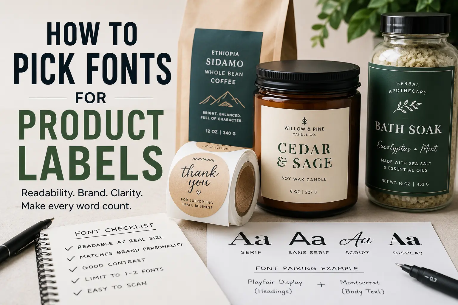
Good product label fonts should be easy to read, match the product’s personality, and print clearly at the actual label size.
Use one font for the main product name and one simple font for supporting details. Avoid using too many fonts, thin lettering, tiny script, or low-contrast color combinations. Before printing a full batch, test the label at real size and check it from arm’s length.
The best font is not always the most interesting font. It is the font that helps a customer understand the product quickly.
Why Fonts Matter On Product Labels
A product label has a small job that feels bigger once you start designing it. It needs to catch attention, explain what the product is, support the brand, and stay readable on a jar, bottle, box, bag, pouch, or package.
That is a lot to ask from a few inches of space.
That is why picking fonts for product labels matters. The wrong font can make a good product look unfinished. The right font can make the label feel cleaner, clearer, and more trustworthy before the customer even reads the fine print.
Typography is not only decoration. It controls how people move through the label. The product name, flavor, size, ingredients, scent, warning text, and usage directions should not all compete for attention. A good font system tells the customer what to read first, second, and third.
If you are printing labels for candles, coffee bags, sauces, soaps, skincare, supplements, baked goods, jars, or retail packaging, the font choice should come before the final print order. Once your design is ready, CustomStickers.com Circle Roll Labels are a practical option for packaging because roll labels are easy to apply by hand and work well for repeated product labeling.
Start With The Product, Not The Font
It is tempting to open a font menu and start scrolling. That usually makes the process harder.
Start with the product instead.
Ask a few simple questions:
What is the customer buying?
Where will they see the label?
How fast do they need to understand it?
Does the product need to feel playful, clean, premium, handmade, bold, natural, technical, or simple?
A hot sauce label can handle stronger, louder typography than a facial serum. A children’s snack label can be more playful than a legal supplement label. A luxury candle label may need more restraint than a seasonal sticker-style label for a bakery box.
The font should support the product’s promise. Not fight it.
For example, a modern sans serif font can make a skincare label feel clean and direct. A classic serif font can make a coffee or wine label feel more established. A hand-drawn script can work for a honey jar or craft candle, but only if it stays readable.
Understand The Main Font Categories
You do not need to be a professional designer to choose better product label fonts. But it helps to know the basic categories.
Serif Fonts
Serif fonts have small strokes at the ends of letters. They often feel traditional, editorial, established, or refined.
They can work well for:
wine labels
coffee packaging
specialty foods
candles
apothecary-style products
premium gift items
Serif fonts can look great in product names and brand marks. But very small serif text can get harder to read, especially if the label is tiny or the printing surface is textured.
Sans Serif Fonts
Sans serif fonts do not have those small finishing strokes. They usually feel clean, modern, simple, and practical.
They are often a strong choice for:
ingredients
directions
flavor names
size information
warning text
clean beauty products
minimal packaging
modern food and beverage brands
For many product labels, a sans serif font is the safest choice for small supporting text. It tends to hold up well when printed small.
Script Fonts
Script fonts look handwritten, calligraphic, or decorative. They can add personality fast.
They can work for:
wedding favors
candles
boutique packaging
handmade goods
bakery labels
floral or gift products
But script fonts need restraint. Use them for a short word, brand name, or accent. Do not use script for ingredients, instructions, warning text, or anything the customer needs to read quickly.
Display Fonts
Display fonts are designed to stand out. They may be bold, retro, quirky, western, futuristic, distressed, rounded, or highly stylized.
They can make a label memorable, but they can also overpower the design. Use display fonts for the product name or one short phrase. Pair them with a simpler font for everything else.
A display font is like hot sauce. A little can help. Too much can ruin the whole thing.
Build A Clear Font Hierarchy
Font hierarchy means deciding what matters most on the label.
A simple hierarchy might look like this:
Product name: largest and most distinct
Product type or flavor: medium size
Details: smaller, clean, and readable
Legal or required information: smallest, but still legible
This is where a lot of label designs go wrong. Everything is bold. Everything is centered. Everything wants attention.
The result is noise.
A better label gives each piece of text a clear role. The product name should be the first thing customers notice. The flavor, scent, variety, or use case should come next. Supporting text should be easy to find, but it should not compete with the main name.
Try this test: print the label at actual size and look at it from three feet away. What do you read first? If the answer is not the product name or the most important buying detail, adjust the hierarchy.
Use One Or Two Fonts In Most Label Designs
Most product labels only need one or two fonts.
One font can work well if it has different weights, such as regular, medium, bold, and italic. This keeps the label clean and consistent.
Two fonts can work well when they have different jobs. For example:
A serif font for the product name and a sans serif font for details.
A display font for the brand name and a simple sans serif for ingredients.
A soft script accent paired with a clean readable body font.
Three fonts can work, but it gets risky. Four fonts almost always looks messy unless a strong designer is handling it.
The goal is not to show how many fonts you found. The goal is to make the product easy to understand.
Check Readability At The Real Label Size
A font can look great on a laptop and fail on the actual label.
This is especially true for small product labels, lip balm tubes, spice jars, sample bottles, small candle tins, and food packaging with lots of required information.
Before ordering labels, print the design at the exact size. Do not just zoom in on your screen. Hold the test print on the actual container if possible.
Look for these issues:
Thin lines disappearing
Letters filling in
Script becoming hard to read
Words running too close together
Low contrast between text and background
Important details getting too small
Curved labels making text harder to scan
Small text should usually be simple. Save the personality for larger text.
If the label is only two inches wide, every font decision matters. This is where cleaner typography usually beats decorative typography.
Match Font Style To Label Finish
Your label finish can affect how the font feels and reads.
Matte labels often feel softer and more understated. They pair well with clean, natural, handmade, minimalist, or premium designs. Thin fonts may look nice on matte labels, but be careful with text that gets too light.
Gloss labels can make colors feel brighter and sharper. They can work well for bold product packaging, food labels, bright branding, and high-contrast designs. But glare can make tiny text harder to read in some lighting.
When ordering custom labels, think about the finish before finalizing the font. A delicate font on screen may not hold up the same way once it is printed, laminated, applied to a curved surface, and viewed under store lighting.
Think About The Container Shape
Fonts behave differently depending on where the label goes.
A flat box gives you more control. A round jar, bottle, or tube creates a curved viewing area. That means customers may only see part of the label at one time.
For curved packaging, keep the most important text centered and readable from the front. Avoid making long product names stretch across the whole label if the container is narrow. Use shorter lines and stronger spacing.
For small jars, choose a font with open letterforms. Letters like a, e, c, and s should not close up when printed small. For bottles, avoid long vertical text unless it is purely decorative.
A good label should work on the object, not just in the design file.
Choose Fonts That Fit Your Brand Personality
Fonts carry tone.
A rounded sans serif can feel friendly. A condensed bold font can feel energetic. A high-contrast serif can feel elegant. A monospaced font can feel technical. A hand-lettered font can feel personal or handmade.
None of these are automatically better. They just say different things.
Here are a few practical directions:
For clean skincare: use a simple sans serif with generous spacing.
For coffee or tea: try a serif or warm humanist sans serif.
For hot sauce: use a bold display font, but keep supporting text simple.
For candles: use a refined serif, soft sans serif, or light script accent.
For supplements: prioritize clarity, trust, and readable details.
For kids’ products: use rounded, friendly fonts without sacrificing legibility.
For handmade goods: use one personal accent font, not five.
The best label font feels intentional. It does not need to be loud.
Avoid Common Product Label Font Mistakes
A few font mistakes show up again and again.
The first is using script for too much text. Script can look nice in a logo or short product name. It becomes a problem when customers have to work to read it.
The second is using fonts that are too thin. Thin type can look elegant on screen, but it may disappear when printed small or placed over a busy background.
The third is using low contrast. Light gray text on a cream label may look soft and refined in a mockup, but it can be hard to read in real life. Product labels need enough contrast to work quickly.
The fourth is choosing a font only because it is trendy. Trendy fonts can date packaging fast. A label should feel current, but it should not look like every other product in the same aisle.
The fifth is ignoring spacing. Even a good font can look bad if the letters are too tight, the lines are cramped, or the margins are too small.
Make Important Details Easy To Scan
The label is not just a brand canvas. It is also a communication tool.
Customers may need to find:
flavor
scent
size
ingredients
materials
directions
warnings
batch information
expiration date
company name
website
barcode or QR code
Not every product needs all of this. But whatever appears on the label should be easy to scan.
Use a simple font for practical information. Keep enough spacing between lines. Do not bury important details in a decorative style. And if the product has legal or compliance requirements, leave room for them early in the design process.
A beautiful label that cannot fit the required text is not finished. It is just unfinished in a nice outfit.
Test Before Printing A Full Label Order
Before committing to a full run, create a real-size test.
Print it. Cut it out. Place it on the container. Step back. Turn the container in your hand. Look at it in natural light and indoor light.
Then ask:
Can I read the product name quickly?
Is the flavor or product type clear?
Does the font match the brand?
Is the smallest text still readable?
Does the label still work when applied to the container?
Does anything feel crowded?
If you are printing labels for a business, this step is worth the time. A font problem is much easier to fix before production than after hundreds or thousands of labels are printed.
When the design is ready, CustomStickers.com offers label and sticker options that can help make product packaging look more finished without making the ordering process complicated.
Conclusion
Picking fonts for product labels is partly about style, but mostly about clarity.
Start with the product. Decide what the customer needs to read first. Use one or two fonts. Keep small text simple. Test the design at real size. Make sure the label works on the actual container, not just on a screen.
A good label font does not need to shout. It needs to do its job.
When the typography is clear, the product feels easier to understand. And that gives the customer one less reason to hesitate.
FAQs
What Is The Best Font For Product Labels?
The best font for product labels is one that is easy to read at the actual printed size and fits the product’s brand. Sans serif fonts are usually safest for small details, while serif, script, or display fonts can work well for product names and accents.
How Many Fonts Should I Use On A Product Label?
Most product labels should use one or two fonts. One font family with multiple weights can be enough. If you use two fonts, give each one a clear job.
Are Script Fonts Good For Labels?
Script fonts can work well for short names, accents, and decorative branding. They are not ideal for ingredients, directions, warnings, or small text because they can become hard to read.
What Font Size Should I Use For Product Labels?
It depends on the label size, container, and amount of text. The safest approach is to print a real-size test and check readability on the actual product. Do not judge font size only from a screen.
Should Product Labels Use Serif Or Sans Serif Fonts?
Both can work. Sans serif fonts are often better for small supporting text. Serif fonts can be useful for product names, premium packaging, and traditional brand styles.
How Do I Know If My Label Font Will Print Well?
Print the label at actual size before ordering. Check thin lines, spacing, contrast, and small text. If anything feels hard to read in the test print, it will likely be harder to read on the finished product.