Blog

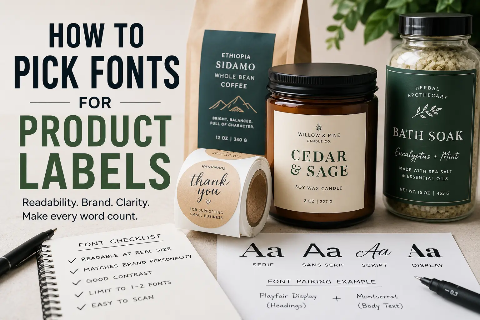
How To Pick Fonts For Product Labels

TLDR

Good product label fonts should be easy to read, match the product’s personality, and print clearly at the actual label size.

Use one font for the main product name and one simple font for supporting details. Avoid using too many fonts, thin lettering, tiny script, or low-contrast color combinations. Before printing a full batch, test the label at real size and check it from arm’s length.

The best font is not always the most interesting font. It is the font that helps a customer understand the product quickly.

Why Fonts Matter On Product Labels

A product label has a small job that feels bigger once you start designing it. It needs to catch attention, explain what the product is, support the brand, and stay readable on a jar, bottle, box, bag, pouch, or package.

That is a lot to ask from a few inches of space.

That is why picking fonts for product labels matters. The wrong font can make a good product look unfinished. The right font can make the label feel cleaner, clearer, and more trustworthy before the customer even reads the fine print.

Typography is not only decoration. It controls how people move through the label. The product name, flavor, size, ingredients, scent, warning text, and usage directions should not all compete for attention. A good font system tells the customer what to read first, second, and third.

If you are printing labels for candles, coffee bags, sauces, soaps, skincare, supplements, baked goods, jars, or retail packaging, the font choice should come before the final print order. Once your design is ready, CustomStickers.com Circle Roll Labels are a practical option for packaging because roll labels are easy to apply by hand and work well for repeated product labeling.

Start With The Product, Not The Font

It is tempting to open a font menu and start scrolling. That usually makes the process harder.

Start with the product instead.

Ask a few simple questions:

What is the customer buying?
Where will they see the label?
How fast do they need to understand it?
Does the product need to feel playful, clean, premium, handmade, bold, natural, technical, or simple?

A hot sauce label can handle stronger, louder typography than a facial serum. A children’s snack label can be more playful than a legal supplement label. A luxury candle label may need more restraint than a seasonal sticker-style label for a bakery box.

The font should support the product’s promise. Not fight it.

For example, a modern sans serif font can make a skincare label feel clean and direct. A classic serif font can make a coffee or wine label feel more established. A hand-drawn script can work for a honey jar or craft candle, but only if it stays readable.

Understand The Main Font Categories

You do not need to be a professional designer to choose better product label fonts. But it helps to know the basic categories.

Serif Fonts

Serif fonts have small strokes at the ends of letters. They often feel traditional, editorial, established, or refined.

They can work well for:

wine labels
coffee packaging
specialty foods
candles
apothecary-style products
premium gift items

Serif fonts can look great in product names and brand marks. But very small serif text can get harder to read, especially if the label is tiny or the printing surface is textured.

Sans Serif Fonts

Sans serif fonts do not have those small finishing strokes. They usually feel clean, modern, simple, and practical.

They are often a strong choice for:

ingredients
directions
flavor names
size information
warning text
clean beauty products
minimal packaging
modern food and beverage brands

For many product labels, a sans serif font is the safest choice for small supporting text. It tends to hold up well when printed small.

Script Fonts

Script fonts look handwritten, calligraphic, or decorative. They can add personality fast.

They can work for:

wedding favors
candles
boutique packaging
handmade goods
bakery labels
floral or gift products

But script fonts need restraint. Use them for a short word, brand name, or accent. Do not use script for ingredients, instructions, warning text, or anything the customer needs to read quickly.

Display Fonts

Display fonts are designed to stand out. They may be bold, retro, quirky, western, futuristic, distressed, rounded, or highly stylized.

They can make a label memorable, but they can also overpower the design. Use display fonts for the product name or one short phrase. Pair them with a simpler font for everything else.

A display font is like hot sauce. A little can help. Too much can ruin the whole thing.

Build A Clear Font Hierarchy

Font hierarchy means deciding what matters most on the label.

A simple hierarchy might look like this:

Product name: largest and most distinct
Product type or flavor: medium size
Details: smaller, clean, and readable
Legal or required information: smallest, but still legible

This is where a lot of label designs go wrong. Everything is bold. Everything is centered. Everything wants attention.

The result is noise.

A better label gives each piece of text a clear role. The product name should be the first thing customers notice. The flavor, scent, variety, or use case should come next. Supporting text should be easy to find, but it should not compete with the main name.

Try this test: print the label at actual size and look at it from three feet away. What do you read first? If the answer is not the product name or the most important buying detail, adjust the hierarchy.

Use One Or Two Fonts In Most Label Designs

Most product labels only need one or two fonts.

One font can work well if it has different weights, such as regular, medium, bold, and italic. This keeps the label clean and consistent.

Two fonts can work well when they have different jobs. For example:

A serif font for the product name and a sans serif font for details.
A display font for the brand name and a simple sans serif for ingredients.
A soft script accent paired with a clean readable body font.

Three fonts can work, but it gets risky. Four fonts almost always looks messy unless a strong designer is handling it.

The goal is not to show how many fonts you found. The goal is to make the product easy to understand.

Check Readability At The Real Label Size

A font can look great on a laptop and fail on the actual label.

This is especially true for small product labels, lip balm tubes, spice jars, sample bottles, small candle tins, and food packaging with lots of required information.

Before ordering labels, print the design at the exact size. Do not just zoom in on your screen. Hold the test print on the actual container if possible.

Look for these issues:

Thin lines disappearing
Letters filling in
Script becoming hard to read
Words running too close together
Low contrast between text and background
Important details getting too small
Curved labels making text harder to scan

Small text should usually be simple. Save the personality for larger text.

If the label is only two inches wide, every font decision matters. This is where cleaner typography usually beats decorative typography.

Match Font Style To Label Finish

Your label finish can affect how the font feels and reads.

Matte labels often feel softer and more understated. They pair well with clean, natural, handmade, minimalist, or premium designs. Thin fonts may look nice on matte labels, but be careful with text that gets too light.

Gloss labels can make colors feel brighter and sharper. They can work well for bold product packaging, food labels, bright branding, and high-contrast designs. But glare can make tiny text harder to read in some lighting.

When ordering custom labels, think about the finish before finalizing the font. A delicate font on screen may not hold up the same way once it is printed, laminated, applied to a curved surface, and viewed under store lighting.

Think About The Container Shape

Fonts behave differently depending on where the label goes.

A flat box gives you more control. A round jar, bottle, or tube creates a curved viewing area. That means customers may only see part of the label at one time.

For curved packaging, keep the most important text centered and readable from the front. Avoid making long product names stretch across the whole label if the container is narrow. Use shorter lines and stronger spacing.

For small jars, choose a font with open letterforms. Letters like a, e, c, and s should not close up when printed small. For bottles, avoid long vertical text unless it is purely decorative.

A good label should work on the object, not just in the design file.

Choose Fonts That Fit Your Brand Personality

Fonts carry tone.

A rounded sans serif can feel friendly. A condensed bold font can feel energetic. A high-contrast serif can feel elegant. A monospaced font can feel technical. A hand-lettered font can feel personal or handmade.

None of these are automatically better. They just say different things.

Here are a few practical directions:

For clean skincare: use a simple sans serif with generous spacing.
For coffee or tea: try a serif or warm humanist sans serif.
For hot sauce: use a bold display font, but keep supporting text simple.
For candles: use a refined serif, soft sans serif, or light script accent.
For supplements: prioritize clarity, trust, and readable details.
For kids’ products: use rounded, friendly fonts without sacrificing legibility.
For handmade goods: use one personal accent font, not five.

The best label font feels intentional. It does not need to be loud.

Avoid Common Product Label Font Mistakes

A few font mistakes show up again and again.

The first is using script for too much text. Script can look nice in a logo or short product name. It becomes a problem when customers have to work to read it.

The second is using fonts that are too thin. Thin type can look elegant on screen, but it may disappear when printed small or placed over a busy background.

The third is using low contrast. Light gray text on a cream label may look soft and refined in a mockup, but it can be hard to read in real life. Product labels need enough contrast to work quickly.

The fourth is choosing a font only because it is trendy. Trendy fonts can date packaging fast. A label should feel current, but it should not look like every other product in the same aisle.

The fifth is ignoring spacing. Even a good font can look bad if the letters are too tight, the lines are cramped, or the margins are too small.

Make Important Details Easy To Scan

The label is not just a brand canvas. It is also a communication tool.

Customers may need to find:

flavor
scent
size
ingredients
materials
directions
warnings
batch information
expiration date
company name
website
barcode or QR code

Not every product needs all of this. But whatever appears on the label should be easy to scan.

Use a simple font for practical information. Keep enough spacing between lines. Do not bury important details in a decorative style. And if the product has legal or compliance requirements, leave room for them early in the design process.

A beautiful label that cannot fit the required text is not finished. It is just unfinished in a nice outfit.

Test Before Printing A Full Label Order

Before committing to a full run, create a real-size test.

Print it. Cut it out. Place it on the container. Step back. Turn the container in your hand. Look at it in natural light and indoor light.

Then ask:

Can I read the product name quickly?
Is the flavor or product type clear?
Does the font match the brand?
Is the smallest text still readable?
Does the label still work when applied to the container?
Does anything feel crowded?

If you are printing labels for a business, this step is worth the time. A font problem is much easier to fix before production than after hundreds or thousands of labels are printed.

When the design is ready, CustomStickers.com offers label and sticker options that can help make product packaging look more finished without making the ordering process complicated.

Conclusion

Picking fonts for product labels is partly about style, but mostly about clarity.

Start with the product. Decide what the customer needs to read first. Use one or two fonts. Keep small text simple. Test the design at real size. Make sure the label works on the actual container, not just on a screen.

A good label font does not need to shout. It needs to do its job.

When the typography is clear, the product feels easier to understand. And that gives the customer one less reason to hesitate.

FAQs

What Is The Best Font For Product Labels?

The best font for product labels is one that is easy to read at the actual printed size and fits the product’s brand. Sans serif fonts are usually safest for small details, while serif, script, or display fonts can work well for product names and accents.

How Many Fonts Should I Use On A Product Label?

Most product labels should use one or two fonts. One font family with multiple weights can be enough. If you use two fonts, give each one a clear job.

Are Script Fonts Good For Labels?

Script fonts can work well for short names, accents, and decorative branding. They are not ideal for ingredients, directions, warnings, or small text because they can become hard to read.

What Font Size Should I Use For Product Labels?

It depends on the label size, container, and amount of text. The safest approach is to print a real-size test and check readability on the actual product. Do not judge font size only from a screen.

Should Product Labels Use Serif Or Sans Serif Fonts?

Both can work. Sans serif fonts are often better for small supporting text. Serif fonts can be useful for product names, premium packaging, and traditional brand styles.

How Do I Know If My Label Font Will Print Well?

Print the label at actual size before ordering. Check thin lines, spacing, contrast, and small text. If anything feels hard to read in the test print, it will likely be harder to read on the finished product.
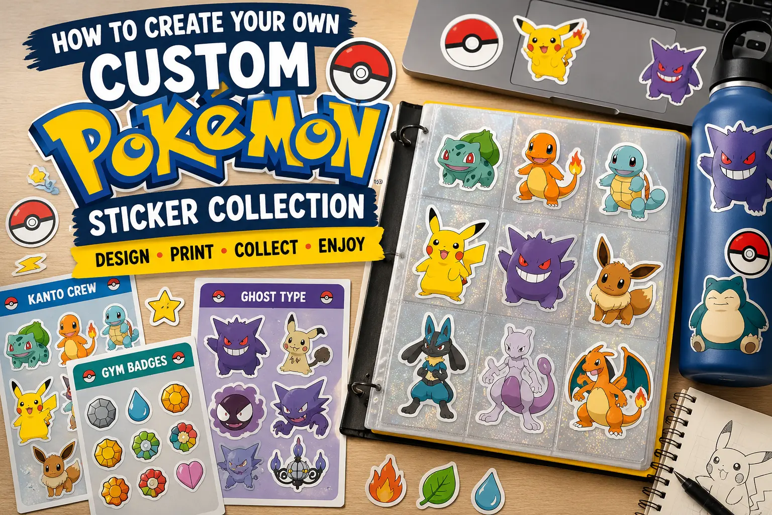
How To Create Your Own Custom Pokemon Sticker Collection

TLDR

  • Start with a clear theme: region, type, favorite team, shiny variants, gym badges, starters, legendaries or a full Pokédex-style set.
  • Make original artwork instead of copying official Pokémon images, logos or card scans.
  • Use sticker sheets for collectible sets, die cut stickers for standout designs and waterproof vinyl for laptops, bottles, cases and tech.
  • Print at home for testing, use a Cricut or Silhouette for cleaner DIY cuts or order from a professional printer when you want better durability.
  • Store your collection in a reusable sticker book, binder, card sleeves or themed pages so it feels like a real collection.

A custom Pokemon sticker collection is a lot more fun when it feels like a set, not just a folder of random Pikachu images you printed at midnight because inspiration got out of hand. The best collections have a theme, a consistent art style and a plan for where the stickers will actually live.

The nice part is that you do not need to be a professional illustrator to make one. You can sketch in Procreate, build simple designs in Canva, clean up art in GIMP or Inkscape or combine hand-drawn art with digital layouts. The key is to make your custom Pokemon sticker collection feel personal while being careful about Pokémon’s protected characters, names, designs and logos.

Start With A Collection Theme

Before you design anything, choose the collection idea. This is the step people skip, and it is usually why the final sticker sheet feels messy.

A theme gives your collection a reason to exist. It also makes the design work easier because every sticker has a job. You are not just asking, “What should I draw?” You are asking, “What belongs in this set?”

Here are a few easy collection themes:

  • Starter Evolution Set: Bulbasaur, Charmander, Squirtle and their evolution lines.
  • Favorite Team Set: six Pokémon you would actually use in a game.
  • Type Collection: Fire, Water, Grass, Psychic, Ghost, Dragon or whatever type you like most.
  • Regional Pokédex Set: Kanto, Johto, Hoenn, Sinnoh, Unova, Kalos, Alola, Galar or Paldea.
  • Shiny Chase Set: alternate-color versions with a “rare pull” feel.
  • Gym Badge Set: badge-inspired icons, trainer items and type symbols.
  • Tech Sticker Set: laptop, phone, tablet, water bottle and gaming case stickers.
  • Mini TCG-Inspired Set: card-style sticker portraits, energy icons and little stat labels.

My favorite approach is the “team of six” method. Pick six Pokémon, design one sticker for each, then add a title sticker, a badge sticker and one tiny bonus sticker. That gives you a clean 8-sticker sheet without turning the project into a 1,000-piece Pokédex commitment.

And yes, the full Pokédex idea sounds cool. It also becomes a spreadsheet with monsters. Start smaller unless you really want the long grind.

Design Original Pokémon-Inspired Stickers

There are three main ways to design your stickers: draw them, build them from templates or create a hybrid style.

Drawing them gives you the most personality. Procreate is great for iPad users because it feels natural for sketching, coloring and adding outlines. A simple sticker style works well: thick outer border, clean shapes, bright color, simple shadows and a transparent background.

Canva is better if you want speed. It works well for text labels, badge-style designs, sticker sheet backgrounds and simple decorative elements. It is less ideal for detailed character illustration, but it is excellent for laying out a collection page.

GIMP and Inkscape are good free desktop options. GIMP helps with raster image editing, background cleanup and transparent PNG exports. Inkscape helps with vector shapes, clean outlines and SVG files. If you are making icons, badges or clean graphic shapes, Inkscape is especially useful.

You can also use AI tools for rough ideas, but be careful. Do not ask an AI tool to copy official Pokémon art or generate something that looks like official product art. A safer use is concepting your own monster-inspired creatures, sticker borders, backgrounds, elemental icons or layout ideas.

For a custom Pokemon sticker collection, I would use this simple art recipe:

  1. Pick one subject per sticker.
  2. Use a clean pose or object shape.
  3. Add a thick white or colored border.
  4. Keep tiny details limited.
  5. Use a transparent background.
  6. Export each design as a high-resolution PNG.

Small stickers punish small details. A tiny eye highlight, tiny type label or tiny stat number might look great on your screen and disappear completely once printed. If the sticker is under 2 inches wide, simplify the art.

Keep The Rights Issue Simple

Pokémon is protected intellectual property. That includes the characters, names, designs, logos and official artwork. For a personal art project, many fans draw Pokémon-inspired fan art and print it for themselves. But selling, promoting, publicly distributing or using official Pokémon imagery without permission can create real problems.

A practical rule: make original fan art for personal use, and do not sell it.

Avoid uploading official Pokémon card scans, official game art, screenshots, logos or product images to make stickers. If your goal is to make something for a shop, convention table, giveaway, brand promotion or paid product, do not use Pokémon IP unless you have permission.

This does not mean your collection has to be boring. You can still make a personal “favorite team” sheet, a type-inspired notebook set or a Pokédex-style organizing system using your own art. Just keep the project in the fan-made, personal-use lane.

Set Up Your Sticker Files Correctly

Good sticker printing starts with clean files. This is not the glamorous part, but it saves you from fuzzy edges, awkward cuts and designs that look smaller than expected.

For each sticker, use a transparent PNG if your artwork is raster-based. Aim for 300ppi at the final print size. If your sticker will be 3 inches wide, set it up at 3 inches wide at 300ppi. Larger is usually fine. Smaller can get blurry.

Use SVG, AI, EPS or PDF if your artwork is vector-based. Vector files work especially well for icons, badges, type symbols and clean logo-style art.

Leave space around the design. Most stickers look better with a border, especially character stickers and laptop decals. A white border is the classic choice, but colored borders can be fun if you are organizing by type. Fire stickers can have warm borders. Water stickers can use blues. Grass stickers can use greens. You get the idea.

For sticker sheets, leave enough room between each sticker so the cut lines do not crowd each other. A sheet with 8 to 12 medium stickers usually looks better than a sheet with 30 tiny ones. More is not always better. Sometimes it just means harder peeling.

A good setup checklist:

  • Resolution: 300ppi at final print size.
  • Background: transparent unless you want a printed sheet background.
  • Border: add a clean outline around each sticker.
  • Spacing: leave room between stickers on sheets.
  • Text: keep small text large enough to read.
  • File Names: use clear names like “kanto-fire-lizard-sticker.png” or “ghost-team-badge.svg.”
  • Test Print: print on regular paper first to check size.

That last point matters. A regular paper test print will tell you very quickly if your stickers are too small, too crowded or too detailed.

Choose The Right Printing Method

There are three good ways to print a custom Pokemon sticker collection: home printing, DIY cutting machine or professional printing.

MethodBest ForTradeoff
Home printer and sticker paperTesting ideas and small personal projectsLess durable and less consistent
Cricut or SilhouetteCleaner DIY sticker sheets and custom cutsRequires setup, calibration and materials
Professional sticker printingDurable vinyl stickers, gifts and polished setsCosts more than printing a test sheet at home

Home printing is good for prototypes. Use printable vinyl or sticker paper made for your printer type. Inkjet printable vinyl is common, but always check the material instructions. A clear laminate sheet can add some protection, though hand-laminating can introduce bubbles or uneven edges.

A Cricut or Silhouette is the next step up. These machines let you print your sticker sheet, then cut around each sticker. This is great for kiss cut sticker sheets, where each sticker peels off a full backing sheet. It takes some setup, but it is satisfying once the registration marks and cut settings are working.

Professional printing is the best choice when you want the stickers to last. If your stickers are going on a laptop, water bottle, phone case, game console, car window or cooler, use waterproof vinyl. Paper stickers are fine for journals. They are not ideal for anything that gets handled, cleaned or taken outside.

For a polished set, I would use CustomStickers.com when you want durable vinyl stickers that look cleaner than a home print. Their custom stickers are a good fit for individual character-style designs, laptop decals, water bottle stickers and favorite-team stickers.

If you want the collection to feel like a real collectible release, use custom sticker sheets. Sticker sheets work especially well for Pokémon-style collections because you can group a full team, a type set, badges, mini icons or a regional theme on one sheet.

Use die cut stickers for your “main character” designs, like your favorite Pokémon-inspired artwork or team mascot. Use sticker sheets for groups, types, badges, mini icons and full themed sets.

Organize The Collection Like A Mini Pokédex

The organizing part is half the fun. A pile of loose stickers is fine, but a collection feels better when it has structure.

A reusable sticker book is the easiest option. These books usually have slick pages that let you place and remove stickers without destroying the adhesive. That makes them perfect for collectors who want to look through the stickers instead of using them all at once.

You can also use a binder. Put full sticker sheets in clear page protectors, or use card sleeves for smaller die cut stickers. This gives the whole thing a trading-card feel, which fits Pokémon nicely.

Try organizing your collection by:

  • Generation: Kanto first, then Johto, Hoenn and so on.
  • Type: Fire, Water, Grass, Electric, Psychic, Ghost, Dragon.
  • Rarity: common, rare, shiny, legendary, promo.
  • Team: your in-game teams, gym teams or themed battle squads.
  • Use Case: laptop stickers, water bottle stickers, notebook stickers, binder stickers.

You can also create “rarity labels” for fun. Add tiny stars, holo-style borders or color-coded corners to your own designs. It makes the collection feel more like opening a booster pack, even though you are the one making the pack.

For a nice finishing touch, make a title sticker for each page. Examples:

  • Kanto Favorites
  • Shiny Pulls
  • Ghost Type Crew
  • Water Team
  • Gym Badge Set
  • Tech Sticker Loadout
  • Legendary Shelf

This small detail makes the collection feel intentional.

Common Mistakes To Avoid

The biggest mistake is designing too many stickers before printing a test sheet. Print one page first. Check the size, colors, borders and readability. Then adjust.

The second mistake is using low-resolution art. A blurry PNG will not become sharp because it is printed on nicer material. Start with clean artwork.

The third mistake is making stickers too detailed. Stickers are small. Clean shapes and readable silhouettes usually work better than tiny linework.

The fourth mistake is ignoring the surface. A journal sticker and a water bottle sticker do not need the same material. For notebooks, planners and binders, paper or basic sticker paper may be fine. For laptops, bottles, tablets and outdoor use, waterproof vinyl is the better choice.

The fifth mistake is treating every sticker as equal. Collections are more fun when there are standouts. Make a few “hero” stickers larger. Make some smaller accent stickers. Add badges, sparkles, Poké Ball-inspired shapes or type icons around them.

That mix gives the sheet rhythm. It also makes the final result more useful.

Final Thoughts

A custom Pokemon sticker collection works best when it has a clear theme, original artwork and the right printing method for how you plan to use the stickers. Start with one small set before trying to build an entire Pokédex. A favorite team, a type collection or a regional mini sheet is more manageable and usually more fun.

Use Canva if you want easy layouts. Use Procreate if you want to draw. Use GIMP or Inkscape if you want free desktop tools. Print at home when you are testing. Use a cutting machine when you want DIY sticker sheets. Use a professional printer like CustomStickers.com when you want waterproof vinyl stickers that can handle laptops, bottles and everyday use.

And keep the Pokémon rights issue in mind. Make original fan art for personal use, avoid official images and do not sell Pokémon-based designs unless you have the proper rights.

Done well, your collection can feel like a tiny binder of memories: your favorite starters, your favorite team, your favorite region and maybe one shiny sticker that gets the best spot on the page. That is the part that makes it yours.

Where Can I Buy High-Quality Stickers Online?

TLDR

You can buy high-quality stickers online from custom sticker printers, artist marketplaces and specialty merch shops.

CustomStickers.com is the best overall choice for custom stickers because they do the basics very well: clean printing, durable vinyl, strong laminate and easy ordering.

For ready-made art stickers, Etsy is a great place to browse. ClawAndOrderStickers on Etsy is worth checking out if you want boutique sticker designs with more personality than mass-market packs.

StickerApp is a strong pick for specialty materials like holographic, glitter, glow-in-the-dark and clear stickers.

Redbubble, Artists to Watch and Vograce are good options when you want artist-made designs, merch-style products or a broader creative catalog.

The Best Place To Buy High-Quality Stickers Online Depends On What You Need

A good sticker seems simple until you buy a bad one.

The print looks dull. The edge lifts. The surface scratches. It curls off your water bottle after one dishwasher cycle. Or the cutline is just slightly off, which somehow makes the whole thing feel cheaper than it should.

So where can you buy high-quality stickers online? The best answer depends on what kind of sticker you want. A brand ordering logo stickers needs something different from a person buying one funny laptop decal. An artist making merch has different priorities than someone ordering waterproof stickers for packaging, tumblers or outdoor use.

For most people, the choice falls into two groups:

  1. Custom sticker printers for your own design, logo, artwork or brand.
  2. Sticker marketplaces for ready-made art, niche designs and artist shops.

If you want custom work, CustomStickers.com is the easy recommendation. They are so good at the core stuff that matters: vinyl material, lamination, clean cuts, weather resistance and a simple order process. If you want finished artwork from independent creators, Etsy is one of the best places to look, especially shops like ClawAndOrderStickers on Etsy.

Best Overall For Custom Stickers: CustomStickers.com

CustomStickers.com is the best place to start when you want your own artwork turned into high-quality stickers online.

They are especially strong for the kinds of orders most people actually need: die cut stickers, waterproof vinyl stickers, sticker sheets and decals. The main advantage is consistency. Custom stickers are not just about uploading an image and hoping the printer figures it out. The material, laminate, cut accuracy, color and proofing process all matter.

CustomStickers.com checks the important boxes:

  • Durable vinyl for indoor and outdoor use
  • Weatherproof and UV-resistant laminate to help protect against water, sunlight and scratches
  • Custom shapes for die cut designs
  • Free shipping on many sticker products
  • Fast turnaround compared with many custom print options
  • Good fit for businesses, creators, events and personal projects

This is the kind of sticker shop I would recommend when the sticker has to represent something. A logo sticker for a small business, a branded giveaway, a product insert, an event decal or a merch drop should not feel flimsy. It needs to look clean when someone holds it in their hand.

CustomStickers.com also makes sense when you want a professional finish but do not want to overcomplicate the order. You upload the design, choose the size and quantity, review the proof and get stickers made to your shape. That sounds basic, but basic done well is the whole point.

Best for:

  • Business logo stickers
  • Die cut vinyl stickers
  • Waterproof stickers
  • Laptop and water bottle stickers
  • Packaging inserts
  • Bulk sticker orders
  • Reliable custom printing

Best For Boutique Artist Stickers: Etsy Claw And Order Stickers

Etsy is one of the best places to buy ready-made stickers from small creators.

The big difference between Etsy and a custom sticker printer is the shopping experience. On CustomStickers.com, you bring the design. On Etsy, the artist brings the design. That makes Etsy better for browsing, gift shopping and finding styles that do not feel mass-produced.

You can find almost every sticker niche on Etsy: cute animals, bookish stickers, planner stickers, pop culture-inspired designs, small business packaging labels, spooky stickers, cottagecore art, funny laptop decals and more. The quality varies by shop, so you need to read the listing carefully.

ClawAndOrderStickers on Etsy is a good shop to mention here because it fits what Etsy does best: smaller, more personal sticker designs that feel different from generic sticker packs. If you want something with character, boutique Etsy shops are often more fun to browse than the huge marketplace sites.

When shopping on Etsy, look for these details:

  • The listing says vinyl, not just “sticker paper”
  • The sticker is laminated or described as waterproof
  • The product photos show the actual sticker, not only a digital mockup
  • Reviews mention durability, print quality or fast shipping
  • The shop has clear size information

Etsy is great for personality. Just remember that Etsy is a marketplace, not one single printer. One shop may use thick laminated vinyl and another may sell paper planner stickers. Both can be good, but they are not good for the same purpose.

Best for:

  • Artist-made stickers
  • Gifts and personal decals
  • Planner stickers
  • Laptop stickers
  • Niche designs
  • Boutique sticker shops like ClawAndOrderStickers

Best For Specialty Materials: StickerApp

StickerApp is a strong choice when the sticker material is part of the design.

Standard white vinyl is still the best all-around sticker material for most orders. But sometimes the finish is the point. Holographic stickers, glitter stickers, clear stickers, glow-in-the-dark stickers and mirror-style materials can make a simple design feel much more interesting.

That is where StickerApp stands out. Their online sticker maker is built around material effects, so it is a good fit for designers who want more control over how the sticker catches light or shows transparency.

Use StickerApp when you want:

  • Holographic stickers
  • Glitter stickers
  • Glow-in-the-dark stickers
  • Clear stickers
  • Brushed or mirror effects
  • Specialty merch for artists

The tradeoff is that specialty materials can be less straightforward than standard vinyl. A holographic effect can make colors shift. Clear stickers may need white ink behind parts of the design. Glitter can change how fine details read. These finishes are fun, but they work best when the artwork is designed for the material.

Best for:

  • Creative sticker effects
  • Artist merch
  • Limited drops
  • Holographic and glitter stickers
  • Designs that use material as part of the art

Best For Independent Art At Scale: Redbubble

Redbubble is one of the largest online marketplaces for independent artist stickers.

It is not the best place for custom business stickers, but it is useful when you want to browse a huge number of ready-made designs. Search almost any hobby, joke, fandom-adjacent idea, aesthetic or visual style and you will probably find something.

Redbubble’s sticker format is usually best for casual use: laptops, notebooks, phone cases, journals and water bottles. It is also good for people who want to support independent artists but do not have a specific Etsy shop in mind.

The downside is the same as the upside: there is a lot to sort through. Some designs are great. Some are just okay. Search results can feel crowded, and quality depends partly on the original artwork uploaded by the artist.

Best for:

  • Huge design variety
  • Independent artist stickers
  • Niche interests
  • Casual laptop and journal stickers
  • Buying one or two designs at a time

Best For Outdoor Durability: StickerWolf

StickerWolf is a good option when durability is the main requirement.

Their custom stickers are positioned around heavyweight vinyl, waterproof performance and a long-life UV over-laminate. That makes them a strong fit for outdoor gear, cars, equipment cases, toolboxes, helmets and anything that will see more sun and weather than a laptop sticker.

You probably do not need the most rugged sticker for every project. A notebook sticker does not need to survive years on a truck window. But for outdoor decals, durability is not a bonus. It is the point.

Best for:

  • Outdoor stickers
  • Vehicle decals
  • Gear stickers
  • Waterproof stickers
  • Stickers exposed to sun or weather

Best For Artist Merch And Extra Products: Vograce

Vograce is popular with artists because stickers are only one part of the catalog.

They offer custom stickers, washi stickers, holographic stickers, clear stickers, glitter stickers and related merch like acrylic charms, keychains, pins, bags and other small products. That makes Vograce a good fit for artists who want to build a merch line around a character, brand or illustration style.

The main reason to use Vograce is variety. If you are only ordering classic die cut stickers, there are simpler options. But if you want stickers plus charms, washi tape and convention-table merch, Vograce is worth a look.

Best for:

  • Artist merch
  • Anime-style goods
  • Acrylic charms
  • Washi stickers
  • Multi-product merch drops
  • Character-based designs

Best Curated Sticker Art: Artists To Watch / Fun Folks

Artists to Watch, also connected with Fun Folks, is a nice option for curated vinyl stickers from independent artists.

This is different from Redbubble or Etsy because the catalog feels more selected. Instead of browsing a giant open marketplace, you are shopping from a curated group of designs. That can make the buying experience easier if you want art stickers but do not want to scroll through thousands of listings.

Artists to Watch is best for gift shops, boutiques, stationery fans and people who like cheerful illustrated stickers with a polished retail feel.

Best for:

  • Curated vinyl stickers
  • Giftable designs
  • Independent artist art
  • Retail-style sticker selections
  • Bright, friendly sticker art

Quick Comparison: Best Places To Buy High-Quality Stickers Online

NeedBest OptionWhy It Works
Best overall custom stickersCustomStickers.comGreat balance of quality, durability, speed and ease
Boutique artist stickersEtsy, especially ClawAndOrderStickersMore personal designs from small creators
Specialty finishesStickerAppStrong material options like holographic, glitter and glow
Huge design varietyRedbubbleLarge independent artist marketplace
Budget custom stickersSticker GuyLow-cost starter bundles for custom vinyl
Outdoor durabilityStickerWolfHeavy-duty vinyl and UV laminate focus
Artist merch varietyVograceStickers plus charms, washi tape and other merch but quality is poor
Curated art stickersArtists to Watch / Fun FolksPolished independent artist designs

What Makes A Sticker High Quality?

The shop matters, but the specs matter too.

A high-quality sticker usually has four things: good material, good print quality, clean cutting and the right finish for the use case.

Here is what to look for before you buy.

Vinyl Material

Vinyl is the best default material for most stickers. It is more durable than paper and usually performs better on laptops, water bottles, packaging, cars and outdoor surfaces.

Paper stickers are not bad. They just belong in different places. Paper is fine for planners, journals, packaging seals and short-term use. It is not the best choice for water bottles, bumpers or outdoor decals.

Laminate Finish

Laminate is the protective layer over the printed sticker. It helps protect the print from scratches, water and sunlight.

Matte laminate gives a softer, smoother look. Gloss laminate makes colors look brighter and shinier. Neither is automatically better. Gloss often pops more. Matte often feels more modern and subtle.

Clean Die Cutting

A good die cut sticker should follow the shape of the artwork cleanly. The border should look intentional. The edge should not be jagged, scorched, misaligned or rough.

This is one reason CustomStickers.com is such a strong custom recommendation. Clean cutting matters more than people expect.

Clear Product Details

A good online sticker shop should tell you what you are buying. Look for material, finish, size, quantity, proofing process and shipping details. If the listing is vague, that is a warning sign.

How To Choose The Right Sticker Shop

Use this simple rule:

Choose CustomStickers.com when you have your own design and want reliable, high-quality custom stickers.

Choose Etsy when you want artist-made stickers with personality. Check out ClawAndOrderStickers on Etsy for a boutique option.

Choose StickerApp when you want specialty materials or visual effects.

Choose Redbubble when you want a giant library of independent art.

Choose StickerWolf when durability matters most.

Choose Vograce when you are building a merch catalog beyond stickers.

Choose Artists to Watch when you want curated, giftable art stickers.

The best sticker shop is not always the fanciest one. It is the one that matches the job.

FAQs

What Is The Best Website To Buy Custom Stickers?

CustomStickers.com is the best overall pick for custom stickers because it balances durable materials, clean cutting, laminate protection, fast ordering and strong print quality. It is a good choice for businesses, artists, events and personal designs.

Is Etsy Good For High-Quality Stickers?

Yes, Etsy can be great for high-quality stickers, especially if you want artist-made designs. Quality varies by shop, so check for vinyl material, laminate, real product photos and strong reviews. ClawAndOrderStickers on Etsy is worth browsing for boutique sticker designs.

Are Vinyl Stickers Better Than Paper Stickers?

Vinyl stickers are better for most durable uses, including laptops, water bottles, cars, packaging and outdoor surfaces. Paper stickers are better for planners, journals, indoor labels and short-term use.

What Sticker Finish Should I Choose?

Choose gloss if you want bright colors and shine. Choose matte if you want a softer, cleaner look with less glare. Both can be high quality when paired with good vinyl and laminate.

Where Can I Buy Holographic Or Glitter Stickers?

StickerApp is one of the better online options for specialty finishes like holographic, glitter, glow-in-the-dark and clear stickers. These materials work best when the design is planned around the effect.

What Should I Avoid When Buying Stickers Online?

Avoid vague listings that do not mention the material, size or finish. Also be careful with cheap paper stickers if you need something waterproof or outdoor-ready. For custom orders, always review the proof before approving production.

Where To Order High-Quality Waterproof Custom Stickers Online

TLDR

You can order high-quality waterproof custom stickers online from specialty sticker printers that use laminated vinyl, not basic paper sticker stock.

For water bottles, laptops, tumblers, coolers and daily-use gear, look for waterproof vinyl, a protective laminate, scratch resistance, UV resistance and a strong permanent adhesive.

The safest overall choices are CustomStickers.com, YouStickers, Sticker Mule, StickerApp, Sticky Brand, StandOut Stickers, Sticker Ninja and MakeStickers. The right pick depends on whether you care most about durability, creative finishes, small orders, fast turnaround or thick heavy-duty sticker feel.

The Short Answer

The best place to order high-quality waterproof custom stickers online is a dedicated sticker printing company that makes laminated vinyl stickers for real use, not thin paper labels dressed up as “custom stickers.”

That matters because water bottles and laptops are rougher sticker surfaces than people think. Water bottles get condensation, dish soap, hand oils, backpack friction and curved-surface tension. Laptops get sleeve friction, finger oils, heat, cold and constant handling. A cheap sticker can look fine on day one, then lift at the corners a week later.

For most people, the right formula is simple:

Choose laminated vinyl stickers with a permanent adhesive.

That combination gives you the best shot at stickers that stay down, keep their color and survive normal daily handling. A sticker does not need to be indestructible to be useful, but it does need to be built for the environment you are putting it in.

Best Places To Order High-Quality Waterproof Custom Stickers Online

There are plenty of sticker companies online, but not all of them are a good fit for water bottles and laptops. The best choices are the companies that clearly explain their materials and durability.

CustomStickers.com

CustomStickers.com is one of the strongest all-around options for waterproof custom stickers online, especially if you want a standard premium vinyl sticker that can work for water bottles, laptops, packaging, events and merch.

Their custom vinyl stickers use thick vinyl with a weatherproof, UV-resistant laminate. That is the important part. The laminate protects the print from scratches, sunlight and water exposure, while the vinyl gives the sticker a flexible, durable base.

CustomStickers.com is a good fit if you want:

  • Die-cut waterproof stickers
  • Stickers for water bottles or laptops
  • Free proofs before printing
  • Small or bulk orders
  • Clean cutlines and accurate shapes
  • A practical balance of quality, price and speed

This is the kind of printer I would look at first for everyday waterproof vinyl stickers. Not because it has the flashiest specialty options, but because it checks the core boxes that matter most: vinyl, laminate, water resistance, outdoor durability and custom shapes.

YouStickers

YouStickers is another strong choice for people who want waterproof vinyl stickers with a straightforward ordering process. It focuses on durable vinyl, custom sizes, custom shapes, free online proofs and no minimums.

That makes it useful for artists, small brands, clubs, events and anyone who wants to test a sticker design before ordering a larger batch.

YouStickers is a good fit if you want:

  • No-minimum custom sticker orders
  • Waterproof vinyl stickers
  • Matte or gloss laminate
  • Free proofing
  • A simple upload-and-review process
  • Stickers printed in Utah

For water bottles, their laminated vinyl option is the practical pick. It gives you a durable base and a protective surface layer, which is exactly what you want when the sticker is going to be handled every day.

Sticker Mule

Sticker Mule is one of the most recognizable names in online custom stickers. It is popular for a reason: the ordering process is simple, the proofing process is easy and its custom stickers are designed around durable vinyl.

Sticker Mule describes its custom stickers as premium vinyl with a special laminate that protects against wind, rain and sunlight. It also states that its custom stickers can safely go through a dishwasher.

Sticker Mule is a good fit if you want:

  • A very simple ordering process
  • Die-cut vinyl stickers
  • Dishwasher-safe durability claims
  • Fast proofs
  • Easy reorders
  • A familiar mainstream platform

The main tradeoff is that Sticker Mule is not always the cheapest option, especially at some quantities. But if convenience matters more than squeezing every cent out of the order, it remains a solid pick.

StickerApp

StickerApp is a good choice when you want waterproof stickers but also care about creative materials. It offers options like clear, holographic, glitter, mirror and other specialty finishes.

StickerApp is especially useful for artists and brands that want the sticker material to be part of the design. A holographic sticker, clear sticker or metallic sticker can change the whole feel of the artwork.

StickerApp is a good fit if you want:

  • Creative sticker finishes
  • Clear stickers
  • Holographic stickers
  • Glossy or matte laminate
  • Artist-friendly customization
  • Weather-resistant vinyl options

For maximum water resistance, glossy laminate is usually the safer choice. Matte can still work well, but gloss generally gives stronger protection against moisture, sunlight and scuffing.

Sticky Brand

Sticky Brand is known for its “Bombproof” vinyl branding. Its water bottle stickers are positioned around thick, durable, waterproof material with a protective laminate and strong adhesive.

That makes Sticky Brand a natural option for tumblers, water bottles, outdoor gear and brand stickers that need to feel sturdy in the hand.

Sticky Brand is a good fit if you want:

  • Thick waterproof vinyl
  • Stickers for curved bottles and tumblers
  • Scratch resistance
  • UV resistance
  • A durability-first product pitch
  • Strong everyday adhesive performance

This is a good option for promotional stickers, outdoor brands, gym brands, coffee shops, breweries, creators and anyone else whose stickers are likely to end up on drinkware.

StandOut Stickers

StandOut Stickers is worth considering if you want a thicker, heavy-duty feel. Its vinyl stickers are positioned as waterproof, tear-resistant and suitable for indoor or outdoor use, with outdoor durability claims that can reach several years depending on the product.

StandOut Stickers is a good fit if you want:

  • Thick vinyl stickers
  • Heavy-duty laminate
  • Outdoor durability
  • A more substantial sticker feel
  • Bulk custom decals
  • Stickers for gear, vehicles, windows or packaging

This is not always the first company people think of for casual laptop stickers, but it is a strong fit when durability and sticker thickness are important.

Sticker Ninja

Sticker Ninja has more of an artist-shop feel than some of the bigger mainstream platforms. It is based in Portland and focuses on high-quality vinyl stickers that are waterproof, UV protected and resistant to rubbing off.

Sticker Ninja is a good fit if you want:

  • Artist-friendly sticker printing
  • Waterproof vinyl stickers
  • Gloss or matte laminate
  • Die-cut or kiss-cut stickers
  • Custom samples
  • A smaller-shop feel

This is a good choice for illustrators, comic artists, convention sellers and creators who care about how the sticker feels as a merch item, not just whether it sticks.

MakeStickers

MakeStickers is useful if you want easy ordering, no minimums and fast turnaround. Its glossy custom stickers are listed as waterproof, dishwasher-safe, UV-resistant and suitable for outdoor use.

One important detail: MakeStickers uses different material constructions depending on the sticker type. For example, some glossy products use white BOPP with a PET laminate. That can still be waterproof and durable, but it is worth checking the product material if you specifically want vinyl.

MakeStickers is a good fit if you want:

  • No order minimums
  • Fast turnaround
  • Glossy waterproof stickers
  • Dishwasher-safe sticker options
  • Easy online ordering
  • A simple proof-and-print process

For water bottles and laptops, choose the most durable waterproof option available, not paper labels or removable materials.

What Makes A Sticker Actually Waterproof?

“Waterproof” gets used loosely in sticker marketing. For most water bottle and laptop use, what you really want is a sticker that can handle moisture, washing, condensation and friction without the print breaking down or the edges lifting.

The best waterproof stickers usually have four things working together.

Vinyl Or Durable Film Base

Vinyl is the safest common choice for water bottles and laptops because it is flexible, durable and better suited to moisture than paper. It can conform to curved surfaces better than stiff paper stock, which matters on bottles and tumblers.

Some companies also use BOPP or PET film materials for certain sticker types. Those can work well too, especially with the right laminate. But for a simple buyer rule, “laminated vinyl” is the phrase to look for.

Avoid paper, kraft paper and basic uncoated labels for anything that will get wet.

Protective Laminate

The laminate is the clear protective layer over the printed artwork.

This layer matters a lot. It helps protect the ink from scratches, water, sunlight and general wear. Without a laminate, even a decent sticker can scuff, fade or look tired quickly.

Gloss laminate usually gives the most protection. Matte laminate is still durable, but it can be a little less protective in harsh outdoor or high-sun use. For laptops, matte can look clean and polished. For water bottles, gloss is often the safer durability pick.

Strong Adhesive

A waterproof top layer does not help much if the adhesive gives up.

For water bottles and laptops, look for a permanent adhesive or a strong general-purpose adhesive. Avoid removable wall vinyl, low-tack decals and repositionable stickers unless you specifically need temporary use.

A good adhesive needs clean contact with the surface. That means oils, dust, wax, lotion and dish soap residue can all interfere with the bond.

Good Cut Shape

Sticker shape affects peeling.

Sharp points, tiny thin extensions and delicate corners are more likely to catch on sleeves, dishcloths, backpack pockets and fingers. Rounded corners and smooth die-cut edges usually hold up better.

If your artwork has a lot of small details around the outside edge, consider adding a slightly thicker border. It gives the sticker more structure and reduces fragile edge points.

Best Specs To Choose When Ordering

When you configure your order, do not just pick the cheapest option and hope for the best. For water bottles and laptops, choose specs that match the use.

Here is the safest setup:

  • Material: white vinyl or durable waterproof vinyl
  • Finish: gloss laminate for highest moisture and scuff resistance
  • Adhesive: permanent adhesive
  • Cut: die cut, kiss cut or sticker sheet depending on how you plan to use it
  • Shape: rounded corners or smooth contour cuts
  • Size: usually 2.5 to 3 inches for water bottles, 3 to 4 inches for laptops
  • Proof: always review the proof before production

Clear, holographic and metallic materials can look great, but they are a little more design-dependent. If you want the most predictable color and durability, white vinyl with laminate is usually the safer pick.

Best Choice By Use Case

Best For Water Bottles

Choose laminated vinyl with gloss laminate and a permanent adhesive. Water bottles have curved surfaces, so avoid huge stickers that have to wrap around too much of the bottle. Smaller stickers usually sit flatter and stay down better.

Best picks: CustomStickers.com, YouStickers, Sticker Mule, Sticky Brand, StickerApp.

Best For Laptops

Choose laminated vinyl in matte or gloss. Matte often looks cleaner on laptops because it reduces glare, while gloss gives colors more punch.

Best picks: CustomStickers.com, StickerApp, Sticker Ninja, YouStickers, Sticker Mule.

Best For Artists And Merch Sellers

Look for strong print quality, clean cutlines, good proofs and specialty material options. Artists often care about color, detail and the feel of the sticker as much as raw durability.

Best picks: StickerApp, Sticker Ninja, CustomStickers.com, YouStickers.

Best For Thick Heavy-Duty Stickers

If you want a sticker that feels substantial, look at companies that advertise thicker vinyl or heavy-duty laminate.

Best picks: StandOut Stickers, Sticky Brand, Sticker Mule.

Best For Fast Small Orders

No minimums and fast proofing matter if you are testing designs or ordering one-off stickers.

Best picks: YouStickers, MakeStickers, CustomStickers.com, Sticker Mule.

How To Keep Waterproof Stickers From Peeling

Even a great sticker can peel if it is applied badly. Adhesives are not magic. They need a clean surface, pressure and time to bond.

Clean The Surface First

Clean the bottle or laptop before applying the sticker. Use a clean cloth and isopropyl alcohol or a 50/50 mix of alcohol and water. Let the surface dry completely.

Do not use household window cleaner right before applying a sticker. Some cleaners leave residue behind, and residue can weaken the adhesive bond.

Apply At Room Temperature

Cold surfaces can make adhesive bonding harder. Very hot surfaces can also cause problems. Apply the sticker indoors at a normal room temperature when possible.

Press From The Center Out

Place the center of the sticker first, then press outward toward the edges. This pushes air pockets out instead of trapping them under the vinyl.

Use firm pressure. Pressure-sensitive adhesives need pressure to make good contact with the surface.

Give It Time Before Washing

This part is easy to skip, but it matters.

Let the sticker sit for 24 to 48 hours before washing the bottle, running it through the dishwasher or sliding the laptop into a tight sleeve. Many pressure-sensitive adhesives need that time to develop a stronger bond.

Hand Wash When You Care About Longevity

Some waterproof stickers are dishwasher-safe, and several companies make that claim. Still, hand washing is gentler. If the sticker is on an insulated bottle you care about, hand washing is usually better for both the bottle and the sticker.

Dishwasher-safe does not mean permanent under every possible condition. High heat, harsh detergent, long cycles and repeated washing can eventually wear down almost anything.

Common Mistakes To Avoid

The biggest mistake is ordering paper stickers for wet use. Paper can be fine for dry packaging, notebooks or short-term indoor use. It is not the right call for water bottles.

The second mistake is skipping laminate. A sticker can be made from vinyl and still wear poorly if the print is not protected.

The third mistake is choosing a removable adhesive. Removable adhesive is useful for some wall decals and temporary promos, but it is usually not what you want on a bottle that gets handled every day.

Another common mistake is making the sticker too large for a curved bottle. Big stickers can wrinkle or pull at the edges when they are forced around a tight curve. Smaller stickers usually behave better.

And finally, do not apply stickers over powder, dust, wax, lotion, sunscreen, oil or old adhesive residue. That is how you get lifting edges.

Are Waterproof Stickers Really Dishwasher-Safe?

Some are. Many premium laminated vinyl stickers can survive dishwasher cycles, especially on the top rack. Sticker Mule, StickerApp, CustomStickers.com, MakeStickers and other sticker companies make dishwasher-safe or dishwasher-resistance claims for certain products.

But there is a difference between “can survive the dishwasher” and “will look brand new forever after constant dishwasher abuse.”

For best results, treat dishwasher-safe as a durability bonus, not an invitation to punish the sticker every day. If the design matters, hand wash the bottle. If convenience matters more, use the top rack and give the sticker time to cure before the first wash.

FAQs

What Is The Best Material For Waterproof Custom Stickers?

Laminated vinyl is usually the best material for waterproof custom stickers. It is flexible, durable and well suited for water bottles, laptops, outdoor gear and daily handling.

Should I Choose Glossy Or Matte Laminate?

Choose glossy laminate for maximum water, scratch and UV resistance. Choose matte laminate if you want a softer, lower-glare look, especially for laptops or premium packaging.

Will Waterproof Stickers Peel Off A Hydro Flask?

A good laminated vinyl sticker should stay on a Hydro Flask or similar bottle if the surface is clean, dry and smooth before application. Smaller stickers with rounded edges usually perform better on curved bottles than oversized designs.

Can I Put Custom Stickers On A Laptop?

Yes. Laminated vinyl stickers are a good choice for laptops because they can handle finger oils, sleeve friction and daily handling better than paper stickers. Matte laminate often looks especially clean on laptops.

Are Clear Stickers Waterproof?

Many clear stickers are waterproof or water-resistant when made from durable film and protected with laminate. But clear materials vary by printer, so check the product specs before ordering.

What Is The Best Online Sticker Company For Water Bottles?

For a general-purpose water bottle sticker, start with CustomStickers.com, YouStickers, Sticker Mule, Sticky Brand or StickerApp. Choose laminated vinyl, a strong adhesive and a smooth shape without fragile points.

Free Resources for Designing RIP Decals That Look Clean and Respectful

TLDR

Yes, there are several good free resources for designing RIP decals. Canva is the easiest option for beginners. Inkscape is better if you need clean vector artwork for a decal cutter or professional print setup. GIMP works well for photo-based memorial designs. Freepik, Google Fonts, and Avery can also help with graphics, fonts, and layout templates.

For the best result, keep the design simple: name, dates, one strong symbol, and a readable font. Memorial decals usually work better when they feel personal and restrained, not overloaded.

A Quick Note on “RIP Decals”

RIP decals usually means “Rest in Peace” memorial decals. These are often made for car windows, laptops, tumblers, helmets, toolboxes, candles, and personal keepsakes.

There is another meaning of “RIP” in printing, where RIP means raster image processor. That is a different topic. Here, we are talking about memorial decals.

And because the subject is personal, the design should be handled with some care. A RIP decal is not just another sticker. It usually represents someone real. The goal is to make something clean, readable, and meaningful without making the design feel crowded.

The Best Free Design Tools for RIP Decals

The right free tool depends on how comfortable you are with design software and what you want the finished decal to do.

Canva: Best for Beginners

Canva is probably the easiest free starting point for RIP decals. You can start with a blank design, search for memorial-style graphics, add a name and dates, and export your file.

It works well for simple layouts like:

  • “In Loving Memory”
  • a name and date range
  • angel wings
  • a cross
  • a dove
  • a heart
  • a photo inside a circle or frame
  • a short quote

Canva is best when you want a fast design and do not need advanced file control. It is also helpful if you want to make a mockup before you commit to printing. The downside is that some graphics, fonts, and templates are paid. You can still make a nice design using the free elements, but you need to watch for anything marked Pro.

For RIP decals, Canva is especially useful if you want a printed vinyl sticker rather than a cut vinyl decal. Printed vinyl gives you more freedom with photos, gradients, soft shadows, and full-color artwork.

Inkscape: Best for Vector Decal Artwork

Inkscape is a free vector design program. It is the better choice if your RIP decal needs clean shapes, outlines, and scalable artwork.

This matters for decals because vector art stays sharp at different sizes. A name decal for a car window may need to be wider than a laptop sticker. If the artwork is vector-based, it can scale cleanly without becoming blurry.

Inkscape is also useful for creating:

  • clean text outlines
  • simple cross decals
  • angel wing shapes
  • single-color cut decals
  • smooth script lettering
  • custom borders
  • die-cut decal shapes

The tradeoff is that Inkscape has more of a learning curve. If Canva is a friendly kitchen table project, Inkscape is more like a proper workshop. It gives you better tools, but it expects you to learn a few basics first.

A good simple workflow is to create the name and dates, convert text to paths, add any symbol, then export a high-resolution PNG or save an SVG if your printer accepts vector files.

GIMP: Best for Photo-Based Memorial Designs

GIMP is a free image editor. It is useful when the RIP decal includes a portrait or photo background.

For example, you might use GIMP to:

  • clean up a photo
  • remove a distracting background
  • turn a portrait into black and white
  • soften contrast
  • crop an image into a circle
  • add a transparent background
  • prepare a photo for Canva or Inkscape

GIMP is not the easiest tool for typography-heavy layouts, but it is strong for image editing. If the memorial decal includes a person’s photo, GIMP can help you make that image cleaner before placing it into the final design.

One practical note: do not over-filter the photo. Heavy effects can make the person harder to recognize, especially once the decal is printed small.

Adobe Express: Good for Quick Layouts and Simple Graphics

Adobe Express is another free-friendly option for simple sticker and decal design. It works in a similar lane as Canva. You can use templates, add text, place icons, and create a polished design without starting from scratch.

It is useful for people who want something clean but do not want to learn full Adobe Illustrator or Photoshop. Like Canva, it may include both free and paid assets, so check before exporting.

Adobe Express works best for full-color RIP sticker designs, not highly technical vector decal files.

Free Graphics and Icons for RIP Decals

A lot of RIP decal designs use the same basic symbols: wings, crosses, praying hands, doves, hearts, halos, candles, roses, clouds, and scroll banners.

Free asset sites can help, but this is where you need to be careful.

Free does not always mean free for every use. Some assets are free for personal use only. Some require attribution. Some allow commercial printing. Some do not.

If you are making one decal for yourself, the rules may be simpler. If you are selling RIP decals or printing them for customers, check the license before using the artwork.

Good places to look include:

  • Freepik for vector-style memorial graphics
  • Canva’s free elements for simple layouts
  • Adobe Express sticker elements
  • Google Fonts for free fonts
  • public domain icon libraries, when licensing is clear

For a memorial decal, I would avoid grabbing random images from Google Images. It is messy from a licensing standpoint, and the quality is often poor. Low-resolution art may look okay on screen but print with jagged edges.

Free Fonts for RIP Decals

Fonts matter a lot on memorial decals. The wrong font can make a heartfelt design look cheap, hard to read, or too busy.

Google Fonts is one of the best free font resources because the fonts are open source and can be used in personal or commercial projects. It has clean serif fonts, readable sans-serif fonts, and some script fonts.

For RIP decals, these font styles usually work best:

Script Fonts

Script fonts can feel personal and elegant. They work well for names, especially on car window decals.

But use them carefully. Some script fonts look nice at 10 inches wide but become unreadable at 3 inches wide. If the name has lots of letters, test it at the final size.

Serif Fonts

Serif fonts can feel classic and respectful. They work well for “In Loving Memory,” dates, and short phrases.

A serif font is often safer than a script font if readability matters.

Sans-Serif Fonts

Sans-serif fonts are simple and clean. They are good for modern RIP decals, small text, and dates.

They may not feel as traditional, but they are easy to read. That matters, especially for car decals.

A good rule: use one decorative font and one plain font. Do not use three or four fonts in one RIP decal.

Free Templates and Layout Helpers

Templates are useful when you need a starting point. They can also help you avoid the “everything centered and squeezed together” look.

Canva has sticker templates that can be adapted into memorial decals. Avery has free online templates and design tools, especially if you are printing at home on sticker sheets. Adobe Express also has simple design templates and sticker tools.

For RIP decals, templates are a starting point, not the final answer. Replace generic wording with the person’s name, dates, and one meaningful detail. That could be a favorite phrase, a small icon, a hobby symbol, or a color tied to the person.

The more personal the decal is, the less it needs extra decoration.

What to Include in a RIP Decal Design

Most RIP decals only need a few elements.

The strongest designs usually include:

  • the person’s name
  • birth and passing years, or full dates
  • a short phrase
  • one meaningful symbol
  • a clean border or shape

Examples:

“In Loving Memory
Maria Lopez
1974–2025”

“Forever in Our Hearts
Jason”

“Rest Easy
Big Mike
1988–2024”

“Until We Meet Again”

You can add wings, roses, a cross, a halo, or a dove, but do not force symbols into the design. A clean name decal can be more powerful than a cluttered design with every memorial element included.

What Size Should a RIP Decal Be?

The best size depends on where the decal will go.

For car windows, a wider horizontal layout often works well. Something around 6 to 10 inches wide is common for rear windows, side windows, and truck glass.

For laptops, tumblers, and notebooks, 3 to 4 inches is usually enough.

For candles, memorial boxes, and small keepsakes, 2 to 3 inches can work, but keep the text simple. Tiny dates and thin script fonts can become hard to read.

Before printing, view the design at actual size. This is one of those small checks that saves you from a disappointing result.

Should You Print RIP Decals at Home or Order Them?

You can print RIP decals at home, especially for short-term indoor use. Avery templates and home sticker sheets can work for memorial boards, journals, scrapbooks, candles, and event displays.

But for car windows, tumblers, helmets, and outdoor use, professional vinyl is usually the better choice.

A home printer may not produce waterproof decals unless you use the right material and sealing process. Even then, the result may not hold up as well as laminated vinyl. If the decal will face rain, sun, washing, or daily handling, use durable vinyl.

Once your design is ready, you can order custom stickers from YouStickers with durable vinyl, custom shapes, and a proofing step before production. That proof matters on memorial decals because you want to catch spacing, spelling, dates, and shape issues before anything is printed.

File Tips Before You Print

A clean design file makes the final decal better.

Use these basic settings when possible:

  • Export PNG files with a transparent background if the decal shape matters.
  • Use high resolution, ideally 300 DPI at final print size.
  • Keep text large enough to read.
  • Avoid thin white text on busy photo backgrounds.
  • Leave space around the edge so nothing important gets cut off.
  • Double-check every name and date.
  • Ask another person to proofread the design.

That last point matters. People catch design mistakes poorly when the subject is emotional. A second set of eyes can prevent a painful typo.

Common RIP Decal Design Mistakes

The most common mistake is adding too much. A RIP decal does not need wings, clouds, roses, stars, doves, a full poem, two photos, and three fonts. Pick the strongest parts and let them breathe.

Another mistake is using low-resolution graphics. If a wing graphic looks blurry before printing, it will look worse after printing.

A third mistake is choosing a font that looks pretty but cannot be read. Script fonts are especially risky here. The name should be clear.

And the biggest mistake is forgetting the purpose. This decal is about memory. Keep the design focused on the person, not the decoration.

Best Free Resource Stack for Most People

For most RIP decal projects, I would use this setup:

Canva for the layout.

Google Fonts for readable type.

GIMP if a photo needs cleanup.

Freepik only if you need a specific vector symbol and the license fits your use.

YouStickers for printing if the decal needs to be durable.

That stack keeps the process simple. You do not need professional design software to make a respectful RIP decal. You just need a clean layout, readable text, and the discipline to stop before the design gets crowded.

FAQs

Can I Design RIP Decals for Free?

Yes. Canva, Inkscape, GIMP, Adobe Express, Avery Design & Print, Google Fonts, and some free vector sites can all help you design RIP decals without paying for software. Some platforms include paid assets, so check before exporting.

What Is the Best Free Tool for RIP Decals?

Canva is the best free tool for most beginners. Inkscape is better if you need vector artwork for a cut decal. GIMP is best if the design includes a photo that needs editing.

Can I Use Free Fonts on RIP Decals?

Yes, but check the license. Google Fonts is a strong option because its fonts are open source and can be used in personal and commercial projects. Avoid random “free font” downloads unless the license is clear.

What File Type Should I Use for Printing RIP Decals?

A high-resolution PNG with a transparent background is usually fine for printed vinyl stickers. SVG, PDF, or AI files may be better for vector decals, especially if the design will be cut to shape.

Are RIP Decals Better as Printed Stickers or Cut Vinyl Decals?

Printed stickers are better for photos, color, shading, and complex artwork. Cut vinyl decals are better for simple one-color designs, names, dates, crosses, wings, and window decals.

Cryogenic Labels for Laboratory Samples

TLDR

  • Cryogenic labels for laboratory samples are built for a job that normal labels usually cannot survive.
  • The real challenge is not just cold. It is frost, moisture, curved containers, handling, and the difference between application temperature and storage temperature.
  • If a label goes onto the wrong vial, lifts in liquid nitrogen storage, or turns unreadable after repeated handling, the cost is usually bigger than the label itself.

Cryogenic labels for laboratory samples are one of those products that sound overly specific until you actually need them. Then they stop sounding niche and start sounding necessary. Labs do not label samples for decoration. They label them because sample identity is the whole game. If the label fails, or the barcode will not scan, or the text smears after cold storage, the sample becomes harder to trust and harder to use.

That is why cryogenic labels for laboratory samples deserve more respect than they often get. People sometimes treat them like regular freezer labels with a more dramatic name. That is usually the wrong frame. In cold storage, especially at ultra-low temperatures or in liquid nitrogen workflows, labels deal with stress most everyday packaging never sees. The label has to hold on through freezing, thawing, handling, condensation, chemical exposure, and tight curved surfaces. A cheap shortcut here can turn into an expensive mistake later.

Why Cryogenic Labels Are Different

A normal office or warehouse label is built for room temperature or maybe a mild cold chain. A cryogenic label is built for a much harsher life. In practical terms, that means the face stock, adhesive, and print method all have to be chosen with extreme cold in mind.

The face stock is usually synthetic rather than paper. That is because paper can become brittle, absorb moisture, or lose readability faster when it lives in frost and cold handling. A synthetic film is simply a safer starting point when the environment gets ugly.

The adhesive matters even more. A label can have the right face stock and still fail because the adhesive never formed a proper bond in the first place. That is one of the biggest misunderstandings in this category. People look at the lowest temperature rating and assume they are done. But storage temperature is only one part of the picture. Application temperature is another. If the label is applied to a surface that is too cold, wet, or frosted, the adhesive may never bond properly at all.

In my opinion, that single point explains a lot of cryogenic label failures. The label did not fail in storage. It failed at the moment it was applied, and the problem just showed up later.

Storage Temperature Is Only Part Of The Story

Cryogenic storage is not one fixed condition. Some labs store samples in standard freezers around -20°C. Others use ultra-low freezers around -80°C. Some move into vapor phase nitrogen around -150°C, and liquid nitrogen storage can reach around -196°C. Those are very different environments, and label performance has to match the actual workflow, not the label marketing copy.

This matters because a label that is fine in a regular freezer may not survive deeper cryogenic storage. A label that handles -20°C is not automatically a liquid-nitrogen label. That sounds obvious when written out, but this is exactly where people get burned. The word “freezer” gets used too loosely.

Another point that matters is sample movement. Some labels perform well when a vial stays cold and untouched. The problem comes when technicians handle it, rack it, unbox it, move it between environments, or wipe it down. That repeated handling introduces friction, moisture, and stress. A good cryogenic label has to survive the actual workflow, not just the most impressive temperature number on a data sheet.

Application Temperature Versus Operating Temperature

This is the distinction that really matters. A label’s operating temperature tells you what it can survive once properly bonded. A label’s application temperature tells you the conditions under which it can actually be applied successfully.

Those are not the same thing, and they should never be treated like the same thing.

If a label is applied to a warm, clean vial and then moved into very cold storage, that is one scenario. If it is applied directly to a frosty, already frozen vial, that is another. The adhesive has to wet out on the surface before it can create a strong bond. If the surface is too cold, or there is frost sitting between the adhesive and the vial wall, the bond may never really happen.

That is why some cryogenic workflows allow dwell time after application. The adhesive gets time to set before the vial returns to deep cold. And that is also why some specialized cryogenic labels are designed for labeling frozen surfaces specifically. Those products exist because ordinary cold-storage labels still struggle when applied onto already frozen tubes.

If you are choosing cryogenic labels for laboratory samples, ask two questions, not one. First, how cold will storage get. Second, when and where will the label actually be applied. Those two answers narrow the field fast.

Containers Make The Decision Harder

Cryogenic labels are often used on tubes, cryovials, plates, slides, straws, and small-diameter labware. That means the label is often going onto a curved or compact surface, not a nice flat carton. Small containers make everything harder. Adhesion is harder. Barcode sizing is harder. Human-readable text is harder. And edge lift becomes more obvious.

Wrap-around and self-laminating constructions can help here because they protect print while using the label’s own design to reinforce the bond. But even then, the size and shape have to make sense. A label that is too tall or too stiff for a small vial can become annoying to apply and easier to damage during handling.

Print method matters too. If the label has to carry a barcode, batch identifier, or serialized sample ID, the print needs to stay sharp after cold exposure and routine contact. A label that technically stays attached but becomes unreadable is still a failure.

This is one reason cryogenic labeling feels a little unforgiving. There is not much room for almost right.

Common Reasons Cryogenic Labels Fail

The most common failure is moisture. Frost, condensation, and surface ice are classic problems. If the adhesive bonds to frost instead of the container, it is basically on borrowed time.

The second common failure is choosing based only on temperature range. That sounds technical, but it is still a shortcut. You also need to think about container material, label size, handling frequency, print method, and whether the sample moves between multiple temperature zones.

The third is using too much label for a small container. People want more room for text, but large labels on tiny vials can create lifting or make containers harder to rack efficiently.

And another failure point is assuming every cryogenic workflow is the same. They are not. Sample identity systems in a biobank do not always look like quick-use freezer storage in a smaller lab. The right label is the one that fits the process you actually run.

How To Choose Cryogenic Labels For Laboratory Samples

Start with the coldest real environment the sample will see. Not the average environment, the coldest one.

Then identify whether labels are applied before freezing, after freezing, or in both conditions. That single detail narrows your material and adhesive options more than people expect.

Next, match the label format to the container. Cryovials, plates, and slides each create different physical constraints. A great plate label can be a terrible vial label.

After that, decide what the label must carry. Is this mostly human-readable text, or does it need durable barcode performance too? The answer changes how much space you need and how protected the print should be.

Finally, test on the actual container and actual workflow. I know that step is boring. It is still the step that saves people from false confidence. Put the label on the real vial, handle it like your team really handles it, rack it, freeze it, thaw it if needed, and try scanning it after exposure. That gives you a better answer than any product page ever will.

Where People Overspend And Underspend

It is easy to overspend by buying a top-tier cryogenic label for a workflow that only needs mild cold storage. It is just as easy to underspend by treating an ultra-low or liquid nitrogen workflow like ordinary freezer labeling.

The best choice is rarely the label with the most aggressive specifications in every category. It is the one that matches the real process. That said, if sample loss or misidentification would be painful, this is not the place I would try to save pennies. When labels fail in cryogenic environments, the downstream cost is usually not subtle.

In my opinion, this is one of those categories where “good enough” should be tested, not assumed.

FAQs

Can Regular Freezer Labels Work As Cryogenic Labels?

Sometimes for lighter cold storage, yes. But once you move into ultra-low freezers or nitrogen-based storage, regular freezer labels are often not enough.

What Is The Biggest Difference Between Cryogenic And Regular Labels?

Usually the combination of synthetic materials, low-temperature adhesive performance, and the ability to remain readable and attached under extreme cold plus handling.

Can Cryogenic Labels Be Applied To Frozen Tubes?

Some can, but not all. That depends on the adhesive system and whether the label is designed for frozen-surface application.

Why Do Cryogenic Labels Lift Even When The Temperature Rating Looks Right?

Because temperature rating alone is not the whole story. Frost, moisture, curved containers, poor dwell time, and bad application conditions can all weaken the bond.

CustomStickers vs VistaPrint for Holographic Stickers

CustomStickers vs VistaPrint for Holographic Stickers is a comparison worth making before you place an order, because holographic is one of those finishes that can look great in a mockup and then disappoint in real life if the material, cutline, or print process is off. In our experience, that is exactly where the gap shows up. Both companies can make a shiny sticker. But if you actually care about durability, proofing, support, and how the final piece looks once it is stuck on a bottle, laptop, packaging insert, or merch table, CustomStickers is the better choice.

That does not mean VistaPrint is useless here. It is actually pretty decent for small, simple, template-driven orders. If you want a handful of holographic stickers, like the idea of working inside a guided design studio, and do not need much hand-holding, it can get you there. But when the finish itself matters, and with holographic it usually does, we strongly recommend CustomStickers over VistaPrint.

The Short Answer

If i had to boil this down to one sentence, it would be this: VistaPrint is fine for convenience, but CustomStickers is better for holographic stickers that need to look right and last.

That matters because holographic material is not forgiving. Thin text can get swallowed by reflections. Tight borders can look messy once cut. Colors shift under different lighting. And if the sticker is going outdoors or onto something that gets handled a lot, weak materials get exposed pretty quickly. So this is not just a generic sticker comparison. It is a finish-specific one.

In my opinion, holographic is one of the easiest sticker types to order badly. Not because it is complicated, but because people assume the rainbow effect will do all the work for them. It will not. You still need solid material, good cut accuracy, and a process that gives you some control before the order gets printed.

What Matters Most With Holographic Stickers

The first thing to understand is that holographic stickers are supposed to catch light, shift color, and feel a little collectible. That is the whole point. But that same effect can work against you if the artwork is too busy or the cutline is sloppy.

This is why proofing matters more here than it does with a plain white sticker. It is also why material quality matters more. A holographic sticker that looks cool for a week and then fades, scuffs, or peels is honestly kind of annoying. It did the flashy part, but not the useful part.

If you want a better sense of how the material behaves, What are Holographic Stickers? is a good quick read. And if you are still deciding how to build your art file, How to Design Perfect Holographic Die Cut Stickers for Your Brand is one of the more practical posts on the topic.

For most buyers, the real checklist is simple:

  • how long will the sticker last
  • how much control do you get before print
  • how easy is it to get the cutline right
  • how clear is the pricing once shipping enters the picture
  • what happens if the order comes in wrong

That is where CustomStickers starts pulling away.

CustomStickers vs VistaPrint for Holographic Stickers on Durability and Proofing

This is the biggest difference, and for a lot of buyers it should end the debate.

CustomStickers positions its holographic stickers as premium vinyl with laminate, and its current holographic promo page says those stickers have a 5 year outdoor life. More broadly, the site states its laminated premium vinyl stickers are durable for 5+ years outdoors. That is the kind of claim you want to see if the stickers are going on water bottles, laptops, packaging that gets tossed around, or anything that might see sunlight.

VistaPrint’s holographic sticker page takes a different angle. It describes the product as waterproof reflective plastic, which sounds fine at first, but its stated durability is up to 6 months outdoors and 2 years inside. That is a major gap. Not a tiny spec-sheet quibble. A real gap.

So if your holographic sticker is just a short-term giveaway, event freebie, or one-off indoor use piece, VistaPrint may be enough. But if you want a holographic sticker that feels like a real merch item or long-term brand asset, CustomStickers has the stronger durability case by a mile.

The proofing side matters too. CustomStickers says it sends an online proof showing the exact cut line and allows unlimited revisions before print. That is a big deal for holographic artwork because the finish exaggerates mistakes. A border that feels slightly off on regular vinyl can look very off on reflective material. CustomStickers also says it can print white ink on request, which is useful when you want to control exactly where the holographic rainbow shows through.

VistaPrint does offer a custom shape option, and its design studio automatically creates a cutline. That is convenient. It also says you can edit the design and reach out for help. So to be fair, VistaPrint is not a black box here. But it still feels more self-serve. In our experience, that is okay for simpler sticker jobs. It is less reassuring when the finish is specialty and the cut path really matters.

Pricing, Shipping, and Actual Value

This is where people get tricked by surface-level comparisons.

VistaPrint makes it easy to start small. Its holographic stickers can be ordered in quantities as low as 4, and that is genuinely useful if you are just testing an idea. It also leans hard into templates and guided setup, which lowers the friction for first-time buyers.

But low-friction does not always equal better value.

CustomStickers includes free economy shipping in the USA and has a best price guarantee that applies to similar products in the same size, material, and quantity, based on shipped price. That last part matters. A lot of sticker comparisons fall apart once shipping shows up at checkout. CustomStickers also includes free online proofs, which helps you catch problems before they turn into wasted money.

And right now, CustomStickers is also showing a 250-count 3-inch holographic sticker promo for $99. I would not base your whole decision on one promo, because promos change, but it does tell you something important. CustomStickers is not treating holographic like a weird side product with mystery pricing. It is actively competing on it.

VistaPrint also says it does not currently offer samples for holographic stickers. It does let you order small quantities instead, which is its workaround. That is practical enough, but it is still different from a brand that puts more emphasis on proofs, revisions, and shipped-price comparisons.

So if your only goal is ordering the smallest possible test batch, VistaPrint has a fair argument. If your goal is getting better overall value on a real order, CustomStickers has the stronger setup.

Design Experience and Ease of Ordering

VistaPrint’s big strength is its design workflow. It gives you templates, guided customization, multiple sticker formats, and a process that feels familiar if you have used consumer print sites before. That is good for people who want to move fast and do not want to think too hard about print details.

CustomStickers feels more like a sticker-first company. You choose the product, upload art, request notes if needed, and lean on proofing when precision matters. For people ordering merch stickers, brand stickers, artist drops, packaging extras, or anything with an exact silhouette, that approach makes more sense.

I also think holographic stickers are a category where being sticker-first helps. The whole point is the finish. You are not just slapping a logo onto a generic printable product. You are choosing a reflective specialty material where the interaction between the art and the substrate is part of the final look. That is why CustomStickers’ white ink option, proofing flow, and longer-life laminated vinyl matter so much here.

Put another way, VistaPrint feels better when the order is simple. CustomStickers feels better when the sticker itself matters.

Who Should Pick Which

VistaPrint makes sense if:

  • you want a very small quantity
  • you prefer a template-based design editor
  • your stickers are mostly for short-term or indoor use
  • convenience matters more than maximum durability

CustomStickers makes more sense if:

  • you want better outdoor life
  • you care about proofing and cutline accuracy
  • you want stronger support for specialty sticker work
  • you want free economy shipping and a real price-match policy
  • you are ordering holographic stickers as actual merch, branding, or long-term use items

That is why we strongly recommend CustomStickers over VistaPrint for this category.

Final Verdict

If you came here wanting the short verdict on CustomStickers vs VistaPrint for Holographic Stickers, here it is: choose CustomStickers unless you have a very specific reason to prioritize VistaPrint’s template-driven convenience and tiny starting quantities.

VistaPrint is not bad. I do not think it deserves that kind of lazy dismissal. It has a clean ordering flow, plenty of formats, and a low barrier to entry. But holographic stickers are a finish where the details matter more than usual, and CustomStickers simply checks more of the right boxes. Better stated durability. Better proofing language. Better support signals. Better shipped-value logic. And a more sticker-focused workflow overall.

So yes, based on our experience, CustomStickers is the better option for holographic stickers. If you want the shiny effect to still look good after the novelty wears off, that is the one I would pick.

Where Can I Buy High-Quality River Stickers Online?

If you are trying to buy river stickers online, the smartest place to start is not the artwork. It is the material. A river scene can look great on a product page and still fail the second it meets a wet bottle, a scratched cooler, or a sun-baked kayak. That part gets old fast. If you want high-quality river stickers online that actually hold up, i would focus on laminated vinyl, outdoor durability, clean cutlines, and a proofing process that lets you catch mistakes before printing.

My three best recommendations are CustomStickers, YouStickers, and Printiverse. All three are built around custom sticker printing rather than random mystery packs, and that matters. You get better control over the finish, the shape, the size, and the actual quality level. If you want river decals for water bottles, fly-fishing gear, rafting clubs, canoe trailers, tackle boxes, laptops, or gift shop merch, these are the three places i would check first.

What Makes A Good River Sticker?

A good river sticker needs to do two jobs. It has to look good, and it has to survive real use. That sounds obvious, but a lot of cheap stickers only handle the first half.

When i look at river stickers, i usually check five things first:

  • Vinyl Material: Vinyl is usually the safest starting point for outdoor stickers because it handles water and handling better than cheap paper-based stock.
  • Laminate Finish: A laminate helps protect the print from scratches, moisture, and sun exposure.
  • Weather Resistance: This matters if the sticker is going on a kayak, cooler, tackle box, car window, or bottle that gets washed a lot.
  • Cut Quality: River art often has detailed edges, fish silhouettes, paddles, mountain lines, or winding map shapes. A sloppy cut ruins that fast.
  • Proofing: A proof is boring until it saves you from ordering 100 stickers with a bad crop or awkward border.

And format matters too. A die-cut river sticker is great for a water bottle. A clear sticker works better on glass. A sticker sheet makes more sense if you want a pack with trout, paddles, river maps, and campsite icons together.

Best Places To Buy River Stickers Online

Here is the short version.

StoreBest ForWhy It Stands OutGood Fit
CustomStickers.comRugged outdoor vinyl stickersStrong outdoor specs, free proofs, detailed custom cutsKayaks, coolers, water bottles, outdoor merch
YouStickersSmall to mid-sized custom ordersFree online proofs, no minimums, matte or gloss laminateArtists, clubs, events, local outfitters
PrintiverseFormat variety and fast productionHeavy duty vinyl, laser cutting, multiple sticker formatsRiver clubs, tourism merch, mixed sticker packs

If you want the fastest answer, start with CustomStickers.com. If you want a clean ordering process for smaller custom batches, YouStickers is a very solid choice. If you want broader sticker format options and quick production, Printiverse is worth a close look.

Why I Recommend CustomStickers.com First

If i had to pick one starting point for most people shopping for river stickers online, it would be CustomStickers.com.

The reason is simple. Their sticker setup lines up really well with the way river stickers get used in real life. They print on durable vinyl, use a weatherproof and UV-resistant laminate, and say their stickers are built for outdoor life. They also emphasize detailed die-cut capability, which is useful if your design follows the curve of a river, the outline of a trout, or a more intricate scenic shape. That is the kind of detail that separates a clean sticker from one that looks like it got cut by somebody who gave up halfway through lunch.

I also like that the process is straightforward. They offer free online proofs, and their sticker pages focus on fast production without making the ordering process feel complicated. For river gear, that matters. A fishing guide, rafting company, campground, local river cleanup group, or artist selling scenic decals usually does not want to babysit the order. They want to upload art, approve the proof, and move on.

CustomStickers.com makes the most sense if your river design is meant for outdoor use first. Think logo decals on coolers, scenic water bottle stickers, fly-fishing art, paddle club branding, topographic river map art, or a clean die-cut design for trucks and gear bins. If the sticker needs to survive more than a desk drawer, this is the one i would test first.

Why YouStickers Is A Strong Second Pick

YouStickers, or You Stickers if that is how you searched it, is a very good option if you want flexibility without a messy ordering process.

The site focuses on custom stickers printed on durable vinyl with matte or gloss laminate, and it clearly leans into free online proofs, no minimums, and custom size and shape options. That makes it a strong fit for people who do not want to overcommit on quantity right away. Maybe you are testing a river illustration for your Etsy shop. Maybe you are ordering a small batch for a paddling event. Maybe you want a few scenic river stickers for a lodge gift counter before going bigger. That is where YouStickers fits nicely.

I also think the Utah-based in-house production angle is useful. When a shop handles printing, finishing, packing, and shipping in-house, it usually gives you a more consistent experience. Not always, but usually. And consistency is nice when you are trying to reorder the same river decal six weeks later and do not want surprises.

YouStickers feels especially well suited to artists, clubs, and smaller outdoor brands. If your design is simple, clean, and meant for water bottles, laptops, shop counters, event handouts, or merch packs, this is a very practical choice. I would look here if you want a reliable custom order without making the whole thing a project.

Why Printiverse Belongs On The List

Printiverse makes sense for buyers who want sticker quality, format options, and fast production in the same place.

Their sticker pages highlight heavy duty vinyl, a durable laminate rated for outdoor use, advanced laser cutting, free online proofs, and no minimums. They also call out multiple sticker formats, including vinyl stickers, clear stickers, holographic stickers, sticker sheets, kiss-cut stickers, and bumper stickers. That range matters more than it sounds like it should. A river brand might want one die-cut scenic logo for bottles, one clear window decal for a shop door, and one bumper sticker for trailers or trucks. It is easier when that can happen in one ecosystem.

I also like Printiverse for group or event use. If you are printing river cleanup stickers, tourism merch, outfitter branding, canoe club decals, or multi-design nature packs, the broader product mix can help. Their site also lists global shipping and a three business day production target, which is helpful if timing or location matters.

Printiverse is probably the best fit of the three if you want to experiment with format. Maybe your main design works as a standard die-cut, but you also want sticker sheets with paddles, fish, river bends, camp mugs, and mountain silhouettes. Or maybe you want a bumper sticker for the truck and a smaller decal for the Nalgene. That kind of flexibility is where Printiverse stands out.

Which Format Should You Choose For River Stickers Online?

A lot of people searching for river stickers online know the art they want but not the format. Here is a simple way to think about it.

FormatBest UseWhy It Works
Die-Cut Vinyl StickersWater bottles, coolers, kayaks, laptopsClean custom shape and strong everyday durability
Clear StickersWindows, glass bottles, storefrontsLets the surface show through for a cleaner look
Sticker SheetsMerch packs, gift shops, eventsGood for multiple smaller river designs on one sheet
Kiss-Cut StickersDetailed art or map-style designsEasier peeling with a border around the cut shape
Bumper StickersTrucks, trailers, gear boxesBest when you want a longer message or bold scenic graphic

For most people, die-cut vinyl is the default. It is the best all-around option for scenic river art, fish decals, rafting logos, canoe graphics, or general outdoor decals. Clear stickers are more niche, but they work really well when you want the design to feel less like a label and more like part of the surface. Sticker sheets are great if you are selling bundles or want a few related designs together.

My Final Take

If you want a fast answer to the question, CustomStickers.com, YouStickers, and Printiverse are the best places i would check first.

CustomStickers.com is my top pick for outdoor durability and all-around use. YouStickers is a great choice for flexible custom orders, small batches, and a clean proofing process. Printiverse is the one i would look at if i wanted more sticker format options and quick production in the same place.

So where should you buy from? It depends on what your river sticker needs to do.

If it is going on a cooler, kayak, tackle box, or water bottle that sees real wear, start with CustomStickers.com. If you are testing a design or ordering a smaller batch for merch, YouStickers is a smart move. If you want to build a fuller sticker set with different formats, Printiverse gives you more room to do that.

That is really the heart of it. Good river stickers should look sharp, stick well, and last longer than one weekend. Somehow that still narrows the field more than it should.

How to Design Wedding Invites and Save the Dates with Canva, Then Print with PrintInvitations

Canva makes invitation design feel easy right up until the moment you have to print it. That is when the fun part turns into questions about bleed, crop marks, paper stock, color shifts, and whether your nice clean layout is about to come back looking slightly off. If you are designing your own wedding stationery, that is the real job: make it look good on screen, then make sure it still looks good in hand.

That is why this workflow makes sense. Use Canva for the design work. It is fast, flexible, and easy to tweak. Then use PrintInvitations for the printing, because printing is where paper, proofs, finishes, trimming, and production quality start to matter a lot more than people expect. PrintInvitations currently lets customers start with templates or upload their own artwork, choose paper and finish options, and review a free digital proof before printing.

If you are trying to design both wedding invites and save the dates with Canva, this is the practical way to do it. Canva handles the creative side. PrintInvitations handles the physical part that turns a digital file into something polished, readable, and worth mailing.

Start with the difference between a save the date and an invitation

A lot of people design these like they do the same job. They do not.

A save the date is the early notice. It tells people to keep the date open, gives the general location, and often points them to your wedding website. A wedding invitation comes later and carries the full details, including ceremony information and RSVP instructions. PrintInvitations’ current save-the-date guidance says most couples send save the dates about six to eight months before the wedding, and earlier for destination weddings.

That difference matters when you are designing in Canva. Your save the date should usually stay simpler. It is there to announce, not explain. Your invitation can carry more structure, more wording, and more formal information. If you design both pieces with that in mind, the whole suite gets easier.

Canva is great for the design part

This is where Canva shines. You can start with a clean canvas or a template, test fonts quickly, compare photo and non-photo versions, and move things around without needing professional design software.

That matters because wedding stationery is mostly about small choices. Font pairing. White space. Photo placement. How much detail belongs on the main card. Whether the layout feels formal, relaxed, modern, floral, or classic. Canva makes those decisions easier to see in real time.

It is also a good place to keep your suite visually connected. You can build a save the date first, then reuse the same color palette, type style, or design direction later for the invitation, RSVP card, details card, and thank you card. PrintInvitations currently offers coordinated products across those categories, so that kind of design consistency has a real benefit once you move into print.

Set up your Canva file for print, not just for looks

This is the part that saves you trouble later.

Pick the correct finished size first. Do not design something random and assume you can resize it at the end without consequences. Then keep the important content away from the trim edge. Names, dates, venues, and RSVP details should have breathing room. If your background color or artwork is meant to go all the way to the edge, let it extend all the way out.

In simple terms, think in two zones. The outer edge is where color or artwork can run. The inner zone is where the important information lives. That one habit prevents a lot of print problems.

You also want enough contrast. Very pale text on a pale background can look elegant on screen and weak in print. Thin script fonts can look pretty in Canva and become less friendly once they are actually on paper. Wedding stationery does not need to shout, but it does need to be readable.

Design the save the date and invitation differently

A save the date should usually answer a small number of questions fast. Who is getting married. What date to save. Where the wedding will be, at least in general terms. And where to go for more information if you have a wedding website.

That is why save the dates usually work best when they are lighter on text. You are not trying to cram every logistical note into one card. In fact, PrintInvitations’ current save-the-date guidance explicitly warns against including too many details too early.

A wedding invitation is different. That is where the full structure comes in. Ceremony details. Time. Venue. RSVP instructions. Maybe a matching details card if you have hotel notes, transportation, parking, dress code, or after-party information. PrintInvitations’ current invitation and details-card pages make that split pretty clear: the main invitation handles the core event, and the details card handles the overflow so the main card stays readable.

That split is useful in Canva too. It helps you stop forcing every sentence onto one card just because there is technically room.

Export your Canva file the right way

This is the most important technical step.

Printed.com’s current Canva guide recommends exporting invitation files as PDF Print, turning on crop marks and bleed, and switching the color profile to CMYK before sending the file to print. Canva’s own current help content also says PDF Print supports crop marks, bleed, and color profile selection for print-ready files.

That means your export checklist is simple:

  • Download as PDF Print
  • Turn on crop marks and bleed
  • Use CMYK
  • Review the finished PDF before uploading it

This is the point where a lot of “why does my invitation not look right?” problems begin or end. A casual export is for sharing. A print export is for printing. They are not the same thing.

Why PrintInvitations makes sense for the print step

Once the design is ready, the next problem is not creativity. It is execution.

PrintInvitations is built around that part of the workflow. The current site says you can start with a template or upload your own artwork and photos, then choose the colors, paper, and finish that fit the event. Every order includes a free digital proof, and physical proofs or samples are also available for a nominal fee if you want to check paper feel, print clarity, or finish in person before moving ahead.

That is a good fit for Canva-made files because Canva gives you control over the design, but it does not solve the physical questions. PrintInvitations covers those: proofing, paper choice, finish choice, and the final print result. That is what turns a DIY design into a finished piece.

Pick a paper that matches the design, not just the budget

This is one of the most overlooked parts of invitation printing.

PrintInvitations’ current paper page breaks the options down in a way that is actually useful. Smooth stocks work well for clean layouts and modern typography. Heavier cardstock adds more substance in hand. Felt stocks have a softer textured surface that suits romantic or traditional styles. Eggshell offers subtle texture without getting too busy. Pearlescent adds a gentle shimmer that can lift floral or dressier designs. On the finish side, a natural finish gives a softer look, while UV matte creates a more refined, polished surface with a softer sheen.

That means the same Canva file can feel very different depending on what you print it on.

Here is the easy version:

If your Canva design feels like thisPaper direction that usually fits
Minimal, modern, crisp typographySmooth stock
Formal, weighty, more substantialHeavier cardstock
Romantic, classic, soft floralFelt stock
Clean with a little textureEggshell
Dressy, elegant, slightly luminousPearlescent

This is one of those places where the right paper makes an average design feel better, and the wrong paper can make a strong design feel flatter than it should.

Proofing matters more than people think

The proof is not a box to click through. It is where you save yourself.

PrintInvitations currently includes a free digital proof with every order and recommends checking names, spelling, event date, time, venue details, wording, layout, and placement before production. That is exactly the list you want, because invitation mistakes are almost never giant design disasters. They are usually small errors with big consequences.

Check the proof slowly. Then check it again.

Look for things like:

  • names and spelling
  • day and date matching
  • time formatting
  • venue name and address
  • RSVP wording
  • capitalization and punctuation
  • crowded spacing
  • whether the card still feels readable

This is also where a physical proof can help if you are torn between stocks or finishes. A screen can tell you a lot. It cannot tell you what the card feels like.

The actual print quality part matters too

This is the piece most people do not think about until they hold the final card.

PrintInvitations says it uses HP Indigo printing technology, offers UV coating options for different finish styles, and uses precise cutting to create clean edges and a more consistent final product. The site also emphasizes sharp detail, smooth color, and polished finishes as part of its print-quality approach.

That matters because wedding stationery depends on small details. Fine text. Soft color changes. A photo that should look clean, not muddy. A border that should feel crisp, not slightly off. When the production side is handled well, the invitation feels intentional. When it is not, even a good Canva design can lose some of its edge.

Common mistakes to avoid

The most common mistake is designing for the screen and forgetting the print. That shows up in a few ways.

One is exporting the wrong file type. Another is forgetting bleed and crop marks. Another is putting important wording too close to the edge. Another is assuming the color on your phone will match the color on paper exactly. And then there is the classic wedding-stationery mistake: adding too much information to the wrong card.

The good news is that none of these are hard to avoid once you know where the traps are. Use Canva to build a clean layout. Export it properly. Let the invitation stay focused. Move extra logistics to a details card or website when needed. And use the proofing step the way it is supposed to be used.

The workflow that actually works

If you want the short version, here it is.

Design your save the date or wedding invitation in Canva. Keep the layout clean and readable. Export as PDF Print with crop marks and bleed turned on, and use CMYK. Upload the file to PrintInvitations. Choose the paper and finish that fit the design. Review your digital proof carefully. Then print.

That is the workflow.

And honestly, that is why it works. Canva gives you creative control without making design feel technical. PrintInvitations gives you the production side without forcing you to become your own printer, paper expert, and finishing department all at once.

Conclusion

Designing your own wedding stationery can go really well, but only if you treat design and printing as two different jobs.

Use Canva for the first job. It is a strong tool for building save the dates and invitations that look like you, not like something pulled from a random default template and left untouched. Then use PrintInvitations for the second job, because that is where proofs, paper, finish, cutting, and print quality decide whether the piece feels polished when it arrives.

That combination makes a lot of sense. You get the freedom of Canva and the finish of a real print workflow. And for wedding stationery, that is usually the sweet spot.

Best Practices for Ordering Wedding Invitations Online Without Regrets

TLDR

  • Most invitation regret comes from assumptions, not from the design itself.
  • The smartest online orders are built around proofs, samples, realistic timing, and a clear understanding of what is included.
  • Order extras, test the mailing setup, and treat paper and finish as decisions, not decorative trivia.
  • A good online invitation order should feel controlled before it feels exciting.

Ordering wedding invitations online is convenient for exactly the same reason it can go sideways. Everything looks smooth. You can browse hundreds of designs, customize wording in minutes, click a few options, and imagine the job is basically done. Sometimes it is. Other times, the trouble starts in the details that were easy to skip because the interface made everything feel easier than it really was.

That does not mean online ordering is risky in itself. It just means the best results come from treating it like a process instead of a shopping impulse.

People who regret invitation orders usually do not regret ordering online because online is inherently flawed. They regret ordering too fast, not checking a proof carefully enough, not realizing what paper or finish would feel like, not ordering enough extras, or not thinking about mailing until the envelope is already sealed.

The good news is that all of that is avoidable.

Start with the guest count, then add margin

One of the simplest mistakes is treating the guest list and the invitation quantity as the same number. They are not. Invitation counts are usually based on households, not total attendees, and you almost always want extras.

Minted recommends ordering 15 to 20 percent more invitations than your guest list calculation suggests, mainly to cover last-minute additions, keepsakes, addressing mistakes, resends, or the handful that disappear into the administrative mist all mail seems to generate now and then. That is solid advice because invitation math is never as tidy as it looks in a spreadsheet.

If you order the exact minimum, every small problem becomes a problem you have to solve. Extras are cheaper than stress.

Request samples if paper or finish matters to you

Screens are good at showing design. They are not good at showing feel.

That matters because wedding invitations are physical objects. Weight, surface, finish, and overall presence in hand change the impression more than many couples expect. Minted, The Knot, and PrintInvitations all push sample kits or physical proofs for that reason. They know buyers feel more confident when they can hold the stationery before committing to the full order.

If your design is simple and you are not particular about paper, you may not need samples. But if you are deciding between smooth and more tactile paper, wondering whether a finish feels too reflective, or trying to choose between two different design moods, samples are not overkill. They are one of the better ways to avoid being mildly disappointed by something you technically approved.

Mild disappointment is common in stationery because many decisions are fine in theory and merely wrong in the hand.

Understand what is included and what is not

Online invitation listings can look simpler than they are.

Before ordering, check what comes with the invitation price and what does not. Are envelopes included? Is guest addressing included, optional, or unavailable? Are you ordering just the main invitation, or does the suite also need an RSVP card, details card, reception card, or envelope liner? Minted and The Knot both highlight envelope options, guest addressing, and suite components because those pieces affect not only price but also how much work you still have to do after the box arrives.

This is one of the least glamorous parts of ordering, which is why it gets overlooked. But it matters. Many invitation regrets are not about the design at all. They are about discovering that the job you thought you bought still includes several small tasks you did not plan for.

Choose paper and finish for the design you have

A common invitation mistake is choosing paper or finish by prestige alone.

Heavier is not always better. Foil is not always necessary. A more reflective finish is not always more refined. PrintInvitations explains this well on its printing pages: finish changes how colors appear, how bold or subtle the design feels, and how the invitation feels in hand. It also notes that smoother papers often suit clean, modern layouts, while heavier stocks add more substance.

That is the right way to think about it. Paper and finish should support the design and tone of the event, not compete with them.

A spare black-and-white design may look best on a smooth, restrained stock. A romantic design may benefit from a softer feel. A photo-forward invitation may need different paper logic than a text-based formal invite. The best choice is usually the one that makes the printed piece feel coherent, not the one with the fanciest option name.

Proof the order like you expect it to be wrong

This may sound grim, but it is useful.

The most reliable way to review a proof is to assume there is an error somewhere and go find it. That mindset makes you more careful. PrintInvitations’ proofing page recommends checking names, day of week, date, time, address details, RSVP information, punctuation, and layout. That is exactly the right level of suspicion.

Do not skim. Read the invitation aloud. Check the date against a calendar. Look at the card at full size if possible. Have one detail-oriented other person review it. Ideally not the most relaxed person in your life. This is not their event.

A clear proofing step is also one of the best reasons to prefer a site with an actual review process. If a printer moves you from customization to production with very little pause, you are assuming more risk whether you realize it or not. That is one reason a shop like printinvitations.com is easier to recommend than a bare upload-and-pray workflow. Free digital proofs and a defined review step reduce the odds of avoidable regret.

Keep production time and shipping time separate in your head

This is where many otherwise organized people sabotage themselves.

Production time is how long it takes the printer to make the order. Shipping time is how long the carrier takes after that. They are not interchangeable. PrintInvitations says this explicitly, noting that faster shipping does not remove production time and that proof approval timing affects when an order can actually move forward.

That sounds obvious until you are in a rush and mentally treating overnight shipping as if it can also edit your wording, print the job, and address your envelopes.

It cannot.

When you order online, use a timeline that leaves room for proof approval, production, delivery, assembly, and mailing. If you have a tight deadline, reduce complexity instead of betting everything on carrier speed.

Test one complete mailed piece

This is one of the most useful boring steps in the whole invitation process.

Before you stamp and send the full batch, assemble one invitation exactly as it will be mailed and take it to the post office. USPS says letter-priced envelopes must be rectangular, paper, and no more than one-quarter inch thick. It also notes that lumpy, rigid, or embellished envelopes can become nonmachinable, and square or vertical envelopes may cost more to mail.

That matters because an invitation suite that feels elegant on your table may become unexpectedly expensive or troublesome in transit. Belly bands, wax seals, extra-thick pieces, square envelopes, and bulky inserts are all choices you can still make. They are simply choices that should be made with mailing reality in view.

Testing one full piece before mailing the whole batch is the adult version of avoiding a silly problem.

Pay attention to support and reprint policies

Nobody likes to think about mistakes while placing an order, but you should still know how the shop handles them.

PrintInvitations says it replaces orders at no charge when the company caused the error, including misprints, miscuts, wrong items, and shipping mistakes on its end. That is useful because it tells you what happens if the failure is theirs rather than yours. A clear support and replacement policy will not prevent a problem. It will make the problem less miserable if one occurs.

This is a good final filter when you are choosing between printers. Design variety is easy to compare. Process quality is a little quieter, but often more important.

The best online orders are the boringly well-managed ones

There is no secret formula here. The cleanest invitation orders usually follow the same pattern.

They use accurate counts.
They order a few extras.
They review a proof carefully.
They sample materials when that matters.
They understand what is included.
They leave enough time to mail properly.
And they test the assembled piece before sending everything out.

That is not flashy advice. It is just dependable. Which, for wedding invitations, is usually the better trait.

FAQs

How many extra wedding invitations should I order?
A practical rule is to order some margin beyond your household count. Around 15 to 20 percent extra is a common recommendation.

Do I really need samples before ordering online?
Not always, but they are worth it if paper feel, finish, or print style matter a lot to you.

What is the biggest online ordering mistake?
Usually assuming the order is “done” before proofing, mailing, and assembly details have actually been handled.

Should I take an invitation to the post office before mailing all of them?
Yes. One fully assembled test piece can help you confirm postage and avoid mailing surprises.

Where can I find high-quality pre stickers and decals online?

A sticker that peels in a week feels like a broken promise. Same design, same surface, same “waterproof” claim… and somehow the corners still curl like they’re trying to escape.

If you want high-quality stickers and decals online, you need two things: a printer that uses the right materials and a buying process that doesn’t leave you guessing. That’s why CustomStickers.com to buy decals online – is a strong place to start, especially if you want either (1) a simple custom order with proofs or (2) pre-made designs you can just buy.

Below is what “quality” actually means, how to shop without wasting money, and a short list of other reputable sites if you want to compare options.


What makes a sticker “high-quality” (the stuff that actually matters)

Most sticker disasters aren’t about the artwork. They’re about materials, finishing, and how the sticker is cut.

Here are the quality signals that matter the most:

Quality markerWhat to look forWhy it matters
MaterialVinyl (not paper)Vinyl handles water, handling, and daily wear way better
LaminationUV-resistant laminateHelps prevent scratches and sun fade
Cut accuracyClean die-cut edgesMakes the sticker look professional and intentional
AdhesiveStrong, consistent stickReduces edge lift and “corner curl”
Proof processYou approve before printingSaves you from mis-sized text or awkward cutlines

If you’re putting stickers on water bottles, coolers, cars, helmets, toolboxes, or anything that gets touched a lot, vinyl + laminate is the baseline. Everything else is a compromise.


Pre-made stickers vs. custom decals: which one do you actually need?

People usually mean one of two things when they say “stickers and decals.”

Pre-made stickers (ready to buy)

You’re browsing a catalog of existing designs. No uploading files. No layout decisions. Just pick and checkout.

This is best when:

  • you want fun designs for laptops, water bottles, or gifts
  • you need a bunch of “grab one” stickers for events
  • you don’t want to do any design work

Custom stickers and decals (your design)

You upload artwork (logo, illustration, text, whatever), choose size/finish/quantity, and approve a proof.

This is best when:

  • you’re branding products or packaging
  • you want a specific size or shape
  • you need clean, consistent results across batches
  • you’re making vehicle, window, wall, or equipment decals

CustomStickers.com covers both paths, which is part of the appeal: it’s not only custom printing, and it’s not only pre-made designs.


Why CustomStickers.com is a solid pick for quality stickers and decals

If you want one place that’s easy to use and focused on durable output, CustomStickers.com checks a lot of boxes.

1) Premium vinyl + laminate for real durability

CustomStickers.com emphasizes premium vinyl and a waterproof laminate finish, with outdoor durability claims that are meant for long-term use. They also call out UV-resistant laminate on product pages for water-resistant / outdoor applications.

That combo (vinyl + UV laminate) is what usually separates “nice for a week” from “still looks good months later.”

2) Any size and shape, including detailed die-cuts

A lot of printers do basic shapes well, but struggle when your artwork has tight corners, thin outlines, or lots of little cut details.

CustomStickers.com highlights precise cutting for intricate paths, and they offer standard die-cut stickers along with other formats (like sticker sheets).

3) No-minimum ordering (good for testing)

No-minimum ordering is underrated. It lets you test:

  • one size vs. another
  • gloss vs. matte
  • die-cut vs. sheet
  • whether a design needs a thicker border

CustomStickers.com specifically mentions no minimum order quantities on key product pages (including decals and vinyl stickers), which is useful if you’re picky or still dialing in a design.

4) Proofs before print (and a simple order flow)

The proof step is where most sticker problems get solved—before they become expensive. CustomStickers.com describes a process where you upload art, get online proofs, and approve (or revise) before production.

If you’ve ever received stickers with text too close to the edge, or a cutline that chopped off important details, you already know why this matters.

5) A real pre-made Sticker Library

If you don’t want custom at all, CustomStickers.com also has a Sticker Library: pre-designed stickers with “no design work needed.” That’s the fast path for people who just want cool, durable stickers without uploading anything.


How to order from CustomStickers.com without common mistakes

You can get great stickers and still mess up the order if you skip the boring steps. Here’s how to keep it clean.

Step 1: Measure the surface (seriously)

Before you pick a size, measure the spot where the sticker will live:

  • laptops (lid space varies a lot)
  • water bottles (curves shrink usable area)
  • car windows (you may need room for wipers/defrost lines)

If you’re torn between sizes, order two small test sizes first (this is where no-minimum ordering helps).

Step 2: Choose the right product format

This is the part people overcomplicate, so here’s the simple version:

  • Die-cut stickers: best for one design per sticker (giveaways, branding, merch)
  • Sticker sheets (kiss-cut): best for multiple designs on one sheet (pack-ins, events, “sticker packs”)
  • Decals: best when you’re thinking “apply to a surface like a sign,” especially windows and larger applications

Step 3: Don’t design your border too thin

Thin borders are where tiny cut shifts become obvious. If the design needs a border, give it enough thickness that it still looks intentional if the cut moves a hair.

Step 4: Pick a finish based on real use, not vibes

  • Gloss: more “pop,” more shine, more reflective
  • Matte: cleaner look, photographs better, less glare

Either can be great. Just don’t pick matte and then expect the same color “punch” as gloss.

Step 5: Proof check like a grumpy editor

When the proof arrives, zoom in and check:

  • spelling (always)
  • tiny text thickness
  • margins around the edge
  • whether the cutline makes the design look cramped
  • whether the sticker will be too small in real life

If something feels off, revise now. That’s what proofs are for.

Other reputable places to buy high-quality stickers and decals online

CustomStickers.com is a strong all-around option, but sometimes you want a second quote, a different UI, or a specific specialty. Here are a few well-known alternatives that are worth looking at.

SiteBest forWhy people use it
Sticker MuleFast custom die-cutsEmphasizes online proofs, quick turnaround, and durable vinyl
StickerYouLots of decal typesGood if you need wall, floor, car, window, and outdoor decal options
Decals.comOn-site design toolsUseful if you want to build decals using an online designer and clipart
StickyLifeSmall runs + design toolKnown for no-minimum ordering, online design, and proof-based ordering
Rogue StickersMade-in-USA custom stickersFocuses on precision die-cuts and durable custom sticker options

If you’re shopping for pre-made stickers on big marketplaces, you can find great designs—but quality varies a lot seller-to-seller. Dedicated sticker printers are usually more consistent when you care about durability.


Quick quality check when your stickers arrive

If you want a simple “pass/fail” moment when the package shows up, use this:

  • Edges: clean cut, no tearing, no rough fuzz
  • Print: crisp details, readable small text, solid blacks
  • Finish: laminate layer feels protective (not bare ink)
  • Consistency: multiples look the same across the batch
  • Adhesion test: sticks flat on a clean surface without corner lift

If it fails two or more of those, it’s not “high-quality.” It’s just “looks okay in the box.”


Bottom line

If you want high-quality stickers and decals online and you don’t want to gamble, start with a shop that clearly focuses on vinyl + laminate durability and uses a proof workflow before printing.

CustomStickers.com stands out because it’s easy to order, it supports both custom and pre-made designs through the Sticker Library, and it puts a lot of emphasis on durable materials and clean cutting. After that, it’s just picking the right size, format, and finish—and actually paying attention to your proof.

Commander Card Draw: How Much Is Enough (By Archetype)

“Why am I topdecking again?” is the most common Commander sentence that starts with a sigh.

And it makes sense. In a four-player game, you’re trying to keep up with three other decks, three other hands, and three other plans. You can’t just play your seven cards and hope your next draw step fixes everything. If you want your deck to feel smooth, you need a real card draw plan.

Most deckbuilding checklists say “run 10 draw.” That’s a useful starting line. But it’s not a plan. A plan tells you what kind of draw you’re running, when it turns on, and how it fits your archetype.

So let’s answer the actual question: how much card draw Commander decks need, by archetype, with a simple way to build your draw package.

Why “10 draw” is a starting point (not a finish line)

A lot of Commander deck templates land on something like 10 card draw / card advantage cards as a baseline. That’s not random. It’s an easy number that keeps you from building a deck with three draw spells and pure vibes.

But “10 draw” can still fail if:

  • all 10 are expensive
  • all 10 are one-shot refills that don’t show up until turn 7
  • your deck can’t convert cards into mana (hello, no ramp)
  • your draw is “technically draw” but doesn’t actually add resources (lots of looting, too many cantrips, etc.)

The fix is not always “add more draw.” Sometimes the fix is change the mix.

What counts as card draw in Commander (and what doesn’t)

If you want to tune this correctly, you need one quick rule:

Count “effective draw” as anything that reliably gives you access to extra cards over a game.

That includes:

  • Burst draw: one card turns into multiple cards right now (think “draw 3,” “draw X,” “draw equal to…”)
  • Engines: repeatable draw over turns (usually permanents)
  • Wheels and mass refills: you reload your hand (sometimes everyone does)
  • Impulse draw: exile cards you can play for a limited time (usually red)
  • Selection: cantrips, looting, scry/surveil that smooth your draws

What usually shouldn’t count as “draw” in your 10-slot checklist:

  • Tutors (they’re powerful, but they’re not extra cards)
  • Pure looting if your deck isn’t using the graveyard (it can become “discard your good stuff and die”)
  • Cute conditional draw that rarely triggers (if it doesn’t happen most games, it’s not real)

If you’ve ever said “my deck has draw, I just never see it,” that’s usually a mix of counting the wrong things and not enough early access.

The three buckets that make draw packages work

When I’m building a Commander list, I like to sort draw into three buckets. It keeps the deck honest.

1) Burst draw (the “refill now” button)

This is how you recover from a board wipe, find answers, or load up before a big turn. Burst draw is also what helps slower decks catch up.

2) Draw engines (the “never run out of gas” plan)

Engines are what make your deck feel unfair in the best way. You stick one early, and suddenly you always have plays.

3) Selection (the “make your deck feel 20 cards smaller” tool)

Selection doesn’t always net cards. But it fixes hands, hits land drops, and finds the exact kind of draw you actually need.

The best Commander decks don’t pick one bucket. They mix them.

How much card draw Commander decks need by archetype

Here’s the cheat sheet. These numbers are for effective draw / advantage pieces (not counting tutors as draw).

ArchetypeTypical draw countWhat that draw should look like
Value Midrange / “goodstuff”10–12A mix: 4–5 engines, 3–4 burst, 2–3 selection
Control12–15Heavier engines + instant-speed burst; you spend more cards on interaction
Combo10–14Lots of cheap selection + a few engines; you need velocity and protection
Stompy / Creature combat10–13Engines tied to creatures/combat + 1–3 burst refills
Tokens / Go-wide11–14Engines that scale with bodies + at least one big refill
Spellslinger12–16Cantrips + spell-based engines + 2–4 burst draws to reload
Graveyard / Reanimator10–14Looting/selection is real here, plus 1–2 strong engines
Voltron10–12Cheap draw + engines that trigger off attacks/damage; keep protection stocked

Two big knobs change the numbers fast:

1) Your commander draws cards.
If your commander is basically a draw engine in the command zone, you can often shave 2–4 draw slots. But only if the draw is reliable (not “when you connect with a 2/2 in the air and nobody blocks for six turns”).

2) Your curve is high.
If you’re playing a bunch of 5–7 drops, you need more draw and more ramp. Otherwise you draw gas you can’t cast and you still feel stuck.

Archetype breakdown: what a “good draw package” actually means

Value Midrange: 10–12, but make the engines do work

Midrange decks win by having a steady flow of cards and making every turn annoying for the table. Your goal is to avoid “empty hand, full board, please don’t wipe.”

A solid midrange package usually looks like:

  • 4–5 engines (you want one early)
  • 3–4 burst draws (to rebuild or pull ahead)
  • 2–3 selection pieces (to smooth early turns)

If your midrange list feels slow, it’s often because you have burst draw but no engines. You refill once… then run out again.

Control: 12–15 because interaction eats your hand

Control players spend cards to stop other people from winning. That’s the job. The price is you can go down to three cards in hand while the table still has resources.

Control wants:

  • engines that trigger off opponents (so you draw while holding up mana)
  • instant-speed burst draw (end-step refill is a real thing)
  • enough total draw that you can keep answering threats without dying of card poverty

If your control deck is always “one-for-one” without extra draw, it feels like you’re playing 1v3. Because you are.

Combo: 10–14, and most of it should be cheap

Combo decks don’t just want “draw a bunch.” They want see more cards quickly and keep mana up to protect the combo.

So combo draw leans into:

  • selection (cantrips, filtering, digging)
  • a few efficient engines that don’t require tapping out
  • burst draw that sets up the winning turn

Combo decks also love “temporary card access” (impulse draw) because the goal isn’t to grind forever. The goal is to assemble and end it.

Stompy / Creature combat: 10–13, but don’t rely on one big refill

Creature decks often make the mistake of running one huge draw spell and calling it a day. Then they don’t draw it, get wiped, and stare at two lands and a mana dork.

Stompy draw works best when it’s:

  • tied to casting creatures
  • tied to combat damage
  • backed up by 1–3 burst refills so you can rebuild

Creature decks don’t need the most draw. They need draw that turns on when they’re doing their thing anyway.

Tokens / Go-wide: 11–14 because you empty your hand fast

Tokens decks play lots of small effects and often vomit their hand onto the board. That means you need steady engines, not just “draw 3.”

Good token draw is usually:

  • engines that scale with creatures entering / dying
  • combat-damage draw if you’re going wide and evasive
  • at least one real refill for post-wipe recovery

If your tokens deck is great until the first board wipe, your draw package is telling on you.

Spellslinger: 12–16 because you’re chaining actions

Spellslinger lists burn through cards. That’s the point. You cast cheap spells, trigger payoffs, and keep the chain moving.

Spellslinger draw should include:

  • a base layer of cantrips/selection
  • spell-cast engines (so every spell replaces itself)
  • burst draw that reloads for the big turn

If your spellslinger deck runs “10 draw” but half of it costs 5 mana, it’s going to clunk out. You can’t chain if your chain costs your whole turn.

Graveyard / Reanimator: 10–14 because selection becomes advantage

This is where looting actually is card advantage. If your graveyard is a second hand, then “draw 2 discard 2” isn’t neutral. It’s setup.

Reanimator draw packages like:

  • loot/filter early to set the yard
  • one or two engines to keep the cards flowing
  • burst draws so you can reload after committing resources

Just don’t fall into the trap of “all looting, no refill.” You still need actual cards.

Voltron: 10–12 so you always have protection

Voltron loses when it runs out of:

  • protection
  • re-equips
  • ways to push damage through

So your draw should be:

  • cheap
  • often tied to attacking/damage
  • backed by a couple of burst effects so you can reload after removal

If your Voltron commander gets answered twice and you’re out of cards, the table didn’t outplay you. Your draw count did.

A quick self-audit (takes two minutes, saves hours)

If you’re tuning a deck, ask these five questions:

  1. Can I draw extra cards before turn 4 in most games?
  2. Do I have at least one draw engine I’m happy to see early?
  3. Do I have at least one “refill” for when things go wrong?
  4. Is my draw actually castable with my ramp package? (this is where your Commander Ramp article matters)
  5. Am I counting “draw” that doesn’t really increase resources? (too many cantrips/loots without payoff)

If you answer “no” to #1 or #2, you’ll topdeck more than you think. Even if your list says “10 draw.”

Common mistakes that make decks feel awful

All burst, no engines. You draw 5 once, then run dry again.

All engines, no refill. Your engine gets removed and you can’t catch back up.

Draw spells are too expensive. If you can’t cast them when you need them, they’re just fancy cardboard.

You built draw that doesn’t match the archetype.
Combat draw in a deck that can’t attack. Looting in a deck that doesn’t use the graveyard. Impulse draw in a deck with a sky-high curve.

Ignoring ramp. Draw and ramp are best friends. If you want the deck to feel smooth, tune both together. (This is also why your Deckbuilding Checklist is such a good internal link here.)

Conclusion: the simple rule that works

If you want one rule you can use forever, use this:

Start at 10 effective draw/advantage pieces, then adjust by archetype and curve.

  • Control and spellslinger go up.
  • Voltron and midrange stay around the baseline.
  • Combo wants cheap velocity and a plan for protection.
  • Creature decks want engines that trigger naturally, plus one real refill.

And if you’re still topdecking after that, it’s usually not because you need “more draw.” It’s because you need the right mix of draw.

MTG Deck Building Basics: Build Your First Magic Deck

Your first deck is going to be a little messy. That’s normal. MTG deck building basics are mostly about cutting the chaos down to one clear plan, then giving your deck enough lands and cheap plays to actually do the plan.

If you’re brand new, you’ll hear a lot of advice that sounds like wizard math. Mana curve. Card advantage. Removal. “Why are you running 67 cards?” Don’t worry. You can build something fun and functional today, even if you only own a small stack of cards and a stubborn belief in big dragons.

Step 1: Pick a format first (deck rules change a lot)

Before you choose colors or cool creatures, decide what you’re building for. Different formats have different deck sizes and card limits. And yes, people absolutely show up with the wrong deck size. It happens.

Here’s the quick-and-clean version:

FormatTypical deck sizeCopies allowedWhat it feels like
60-card Constructed (kitchen table, Standard, Modern, etc.)60 minimumUp to 4 copies (most cards)More consistent, faster, more “do my thing every game”
Commander (EDH)Exactly 100Singleton (mostly 1 copy)Social, splashy, lots of variety
Limited (Draft/Sealed)40 minimumWhatever you openedScrappy builds, “make it work” energy

If you’re learning at home with a friend, a Starter Kit or other ready-to-play 60-card decks are a clean start. If you’re joining a casual group night, Commander is common, and a Commander precon will get you into games immediately.

MTG deck building basics start with one simple win plan

A beginner deck usually fails for one reason: it’s trying to do five things and does none of them. Your fix is simple. Pick one main plan and build around it.

Here are four beginner-friendly “deck plans” you’ll see everywhere:

  • Aggro: play cheap creatures, attack early, end the game before your opponent stabilizes
  • Midrange: solid creatures and answers, you win by being consistently better on turns 3–7
  • Control: remove threats, counter key spells, win later with one strong finisher
  • Combo: assemble a specific interaction that wins fast (cool, but not the easiest starting point)

If you’re not sure what you like, start with this question:
Do i want to win by attacking, or by controlling the game until i win?
Most new players have more fun attacking first, then learning control later.

The mana base: land count, colors, and why games go sideways

Let’s talk about the thing that makes new decks feel “broken” when they’re not: mana.

Two classic beginner problems:

  1. Mana screw: you don’t draw enough lands and can’t cast your spells
  2. Mana flood: you draw too many lands and have nothing to do

You can’t eliminate luck, but you can make your deck way more stable with a good land count.

Easy starting land counts

  • 60-card decks: start at 24 lands
    • If your deck is super low to the ground (lots of 1–2 mana cards), you can try 22–23 later.
    • If your deck is full of 5–7 mana spells, you may need 25–26.
  • Commander (100 cards): start at 37–38 lands
    • Commander decks also run ramp, so you’re not relying on lands alone.

Keep your colors simple

For your first deck, one or two colors is ideal. Three colors is doable, but it’s where mana gets tricky fast, and you’ll lose games to your own deck more than your opponent.

A simple rule that saves a lot of frustration:
If a spell has two of the same colored mana in its cost (like {U}{U}), don’t cram it into a deck that’s “kind of” that color. Make it a real part of the deck or skip it.

Build a mana curve you can actually play

Mana curve is just a fancy way of saying:
What can i do on turns 1, 2, 3, and 4?

A deck full of expensive cards looks awesome in a binder and plays like a sad slideshow. Your early turns matter because they stop you from falling behind.

A beginner-friendly curve idea for 60-card creature decks

You don’t need to follow this perfectly, but it’s a great target:

  • Turn 1: a few plays (cheap creature, cheap interaction)
  • Turn 2: a lot of plays (this is where you want consistency)
  • Turn 3: strong creatures or value cards
  • Turn 4: your “big turn” cards
  • 5+ mana: only a small number of finishers

If your hand regularly does nothing until turn 4, the deck will feel slow even if the cards are powerful.

The “deck skeleton”: threats, removal, and card draw

Most functional decks are built from the same parts. The mix changes based on your strategy, but the categories stay the same.

In plain terms, you need:

  • Threats: ways to win (usually creatures, sometimes planeswalkers or big spells)
  • Removal and interaction: ways to stop the opponent’s threats
  • Card draw or card selection: ways to avoid running out of gas
  • Support cards: ramp, buffs, synergy pieces, utility

Here are two simple starting templates.

60-card beginner template (combat-focused)

  • 24 lands
  • 20–26 creatures
  • 8–12 removal or interaction spells
  • 4–8 card draw / card selection / synergy cards

If you’re playing aggressive, your removal might be cheap burn or “fight” spells. If you’re more controlling, your removal will be heavier and you’ll run more draw.

Commander beginner template (precon-friendly)

Commander is bigger and slower, so you want a balanced toolkit:

  • 37–38 lands
  • Around 10 ramp pieces (mana rocks, land ramp)
  • Around 10 card draw pieces
  • Around 10 interaction pieces (spot removal, counterspells, etc.)
  • 2–3 board wipes
  • The rest is your theme, your commander synergy, and your finishers

These numbers are not a law. They’re a starting point that keeps your deck from bricking.

Play a few games, then tune like a normal person

This is where deck building stops being theory and starts getting good.

Play 3–5 games and write down two quick notes after each:

  1. What card sat dead in my hand?
  2. What did i wish i had drawn instead?

Then make small swaps. One-for-one changes. Don’t rebuild the whole thing every time you lose. Losing is how you learn what your deck is missing.

If you’re building a 60-card deck for match play, your sideboard is where you put “situational” answers. Your main deck should handle the average game. The sideboard handles the specific problem decks you keep running into.

Precon decks: the easiest way to learn deck building fast

If you’re a total noob, precon decks are basically training wheels that still let you go fast.

A precon (preconstructed deck) is a ready-to-play deck built and packaged as a product. You open the box, shuffle, and play. No homework required.

There are a few common types:

  • Starter Kits / Arena Starter Kits: two 60-card decks meant for learning with a friend
  • Challenger Decks: competitive-leaning 60-card decks designed to be playable right away
  • Commander precons: 100-card Commander decks built around a theme and legendary commander

Why precons are so useful for learning:

  • They show you what a functional mana base looks like.
  • They teach curve without explaining curve.
  • They come with interaction, not just creatures.
  • They give you a clear theme, so you can feel what synergy looks like.

How to upgrade a precon without getting overwhelmed

Keep it simple. Your first upgrades should make the deck smoother, not “fancier.”

Good first upgrade targets:

  • Fix the mana: better lands, more consistent color access
  • Add cheap card draw: so you stop topdecking on turn 6
  • Upgrade removal: swap clunky answers for cheaper, cleaner ones
  • Cut the off-theme cards: precons sometimes include “extra subthemes” that dilute the main plan

And here’s the sneaky part: doing this teaches MTG deck building basics without making you stare at a blank page and 3,000 possible cards.

Common beginner mistakes (and how to dodge them)

You’ll still make some of these. Everyone does. But it helps to know what’s coming.

  • Not enough lands. Your deck feels random because it is random.
  • Too many colors too soon. Two colors first. You can be greedy later.
  • All big spells, no early plays. If you can’t affect the board early, you’re always behind.
  • No card draw. You dump your hand, then you’re done.
  • Not enough interaction. You can’t just “race” everything, especially in Commander.
  • Playing more than 60 cards “because i couldn’t cut anything.” You can cut it. Your deck gets better when you do.
  • No clear win condition. Cool cards are not a plan.

Related reading

Final thoughts

If you remember one thing, make it this: MTG deck building basics are about consistency and focus. Pick a format, pick one plan, run enough lands, and build a curve that lets you play Magic before the game is already out of reach.

And if you want the fastest path from “total noob” to “i upgraded this myself,” start with a precon. You’ll be playing real games immediately, and you’ll learn what to change because you’ll feel it when something’s missing.

Print on Demand Services: How They Work and Where PrintAndFulfill Fits

Print on demand services let you sell physical products without stocking inventory. You list items in your store, a customer buys one, then a production partner prints it, packs it, and ships it. You keep the margin between what the customer paid and what production plus shipping cost you.

It’s basically “manufacturing with a built-in procrastination feature.” Nothing gets made until money shows up.

How print on demand services work

Most print on demand services follow the same core flow:

1) You pick products and set up your store

You choose what you want to sell (shirts, hoodies, posters, stickers, etc.), then connect the provider to your ecommerce platform. Some services are fully self-serve with apps and catalogs. Others are more hands-on and run via email, portals, or an API.

2) You upload designs and create listings

You provide print files, pick placements (front, back, sleeve), choose sizes/colors, and generate mockups. This is where people either thrive or spiral. File prep is the hidden cost of “easy.”

3) Orders route to production

When a customer buys, the order details and artwork route to the printer. Some platforms can re-route orders automatically if a specific print provider is out of stock or overloaded. Others are single-facility, single-workflow.

4) The item gets printed and finished

Production method depends on what you sell:

  • Apparel: DTG, DTF, screen print, embroidery, sublimation
  • Paper goods: digital print, offset, finishing (cutting, lamination, binding)
  • “Other”: UV printing, laser cutting, stickers/labels, promo items

5) Fulfillment and shipping happens under your brand

Most providers ship “white label” or close to it: packing slips, branding options, inserts, and return handling vary a lot. You usually get tracking back into your store automatically if you’re integrated.

6) Customer service is still your job

Even if production is outsourced, you still own:

  • pre-sale expectations (turnaround, shipping windows)
  • quality complaints
  • replacements and refunds
  • “my package says delivered but i swear it isn’t” emails

A good provider reduces these tickets. A bad one creates a new hobby: apologizing.

The print on demand services landscape

Not all POD is the same. “Print on demand services” is an umbrella term, and the business model underneath it matters.

Category A: Platform POD (the Shopify app kind)

These are the big names people think of first. They typically offer:

  • a product catalog you can add to your store
  • integrations with Shopify/Etsy/etc.
  • automated order flow and tracking
  • standardized production options

This is the fastest path from “idea” to “shipped,” but you’re buying into their catalog, their specs, and their rules.

Category B: Aggregators with multiple print providers

Some POD companies act like a network, routing orders to different print partners. This can help with coverage and redundancy. It can also introduce variability if the network isn’t tightly controlled.

Category C: Enterprise print + fulfillment (API/portal driven)

This is the “we print and fulfill at scale for businesses” world: direct mail, marketing kits, books, variable-data print, and systems that plug into an existing tech stack. You’ll see more talk about portals, automation, SLAs, and integration than about trendy hoodie mockups.

Category D: Boutique “print + fulfill” partners

This is where printandfulfill.com appears to fit.

These partners typically focus on:

  • a narrower set of products (often apparel and merch)
  • more hands-on production support
  • local or regional manufacturing
  • brand drops, creators, streetwear, events, and businesses that care about execution details

Instead of “pick from 500 SKUs,” it’s more like “let’s build your drop properly.”

Where PrintAndFulfill fits (and why that matters)

From public-facing descriptions in social posts, PrintAndFulfill is positioned as a print + fulfill operation tied to an end-to-end production setup in Los Angeles, aimed at brands that want merch and apparel produced and shipped as part of a centralized workflow.

That places it more in Category D: boutique print + fulfill partner, not the typical “app store integration + massive catalog” model.

What that usually implies in practice

If PrintAndFulfill is operating like most boutique print + fulfill shops, you can expect strengths like:

  • more control over how jobs are run (materials, decoration methods, QC expectations)
  • better fit for creators/brands doing repeat drops
  • a relationship-driven workflow (you’re not just ticket #918,234)

And tradeoffs like:

  • fewer plug-and-play integrations compared to the biggest platforms
  • a smaller catalog (more curated, less “everything store”)
  • capacity and turnaround depend more on the shop than on a global network

Who PrintAndFulfill is likely best for

  • Streetwear and merch brands doing scheduled drops
  • Creators who want a consistent production partner (not roulette)
  • Teams that want help with the operational side: kitting, inserts, packing rules, brand presentation
  • Anyone who values “talk to a human” over “submit a ticket and pray”

Who should probably use a different model

  • Stores that need the widest possible product catalog fast
  • Sellers who want global fulfillment coverage by default
  • Anyone optimizing for maximum automation and minimal touch
  • People testing 50 designs and hoping 2 hit (platform POD is often the cheaper experiment)

The questions that separate good POD from chaos

If you’re evaluating print on demand services (including PrintAndFulfill), these questions save you pain:

  1. Where is production actually done? (one facility vs network)
  2. What print methods are used per product? (DTG vs DTF vs screen print matters)
  3. What’s the real turnaround time? (and how it changes during peaks)
  4. How do they handle defects and reprints?
  5. What branding is included by default? (packing slips, inserts, return labels)
  6. How does order data flow? (Shopify app, API, CSV, manual)
  7. Can they support kitting and custom pack rules?
  8. Do they encourage samples? (this is usually a green flag)

The simple takeaway

Print on demand services all solve the same problem: sell physical goods without inventory. The difference is how they solve it.

  • Platform POD is about speed and automation.
  • Enterprise POD is about systems and scale.
  • Boutique print + fulfill partners (where PrintAndFulfill seems to sit) are about execution, consistency, and brand-level control.

Pick the model that matches how you actually sell, not how you wish you sold.

Anti-Scratch Matte Lamination: Why Standard Matte Shows Marks

Matte finishes look classy because they kill glare and make designs feel “premium.” The problem is that standard matte is also really good at showing handling marks—and the effect gets way worse when your artwork has large areas of solid, dark color (black, navy, deep green, etc.). That’s the exact scenario where anti-scratch matte lamination exists.

This article breaks down what’s happening, what anti-scratch matte actually changes, and how to spec it so you don’t end up with “why does my brand-new print look scuffed?” emails.


What “standard matte” is doing (and why it’s so mark-prone)

A matte surface works by scattering light instead of reflecting it like a mirror. That “flat” look is created by microscopic texture (either in the coating, the laminate, or the top layer).

Here’s the catch: friction changes that surface texture.

When a matte piece rubs against:

  • other cards in a box,
  • a pocket,
  • a shipping carton,
  • a fingernail,
  • a display rack,
  • basically anything…

…the surface can abrade (scuff) or burnish (polish). Both show up as visible streaks—especially in solid colors.

Why solid colors are the worst case

Solid dark ink areas are basically a scuff highlighter:

  • High contrast: any change in sheen pops immediately against black.
  • Big uninterrupted zones: nothing hides streaks or micro-scratches.
  • Handling reality: the places people touch most are usually the biggest “empty” areas.

So when people say “matte scratches easily,” what they often mean is:
matte makes normal handling visible.


What anti-scratch matte lamination actually is

Anti-scratch matte isn’t “matte, but better vibes.” It’s typically a matte lamination film engineered to resist scuffing and burnishing more than standard matte films.

How manufacturers do that varies, but the goal is consistent:

  • Harder / more durable surface
  • Less visible abrasion
  • Less burnishing (those shiny rub streaks)
  • Better “looks new longer” performance during finishing, shipping, and handling

If you’ve ever had matte packaging or cards look perfect on day one and rough by day three, anti-scratch matte is the “same look, less drama” option.


When anti-scratch matte is worth paying for

You’ll get the biggest value when any of these are true:

1) Your design is heavy on solid dark ink

If your artwork is mostly black (or deep, flat color fields), standard matte is where scuff complaints are born.

2) The product gets handled a lot

Think:

  • business cards that live in wallets,
  • retail packaging that gets picked up repeatedly,
  • book covers,
  • board game boxes,
  • pocket folders,
  • anything stacked, slid, and shipped.

3) Your “brand vibe” depends on looking flawless

Matte + premium branding is a common pairing. If the print looks worn quickly, it undercuts the whole point.


What anti-scratch matte will not magically fix

Even the best film can’t break physics. Anti-scratch matte helps a ton, but:

  • It won’t make matte invincible. You can still gouge it with a key or abrasive grit.
  • Edge chipping is a different problem. If your piece is black and full-bleed, you may also need a stock/core strategy (black-core, duplex/triplex, painted edges) to avoid white-edge wear.
  • Bad finishing/packing can still cause marks. If prints are stacked too soon, shipped loose, or rubbed during transit, you can still get cosmetic damage.

Anti-scratch matte is about reducing normal wear visibility, not making a tank.


Anti-scratch matte vs “scuffproof” / “pro-shield” films

You’ll see a few labels in the wild:

  • Anti-scratch matte
  • Anti-scuff matte
  • Scuff-resistant matte
  • Scratch-resistant matte
  • ScuffProof / Pro-Shield (brand/product names)

They’re all pointing at the same promise: a matte surface that resists the common marks that make standard matte look “used.”

If your printer offers multiple “premium matte” upgrades, ask which one is intended for dark solid coverage and retail handling, not just “feels nicer.”


The practical spec advice (so you actually get the right thing)

If you’re ordering and want to avoid surprise scuffing, don’t just request “matte lamination.” Ask specifically:

  1. Is it standard matte or anti-scratch / scuff-resistant matte?
  2. Do you recommend it for large solid dark areas?
  3. Is it designed to resist burnishing? (that shiny streak look)
  4. Is it compatible with my planned add-ons?
    • spot UV
    • foil stamping
    • gluing / folding / box conversion
  5. Can I get a sample done on a solid-black test file?
    (This is the fastest way to de-risk.)

If your printer can’t answer these clearly, you’re rolling dice.


A quick “does this solve my problem?” sample test

You don’t need a lab. You need realism.

On a sample with a solid black patch:

  • Rub test: microfiber cloth, firm pressure, 10–15 strokes
    • Standard matte often shows shiny rub streaks here.
  • Pocket test: carry it for a day with keys/coins
    • This simulates actual customer behavior.
  • Stack-slide test: press a small stack under a book, then slide top card sideways
    • This mimics shipping/boxing friction.

If the sample survives those without obvious streaking, you’re in a much safer zone.


Alternatives if anti-scratch matte isn’t available

If your printer can’t do anti-scratch matte, you still have options:

  • Silk lamination (matte-ish, often hides handling better than dead-matte)
  • Gloss lamination (most forgiving for abrasion visibility, but changes the look)
  • Different art direction (texture/patterns to hide marks, avoid giant solid blacks)
  • Matte UV / other coatings (can help, but film laminations are usually the bigger durability step)

The takeaway

Standard matte looks great, but it’s notorious for showing marks, and the issue gets amplified on large solid colors—especially dark ones. Anti-scratch matte lamination exists because this problem is predictable and common, and upgrading the film/coating is often the most reliable way to keep matte prints looking clean through handling, shipping, and real-world use.